What Is Responsive Web Design & Why It Matters in Mobile-First Indexing

Key Takeaways
- Responsive web design adapts your website to all devices, ensuring consistency and usability.
- Mobile-first indexing means Google now prioritizes your mobile site version when ranking content.
- Responsive layouts improve engagement, lower bounce rates, and contribute to stronger SEO rankings.
- Core Web Vitals like LCP, CLS, and INP are easier to optimize with responsive design.
- A single responsive site simplifies updates, reduces errors, and consolidates SEO authority.
- Tools like Lighthouse and PageSpeed Insights help identify mobile usability and speed issues quickly.
- Businesses using responsive design gain long-term SEO benefits, higher conversions, and better user trust.
Responsive Web Design (RWD) is a necessity in today’s mobile-first landscape. It ensures that your website adapts to any screen; desktop, tablet, or smartphone; delivering a consistent and optimized user experience across all devices. RWD utilizes flexible grids, images, and CSS media queries to dynamically adjust the layout according to device size.
With over 60% of traffic coming from mobile devices, Responsive Web Design improves usability, engagement, and visibility. Google’s mobile-first indexing means the mobile version of your site is now the primary one used for indexing and ranking. A responsive website meets those expectations by being both user- and search-engine-friendly.
It reduces bounce rate, increases engagement, and contributes to better SEO. This blog explains what responsive web design is, how it works, why responsive design is important for SEO, and how you can implement it effectively. If your goal is to stay competitive and deliver a seamless experience across all devices, responsive web design is a non-negotiable requirement.
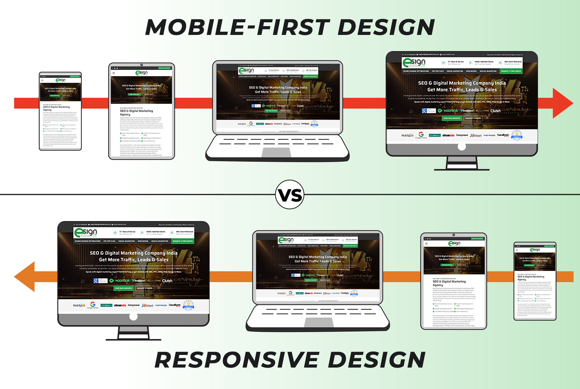
Responsive Web Design and its Functions
Responsive web design ensures that a single website layout can adapt automatically to different screen sizes and devices. This approach eliminates the need for multiple versions of the same site, such as separate mobile or desktop versions.
It leverages three core components:
- Fluid grids that scale proportionally: Layout columns automatically resize based on screen size using percentage-based widths for seamless scaling.
- Flexible images that resize within containers: Images adjust dynamically to fit their surrounding containers without breaking layout or overlapping elements.
- CSS media queries that apply different styles based on screen width: Media queries detect device width and apply specific CSS rules for optimized styling and responsiveness.
These elements work together to maintain a visual hierarchy, ensure readability, and promote usability across all devices. The result is a website that remains both functional and visually appealing on all platforms. A well-implemented responsive design utilizes relative units, such as percentages, instead of fixed pixels, enabling content to adjust seamlessly.
This layout consistency enhances user satisfaction, reduces bounce rates, and ensures accessibility for everyone. Learn more about why responsive design is important for SEO. Furthermore, responsive design simplifies maintenance by requiring updates to only one version of a site, saving time and reducing errors. This streamlined workflow contributes to faster loading speeds, another factor that improves user experience and search engine performance.
Evolution from Desktop-First to Mobile-First Thinking
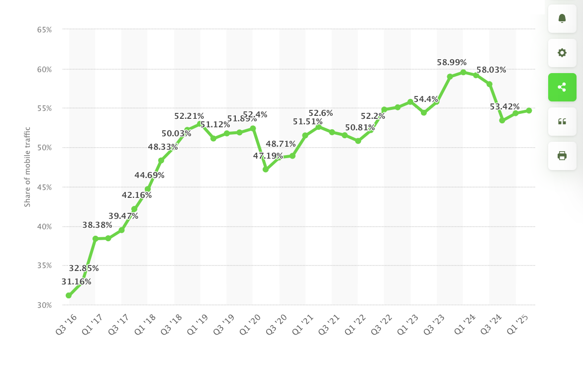
The web’s early days were dominated by desktop-centric design. Sites were built for large screens, with little regard for mobile usability. As smartphone adoption has exploded, user behavior has shifted dramatically; today, mobile devices account for more than half of global web traffic.
This shift forced designers and developers to abandon the “desktop-first” approach in favor of mobile-first strategies. The idea is simple: design for the smallest screen first, then scale up. This ensures that essential content is prioritized and the experience remains intuitive across devices.
Technologies like media queries and frameworks like Bootstrap enabled responsive design to flourish. Designers could now build fluid layouts that adapt to screen size, orientation, and resolution. Google fueled this transition with its mobile-first indexing, further encouraging developers to optimize mobile experiences.
Milestones such as responsive frameworks, HTML5, and mobile testing tools empowered developers to prioritize usability across screens. Today, mobile-first thinking influences layout, content strategy, and SEO. Businesses that ignore mobile users risk losing relevance, visibility, and conversions. Learn how to design an SEO-friendly website that Google will love. In today’s digital era, mobile-first is no longer optional, it’s essential.
Understanding Google’s Mobile-First Indexing Strategy
Google’s mobile-first indexing means that Googlebot primarily uses the mobile version of a website’s content for crawling, indexing, and ranking. This marks a significant shift from traditional indexing, which focused on desktop versions.
With mobile traffic surpassing desktop, Google adapted its algorithms to reflect user behavior. As of July 2024, mobile-first indexing has become the default for all websites. This change affects how sites are evaluated: if your mobile version lacks content, images, or structured data, Google may not index or rank those elements.
Responsive web design solves this by ensuring the same HTML and content are served to both desktop and mobile users. This consistency prevents content loss and avoids duplicate versions of pages. Google favors responsive layouts because they streamline crawling and minimize technical errors.
Site owners should use Google’s Mobile-Friendly Test, PageSpeed Insights, and Search Console’s Mobile Usability report to monitor compliance. Key factors include mobile load speed, font size, tap target spacing, and viewport settings. When your site performs well on mobile, it naturally earns better rankings. Responsive design is both a design solution and a modern SEO strategy.
Connection Between Responsive Design and SEO Success
Responsive design has a direct impact on SEO by enhancing user experience, improving page speed, and increasing crawl efficiency. A unified URL structure consolidates all SEO signals; such as backlinks, social shares, and metrics; into one version of each page. This improves domain authority and reduces duplicate content risks.
Google confirms responsive design is their preferred method for mobile configuration because it simplifies indexing and ranking. Understand how anchor text optimization plays a role in mobile SEO success. A mobile-friendly website design loads faster, retains visitors longer, and increases engagement. These factors contribute to lower bounce rates and higher conversion rates; signals search engines use to evaluate site quality.
Responsive sites also perform better on Core Web Vitals, which include:
- Largest Contentful Paint (LCP) – Measures how fast the largest visible element loads for users.
- Cumulative Layout Shift (CLS) – Evaluates visual stability by tracking unexpected layout movements during page load.
- Interaction to Next Paint (INP) – Captures the delay between user interaction and visual page response for interactivity.
By designing responsively, you align your site with these performance standards. Another benefit is reduced technical debt. Managing a single responsive site is easier and more cost-effective than maintaining separate versions for different devices. This ensures timely updates and consistent metadata.

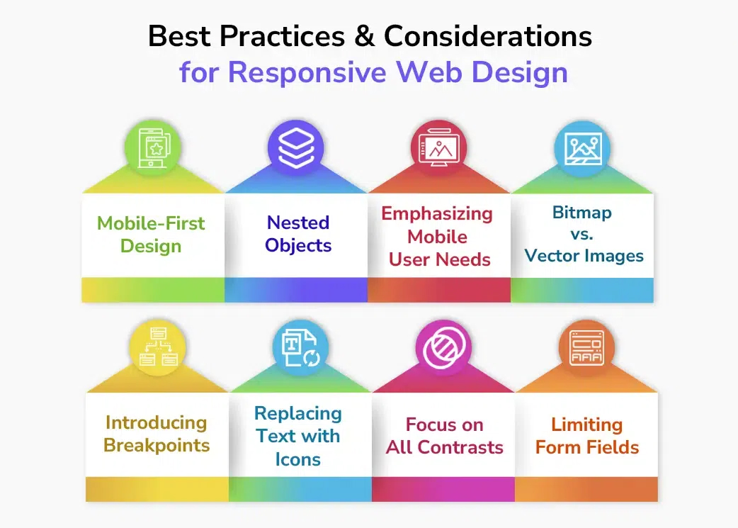
Responsive Web Design Best Practices
Before diving into code or redesign, take a diagnostic pulse of your current site’s health. This initial check helps identify areas that affect performance, UX, or mobile responsiveness before rebuilding.
Start by auditing your current site using trusted tools:
- Google’s Mobile-Friendly Test – Analyzes mobile responsiveness and flags touch target or viewport configuration issues.
- Lighthouse – Audits performance, accessibility, and SEO while highlighting load speed and interactivity problems.
- PageSpeed Insights – Provides Core Web Vitals metrics and optimization suggestions for mobile and desktop versions.
These tools don’t just spot performance flaws, they reveal exactly how your website behaves for real users. These tools highlight mobile usability and performance issues. Adopt a mobile-first approach; design for the smallest screen first, then enhance for larger ones. This ensures essential content is visible on mobile devices.
Use flexible grids, relative units (em, rem), and CSS media queries to create adaptive layouts. Optimize images using WebP formats, compression tools, and srcset attributes to enhance performance. Keep navigation simple: hamburger menus, large tap targets, and no hover-only features.
Ensure readable font sizes and proper color contrast to facilitate clear visibility. Use the viewport meta tag to control scaling. Test across real devices to identify and resolve inconsistencies. Avoid hiding content on mobile; it may be excluded from indexing. Focus on performance by minimizing JavaScript, deferring CSS, and using caching. Proper implementation requires teamwork between design, development, and SEO.
The Final Note
Responsive web design is more than a trend; it’s a modern standard for digital success. In today’s mobile-first ecosystem, adapting across devices is essential. Responsive design enhances performance, improves SEO, and provides a consistent user experience. It reduces maintenance, lowers development time, and ensures accessibility across platforms. As mobile usage grows, the benefits of responsive web design help retain visibility, engagement, and competitiveness. Businesses prioritizing responsive sites earn more trust and conversions
Whether building new or retrofitting existing sites, make responsive web design a core strategy. It’s not just about search rankings; it’s about creating value for users. A responsive site shows professionalism and builds brand credibility. Act now to avoid traffic losses, SEO penalties, and poor user experience. Embrace mobile-first thinking to future-proof your online presence.
Ready to Win in a Mobile-First World?
Ready to transform your site into a responsive, mobile-friendly website design? Let eSign Web Services help. Our certified experts specialize in SEO-optimized, user-friendly web design tailored to your business goals.
With over 17 years of experience and more than 1,000 five-star reviews, we deliver results without requiring long-term contracts. Request a Free Quote today and unlock your website’s full potential.
Frequently Asked Questions
Q: Will responsive design automatically improve my Google rankings?
A: Not instantly. Responsive design enhances Core Web Vitals, strengthens cross-device user experience, and supports page speed optimization. These improvements indirectly boost rankings by reducing friction, improving engagement, and aligning your site with Google’s mobile-first approach in web design.
Q: How long does it take to convert a non-responsive site to responsive?
A: Most projects take 4–12 weeks. Timelines depend on complexity and integrations. A mobile-first web development approach speeds results, ensuring proper page speed optimization, improved Core Web Vitals, and smoother cross-device user experience without unnecessary code or design delays.
Q: Is it better to create a separate mobile site or use responsive design?
A: Use responsive design. It provides a consistent cross-device user experience, prevents SEO conflicts, and aligns perfectly with mobile-first indexing. This method ensures faster page speed optimization and better compliance with Core Web Vitals and modern UI/UX principles.
Q: What’s the biggest mistake people make when implementing responsive design?
A: Many hide desktop content on mobile. Instead, adapt layouts with modern UI/UX principles and test through the mobile usability report. Avoiding this mistake improves accessibility, user engagement and bounce rate, and ensures consistent interaction across all devices.
Q: Do I need to redesign my entire website to make it responsive?
A: Not always. Often, only layout tweaks and media queries are needed. A mobile-first approach in web design ensures adaptability, while testing with Core Web Vitals and Google mobile-friendly test confirms efficiency and overall usability improvements.
Q: How do I verify if my site is mobile-optimized?
A: Run the Google mobile-friendly test and check the mobile usability report. Review Core Web Vitals for performance insights. Regular page speed optimization helps identify and fix issues affecting responsiveness and cross-device user experience effectively.
Q: Does responsive design improve load time on mobile devices?
A: Yes. It supports faster rendering with page speed optimization, compressed images, and simplified code. Monitoring Core Web Vitals ensures consistent performance, enhancing user engagement and bounce rate while improving overall site usability and visibility.
Q: How does responsive design benefit SEO across devices?
A: Responsive design unifies URLs and enhances cross-device user experience, strengthening crawl efficiency and authority. This mobile-friendly structure aligns with mobile-first web development, improving Core Web Vitals, user engagement and bounce rate, and long-term organic rankings.
Q: Which modern UI/UX principles matter most for responsive sites?
A: Focus on readability, spacing, and easy navigation. Follow modern UI/UX principles with touch-friendly elements. These improve cross-device user experience, lower bounce rate, and enhance performance across devices with solid page speed optimization techniques.
Q: How does a mobile-first approach in web design change workflow?
A: It prioritizes smaller screens first. A mobile-first approach in web design improves clarity, structure, and Core Web Vitals, creating a smooth cross-device user experience while reducing redesign needs and development rework.
Q: How do user engagement and bounce rate influence mobile SEO?
A: Higher user engagement and bounce rate metrics reflect experience quality. Optimizing Core Web Vitals and page speed optimization enhances usability, signaling relevance to search engines, which boosts visibility and strengthens mobile-first web development outcomes.
Author Details

Ashwani Kumar Sharma
Ashwani has been actively involved in SEO services since 2005. His expertise and distinctive work approaches have made him one of the most experienced and trusted SEO experts in the industry. He is a certified SEO and Google Ads professional. He also has strong business development skills in advanced SEO, PPC, and digital marketing strategies.