Why Your Website Looks Good but Doesn’t Convert (UX Diagnosis Guide)
Key Takeaways
- Just a gorgeous site won’t save you; clarity, speed, trust, and smooth flow are what convert.
- Start by fixing friction: messy messaging, confusing paths, weak CTAs, slow loads, and trust gaps.
- Make your value obvious above the fold, using plain language people instantly understand.
- Simplify navigation so visitors reach services, pricing, or contact without hunting or guessing.
- Keep forms short and explain what happens next to stop last-second hesitation.
- Prioritize mobile experience and site speed because impatient thumbs don’t wait around.
- Use real behavior data; funnels, recordings, heatmaps, to find problems and fix them confidently.
- Add trust near CTAs: proof, reassurance, and transparency help users feel safe to act.
A website can look premium and still underperform. If you’re dealing with a low conversion rate website, the issue is rarely “we need more traffic” or “it’s time for a complete redesign.” More often, it’s friction; unclear messaging, confusing navigation paths, underwhelming CTAs, slow load times, or subtle trust gaps that cause hesitation. These small breakdowns compound. That’s why website conversion optimization is not about making a site look better; it’s about making it easier to act. Many brands struggle because of subtle design decisions that quietly block conversions, like the ones we break down in our guide to errors in website design that reduce conversions. The goal is to remove resistance so visitors can move forward confidently, without over thinking their next step.
Here’s the reality: users don’t casually browse business websites; they evaluate them. Within seconds, they decide whether you’re relevant, credible, and worth their time. Stanford’s credibility research found that people relied heavily on surface cues like design when judging a site’s trustworthiness.
Strong design earns initial trust, but it doesn’t sustain it. Clear messaging and logical flow are what turn interest into action. If your value proposition isn’t immediately obvious, users won’t stay to interpret it.
Why this matters:
- You lose ready-to-buy visitors fast: If your value isn’t clear immediately, high-intent users won’t “figure it out”—they’ll choose the next option.
- Small friction becomes big revenue loss: Confusing paths, weak CTAs, and hesitation points compound across every visit, turning minor UX gaps into missed leads and sales.
- Clarity improves marketing efficiency: When the site converts better, the same traffic (SEO, ads, referrals) produces more results, lowering cost per lead and improving ROI.
Consider this guide a practical website UX diagnosis, not a theory discussion. We’ll identify where users disengage, uncover what’s quietly blocking conversions, and prioritize the changes that impact revenue, not just aesthetics. The objective isn’t to create a “nice” website. It’s to build one that consistently converts.
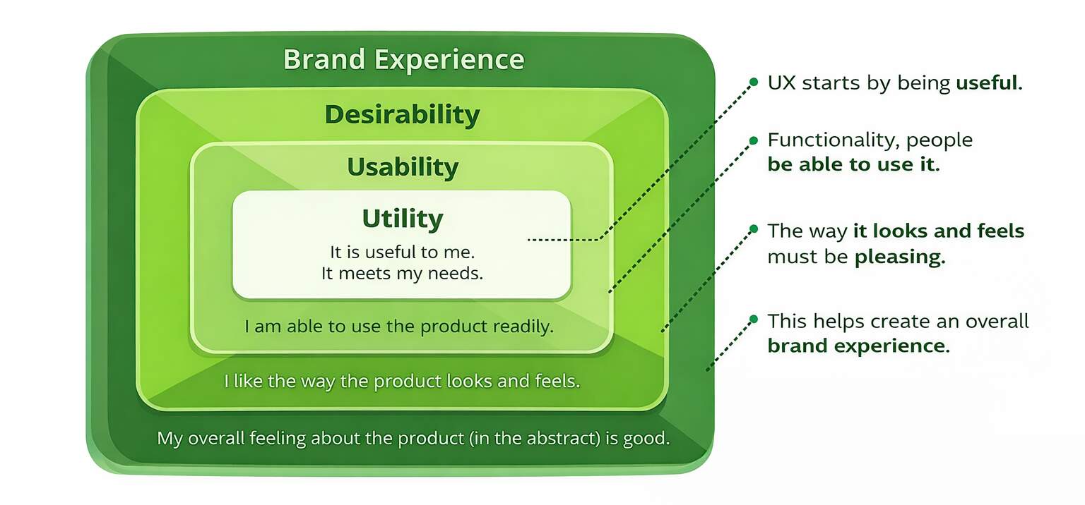
When Visual Design Overpowers Usability
A modern UI can be a gift or a distraction dressed as art direction. Stanford’s research on credibility demonstrates that design plays a huge role in credibility judgments, so visual decisions matter for rapidity. But when visuals overpower function, people don’t convert, they bounce, scroll aimlessly, or click like they’re playing “escape room” with your navigation. That’s where usability issues quietly condemn a good-looking page to a dead end.
The most common issue is that creativity often wins over clarity. The hero section reads more like a brand statement than a clear answer. Call-to-action buttons blend into background designs, and it becomes harder to read because of the focus on looks. However, users do not read the same way as your design team thinks they do. Nielsen Norman–cited guidance notes that visitors often read only a fraction of page text (about 28% on average). If key meaning isn’t skimmable, it might as well not exist.
To address this through website conversion optimization, have your design decisions serve you. Focus on one goal per page, one primary CTA, and one simple promise.
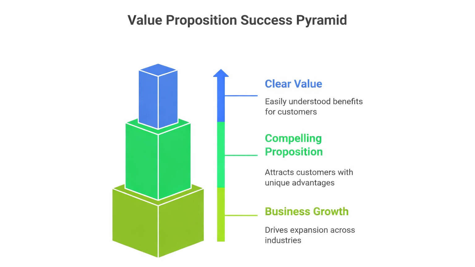
Unclear Value Proposition and Messaging
If your headline looks like your competitors’, it’s not effective branding; it’s just blending in. Users quickly judge relevance, and if your unique value isn’t clear right away, you risk creating UX conversion issues that quietly cost your business leads. This can lead to fast exits, low engagement, and wasted paid clicks. Improving your messaging for clarity is a high-impact fix that benefits all visitors, not just a few.
A big culprit is unclear copy: “innovative solutions,” “customer-first,” “best-in-class.” Nobody argues with it, but nobody acts on it either. Here’s what this looks like in real life: a startup founder lands on your services page, can’t tell who it’s for in five seconds, and hits back, because searching feels easier than decoding. This gets worse when the page doesn’t align with the intent (ad promise vs. landing page reality), which instantly lowers trust.
Use website conversion optimization to make the value proposition measurable, not poetic. In paragraph one of your page, answer: who it’s for, the outcome, and the differentiator.
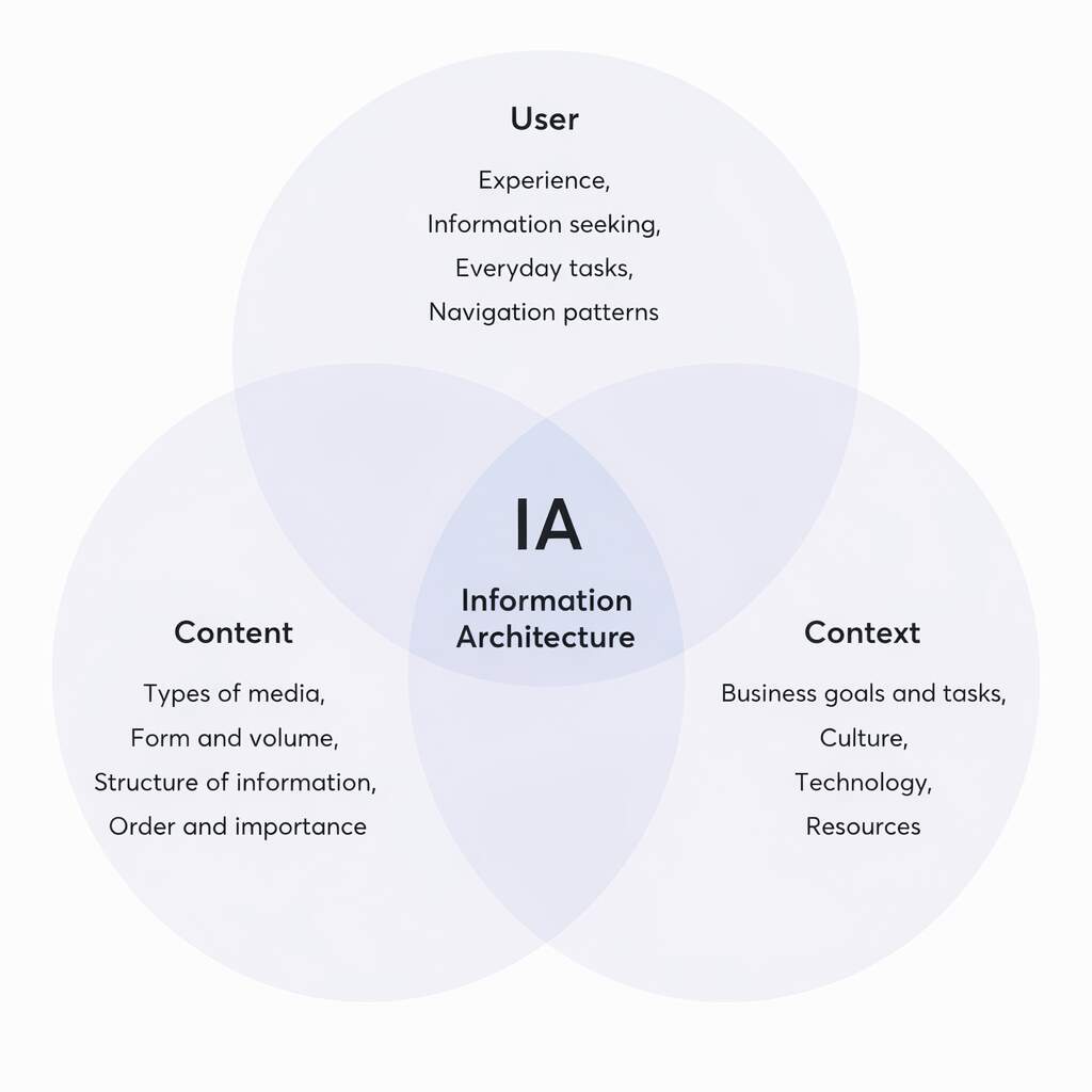
Navigation & Information Architecture Issues
If your user is struggling to find your pricing or contact page, with a map, a compass, and emotional support, then your conversion problem isn’t mysterious; it’s built. Overstuffed menus, unclear categories, and “where do I click now?” moments create decision fatigue. And decision fatigue kills action. Clean information architecture reduces confusion and shortens time-to-decision, which is what website conversion optimization is really paying for: fewer steps between interest and action.
Most sites lose conversions because they offer too many paths too early. When everything is equally emphasized, nothing is. Visitors don’t want 14 menu options; they want the fastest route to “Is this for me?” and “What do I do next?” This is where content grouping matters: put the most asked questions first, use scannable sections, and make the next step predictable. Bonus: simpler navigation also improves crawlability and internal linking logic, quiet SEO wins without extra content.
A practical fix is to align navigation with intent, not org charts. Your menu should reflect how buyers think, not how departments are structured.
Quick checklist:
- Limit top-level nav items and group by user goal.
- Add “next-step” CTAs inside key pages (not just the header).
- Use clear subheads that mirror buyer questions to support conversion funnel optimization and reduce drop-offs.
Friction in Forms and Conversion Paths
Forms are where “interested” becomes “lead,” and that transition is fragile. Baymard’s research found that the average checkout in 2024 included 11.3 form fields, and 18% of users abandoned due to checkout complexity. Even outside ecommerce, the principle holds: every extra field is a mini tax on motivation. That’s why a low conversion rate website often has a form problem hiding in plain sight.
The two biggest issues are length and uncertainty. Long forms feel intrusive (“Why do you need my budget right now?”), and unclear next steps create hesitation (“Will you spam me?” “How fast do you respond?”). Add a missing-trust situation, and users bail. This is where form optimization and reassurance microcopy do real work: “We reply within 1 business day,” “No spam,” and a simple privacy note can boost completion by reducing perceived risk.
Treat your form like a promise, not a questionnaire. Fix it with website conversion optimization by reducing effort and increasing clarity.
| Form Element | What Users Feel | Common Drop-Off Trigger | Better Fix |
| Too many fields | “This is work.” | High abandonment mid-form | Keep only essentials; move qualifiers to follow-up |
| Budget/phone required early | “Why do you need that now?” | Users exit before submitting | Make optional or ask after intent is confirmed |
| No timeline or next step | “What happens after I submit?” | Hesitation + bounce | Add “What happens next” + response time |
| No privacy reassurance | “Will I get spammed?” | Users don’t finish | Add privacy line + “No spam” microcopy |
| Weak error handling | “This is annoying.” | Rage clicks, restarts | Inline validation + clear error messages |
| No trust near form | “Is this legit?” | Last-second abandonment | Add logos/testimonials/security note near CTA |
Treat your form like a promise, not a questionnaire, because every extra step adds doubt.
Reduce effort, explain what happens next, and place trust cues right where the decision happens.
That’s how you turn form friction into completed submissions and real leads.
Performance and Technical UX Barriers
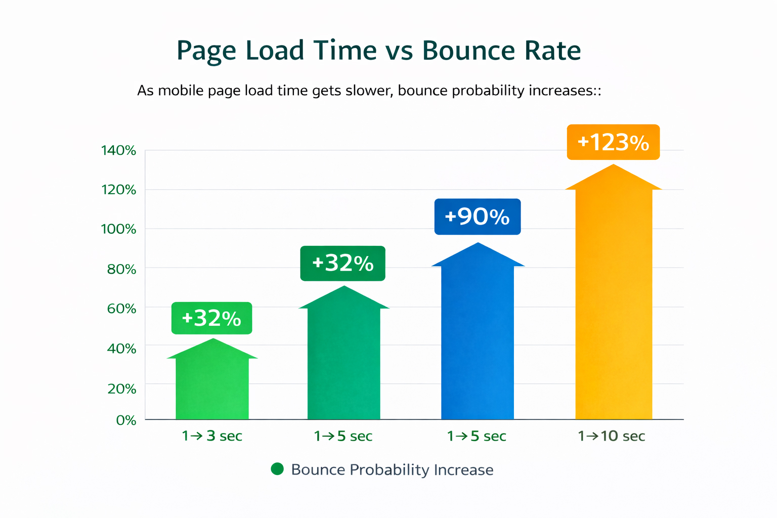
Performance is UX, and UX is revenue. Google’s research says 53% of visits are likely to be abandoned if a mobile page takes longer than 3 seconds to load. Akamai has also reported that a 100-millisecond delay in load time can hurt conversion rates by 7%. That’s not a rounding error, that’s your pipeline leaking because the page couldn’t get itself together.
Speed issues don’t just cause bounces; they reduce trust. Slow sites feel less reliable, even if the user can’t articulate why. You also lose conversions when layouts shift, buttons misfire, or behavior changes across browsers. It’s like walking into a store where the shelves move while you’re shopping. This is website performance UX in action: stability and responsiveness are part of “ease,” not “engineering.”
Fix the technical blockers before you rewrite your entire site. Study notes that sites appearing on Google page one load in about 1.65 seconds on average.
Website Performance Improvement Actions:
- Audit Core Web Vitals targets (INP “good” is under 200ms). Remove heavy scripts, compress images, and reserve space to prevent layout shifts.
- Test critical flows on real devices to improve the mobile user experience and reduce surprises.
Lack of Data-Driven UX Optimization
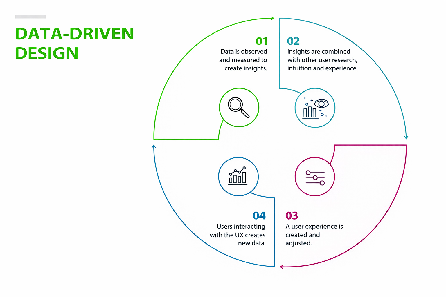
If you’re not measuring behavior, you’re not optimizing, you’re decorating. A lot of teams “fix” UX based on opinions, internal debates, or whoever talks fastest in meetings. That approach misses real user behavior and leads to random changes that don’t move the needle. A proper website UX diagnosis combines analytics (what happened) with behavioral insight (why it happened), so you can prioritize the leaks that actually affect outcomes.
Start by looking at where users drop off: high exit rates on pricing, low click-through rates on primary CTAs, form starts vs. form completions. Then, validate the “why” with heatmaps or session recordings. You’ll usually find UX conversion issues like rage clicks, missed CTAs, confusing copy blocks, or people bouncing because they never understood the offer. The goal is not “more data.” It’s clearer decisions.
Build a lightweight system you can run monthly, not a one-time “audit project” that dies in a folder. Use website conversion optimization as an operating rhythm: test, learn, repeat.
Weak Calls-to-Action and Conversion Triggers
A CTA can be visible yet ineffective; like a billboard that says “Do something.” Generic buttons (“Submit,” “Learn More”) don’t create momentum; they create uncertainty. Strong CTAs reduce uncertainty by promising a clear outcome, and that’s the heart of call-to-action optimization. If you want better action rates, your CTA must answer: what do I get, what happens next, and why should I do it now?
Placement matters as much as copy. CTAs perform best at decision points: after benefits, after proof, and after objections are handled. Drop one too early, and it comes across as pushy. Hide it too late, and users never reach it. Also, don’t make users hunt for the next step after they’re convinced; that’s how you lose “ready buyers” at the finish line.
Treat CTAs like micro-commitments that move the journey forward. That’s what conversion rate optimization UX looks like in practice: guiding attention and lowering risk.
Steps to Strengthen Your CTAs
- Replace generic CTA labels with outcome-focused wording (quote, demo, pricing, audit).
- Add reassurance microcopy (“No spam,” “1 business day response,” “Cancel anytime”).
- Repeat CTAs thoughtfully (top, mid, end) without turning your page into a button museum.
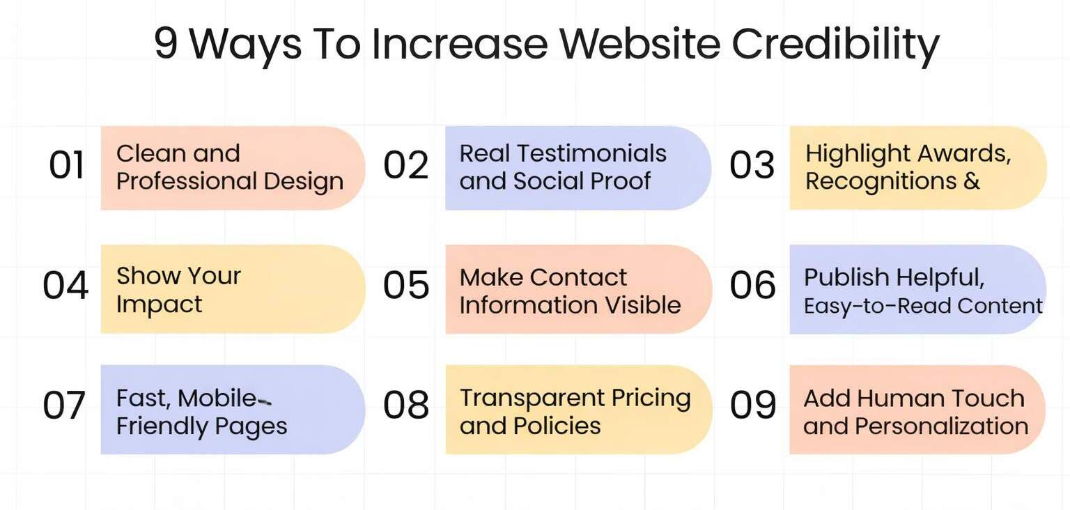
Trust, Credibility, and Perceived Risk
Conversions are confidence decisions. Even when users want what you offer, they’ll hesitate if anything feels uncertain: unclear pricing, vague deliverables, missing proof, or inconsistent branding. A research found that users relied heavily on surface cues (such as design) when making credibility judgments. So yes, design matters. But credibility is also built through consistency, transparency, and proof placed where decisions are made.
Here’s what this looks like: a visitor is ready to inquire, but the site has no testimonials near the form, no clear process, and no “what happens next.” The risk feels high, so they delay. That delay is a conversion death. Your job is to reduce perceived risk with proof, clarity, and predictable next steps, especially on high-intent pages like pricing and contact. This is where landing page UX should feel calm, specific, and trustworthy.
Fix trust like it’s part of the product, not a footer accessory. Build website conversion optimization around confidence, and remove user-journey friction that creates doubt.
Comparison Table (SERP/Competitor Snapshot)
| What Users See in Search Results | What Those Pages Do Well | What They Often Miss | Your Opportunity |
| “UX mistakes killing conversions” listicles | Quick scanning, lots of tips | No prioritization or measurement | Provide a diagnosis flow + tracking plan |
| “CRO checklist” posts | Actionable bullets | Generic, not tied to intent | Add real micro-scenarios + fix order |
| “Speed optimization” guides | Strong performance focus | Ignores messaging + trust | Connect speed to trust + conversion behavior |
| “Landing page best practices” articles | Good structure | Weak on forms and risk reducers | Add clear next-step messaging + trust placement |
Wrapping It Up
A website usually doesn’t struggle because it lacks creativity. It struggles because it makes people work too hard to understand, trust, or take the next step. Conversions rarely get blocked by one big, obvious mistake. They get slowed down by small frictions that don’t look dramatic on a design review, a headline that sounds nice but says nothing, a CTA that blends in, a menu that feels like a maze, a form that asks too much too soon, a page that loads slowly, or a missing reassurance right when someone is ready to act. On their own, these feel minor. Together, they quietly drain revenue and turn good traffic into missed opportunities.
That’s why website conversion optimization isn’t about ripping everything out and starting over. It’s about spotting what interrupts decision-making and fixing the highest-impact leaks first. When you simplify the journey, clarify the offer, strengthen CTAs, tighten forms, and remove hesitation, the results show up where it matters: more inquiries, more bookings, more sales. It’s the difference between a website that “looks professional” and one that consistently performs.
This is exactly the kind of work eSign Web Services focuses on, turning good-looking websites into conversion-ready experiences by removing friction and building trust where it counts.
Ready to Turn Your Website Into a Conversion Engine?
If your site looks great but conversions feel stuck, you don’t need another cosmetic redesign, you need a clear diagnosis and a practical fix plan. eSign Web Services can review your UX, messaging, CTAs, forms, and performance to identify what’s blocking action and what to prioritize first. You’ll get a straightforward roadmap built for measurable improvement, not vague “best practices.” Reach out today for a UX-focused conversion review and start turning more of your existing traffic into real leads.
Frequently Asked Questions
Question: Why does a visually attractive website fail to convert?
Answer: A visually attractive website can still fail to convert if usability, clarity, and user flow are weak. Design alone does not guide users toward action. Common issues include unclear value propositions, hidden or weak calls-to-action, confusing navigation, and slow load times. When users cannot quickly understand what to do next or why they should take action, they disengage. High-converting websites balance aesthetics with usability, ensuring that design supports clear messaging and frictionless conversion paths.
Question: How does UX directly impact conversion rates?
Answer: UX influences how easily users can navigate a site, understand its value, and complete desired actions. Poor UX increases cognitive load, creates confusion, and introduces friction in the user journey, leading to higher drop-offs. Clear navigation, readable content, fast performance, and intuitive conversion paths reduce friction and build trust. When UX is optimized, users feel confident and supported throughout their journey, which directly increases the likelihood of completing sign-ups, inquiries, or purchases.
Question: What are the most common UX mistakes that hurt conversions?
Answer: Common UX mistakes include unclear messaging, cluttered layouts, hidden CTAs, long or intrusive forms, poor mobile experience, and slow page load times. Many websites also overwhelm users with too many choices or fail to provide trust signals at key decision points. These issues create friction and hesitation, even when the design looks modern. Addressing these problems requires focusing on user intent, simplifying journeys, and ensuring every design element supports a clear conversion goal.
Question: How can unclear messaging reduce conversions?
Answer: Unclear messaging makes it difficult for users to understand what a product or service offers and why it matters to them. When value propositions are vague or generic, users struggle to connect the offering with their own needs. This confusion reduces trust and increases bounce rates. Clear, benefit-driven messaging helps users quickly grasp the purpose of the page and the value of taking action, which improves engagement and conversion rates across key pages.
Question: Why are calls-to-action so critical for conversion?
Answer: Calls-to-action guide users toward the next step in their journey. Weak, generic, or poorly placed CTAs fail to motivate action, even if the content is strong. Effective CTAs clearly communicate what users will gain and what happens next, reducing uncertainty. Strategic placement at natural decision points ensures CTAs appear when users are most ready to act. Strong CTAs, combined with trust signals, significantly improve conversion performance.
Question: How does mobile UX affect website conversions?
Answer: Mobile UX plays a major role in conversions because a large share of users access websites on mobile devices. If pages load slowly, buttons are hard to tap, or layouts break on smaller screens, users are more likely to abandon the site. Mobile-friendly design ensures readability, easy navigation, and frictionless form completion. Optimizing for mobile improves user satisfaction and prevents conversion losses caused by poor on-the-go experiences.
Question: Can page speed really impact conversions?
Answer: Yes, page speed has a direct impact on conversions. Slow-loading pages increase frustration and reduce user patience, leading to higher bounce rates. Even small delays can significantly affect engagement and completion rates. Fast-loading websites create a smoother experience, build trust, and keep users focused on the content and conversion path. Optimizing performance is one of the most effective ways to improve both UX and conversion rates simultaneously.
Question: What role do trust signals play in conversion optimization?
Answer: Trust signals help users feel confident about taking action on a website. Testimonials, reviews, security badges, certifications, and clear privacy assurances reduce perceived risk. Without these elements, users may hesitate to share personal information or complete purchases. Placing trust signals near conversion points reinforces credibility at critical moments, helping users move forward with greater confidence and improving overall conversion rates.
Question: How can data be used to diagnose conversion issues?
Answer: Data helps identify where users drop off and which parts of the journey create friction. Analytics tools reveal patterns such as high bounce rates, form abandonment, and exit pages. Heatmaps and session recordings provide deeper insight into user behavior. By combining quantitative data with qualitative feedback, teams can diagnose specific UX issues and prioritize improvements that directly impact conversions rather than relying on assumptions or opinions.
Question: What is the best way to start improving website conversions?
Answer: The best starting point is a focused UX audit of key conversion paths. Identify friction points in messaging, navigation, forms, CTAs, performance, and mobile experience. Prioritize changes that simplify user journeys and clarify next steps. Testing improvements through A/B experiments helps validate what works. Conversion optimization is an ongoing process, and continuous iteration based on user behavior leads to sustainable performance improvements over time.
Author Details

Ashwani Kumar Sharma
Ashwani has been actively involved in SEO services since 2005. His expertise and distinctive work approaches have made him one of the most experienced and trusted SEO experts in the industry. He is a certified SEO and Google Ads professional. He also has strong business development skills in advanced SEO, PPC, and digital marketing strategies.