5 Website Design Mistakes That Kill Conversions
Key Takeaways
- Prioritize clarity over creativity to avoid confusing users and reduce abandonment.
- Faster load times reduce bounce rates and increase trust, especially on mobile.
- Design mobile-first to prevent frustrating experiences and maximize mobile traffic conversions.
- Clear information architecture and visible CTAs boost conversions by guiding users effortlessly
- Simplify checkout and forms to reduce friction and cart abandonment rates.
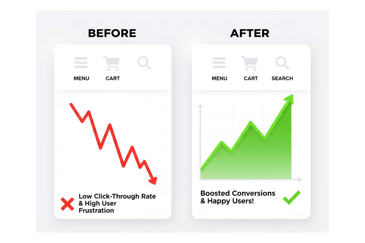
If your website traffic looks strong but your sales or leads remain disappointingly low, chances are the issue isn’t with your marketing—it’s with your design. Visitors may be landing on your site, but subtle friction points in layout, copy, or usability are quietly nudging them away. Small details, such as confusing menus, slow-loading pages, or inconsistent calls-to-action, pile up, creating a poor user interface that erodes trust and patience —hurting conversion rate optimization (CRO) across the funnel. l. Inconsistent design elements, unclear CTAs, and slow speed all weaken your overall Conversion rate optimization performance. The result? Abandoned carts, missed leads, and wasted ad spend.
The upside: most of these leaks are fixable, and the fixes aren’t that difficult. You just need to know where to look. So buckle up. Let’s dive into the five common website design mistakes businesses make in website design & development, why they matter, and what you can do to fix them before they cost you more revenue. Recognizing these common website design mistakes early can save both time and conversions.
1. Aesthetics Alone Don’t Convert
A site can look stunning yet still fail to meet its objectives. When teams prioritize high-fashion aesthetics over clarity, they often sacrifice usability. Pages overloaded with animation, unconventional icons, or vague micro-copy look creative but leave users scratching their heads. That moment of confusion—when someone has to stop and think about what a button does—kills momentum. According to Nielsen Norman Group, users rely on “information scent” (visual or textual clues about what comes next) to feel confident in their clicks. If they don’t smell the trail, they bail. A weak information scent causes hesitation, which in turn leads to abandonment.
This is a textbook example of how a poor user interface sabotages conversions. To improve, you need to ensure every label, menu, and CTA communicates clearly. Replace vague “Learn More” buttons with outcome-driven text like “See Pricing” or “Get a Demo.” Reinforce icons with words (don’t assume your hamburger icon says “menu” to everyone). When in doubt, test with real users—what seems obvious to you as a designer may be baffling to a visitor.
What to do
- Make critical actions explicit (e.g., “Start Free Trial,” “Get Quote”).
- Avoid “mystery meat” navigation (icons without labels).
- Write headers and CTAs that match the page the click leads to; don’t surprise people.
Tools: Hotjar or Microsoft Clarity for click maps, session replays, and hesitation tracking. You can literally watch where people hover, pause, or rage-click. This gives a raw look at where design gets in their way.
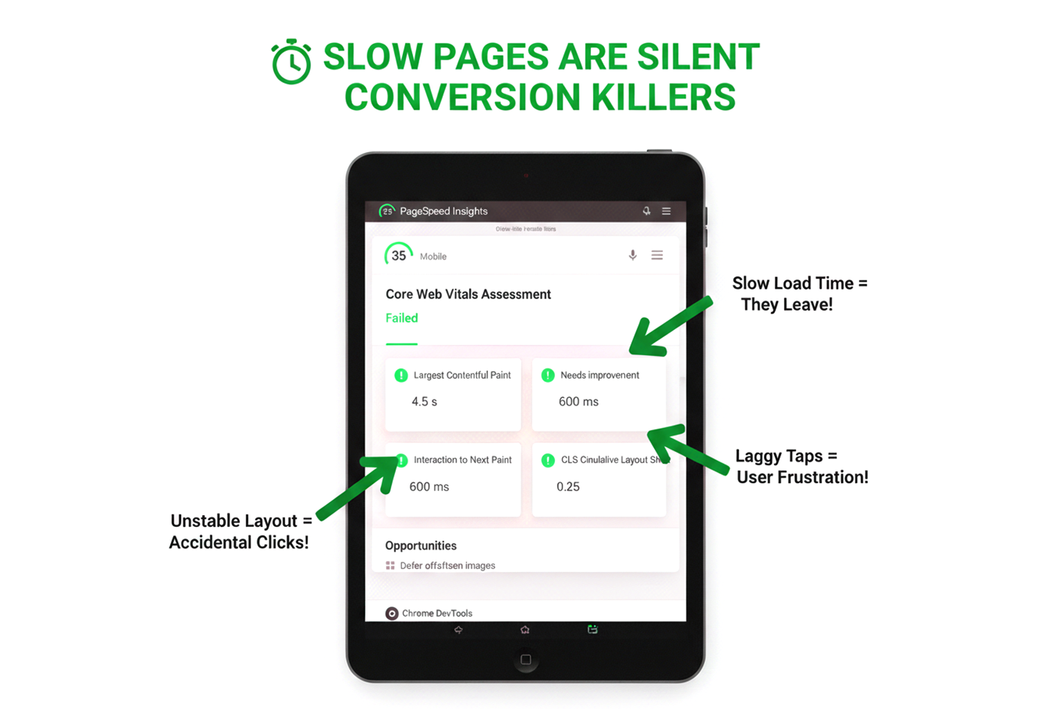
2. Speed Tax: When Pages Make People Wait
Speed is the silent killer of conversions. Studies from Google show that if a page takes longer than three seconds to load, more than half of mobile users will abandon it. In fact, as load time increases from one to three seconds, the bounce rate rises by 32%. By the time you hit ten seconds, they’ve spiked by 123%. People today expect instant gratification, and patience is in short supply. Every extra second is a chance for them to close the tab and check a competitor instead.
This is why Google’s Core Web Vitals (LCP, INP, and CLS) exist—they measure how quickly the site renders, responds, and stays stable. Businesses that treat these as “just SEO metrics” are missing the bigger picture. Vodafone, for example, improved Largest Contentful Paint (LCP) by 31% and saw an 8% increase in sales. Faster experiences create confidence. Slow ones trigger doubt.
What to do
- Compress and resize hero images; convert them to WebP or AVIF.
- Defer non-critical scripts like chatbots or analytics that don’t need to block rendering.
- Monitor real-user field data (from Chrome User Experience Report or Search Console) because synthetic tests don’t always reflect what customers actually experience.
- Treat INP—interaction response times—as carefully as LCP; laggy taps can be as deadly as slow loads.
Tools: PageSpeed Insights for lab + field data, Lighthouse audits in DevTools for CI/CD checks, and Search Console’s Core Web Vitals report to monitor trends.
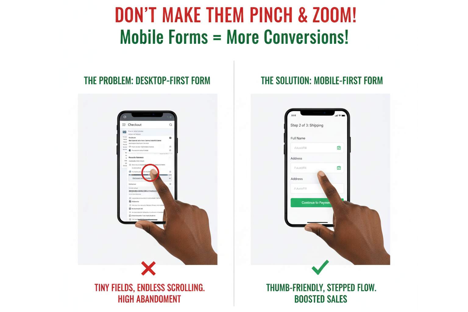
3. Designing Desktop-First in a Mobile-Majority World
It’s 2025, and mobile isn’t the future—it’s the default. Yet, many sites still look like shrunken-down desktop designs, packed with tiny buttons, cramped forms, and intrusive pop-ups that overwhelm a phone screen. Considering mobile accounts for nearly 60% of global web traffic, a desktop-first design is practically leaving money on the table.
Think about your own browsing habits: how often do you complete tasks one-handed on a phone? If your forms require pinching, zooming, or endless scrolling, users will quit. Mobile-friendly doesn’t just mean responsive layouts—it means mobile-first design and thoughtful flows. Break long forms into short steps with progress indicators. Enlarge buttons so they’re thumb-friendly (44px by 44px is the WCAG gold standard). Avoid sticky bars or banners that cover CTAs. And test everything on a small device—what feels fine on a widescreen monitor is often maddening on a 360px phone. This oversight is one of the biggest common website design mistakes—a poor user interface designed for desktops will almost always fail mobile users.
What to do
- Design at mobile breakpoints first, then scale up to desktop.
- Simulate one-hand flows; if you can’t finish a checkout while holding your phone in a coffee line, neither can your customers.
- Use rage-click data to identify mobile pain points—when users repeatedly tap on unresponsive or blocked elements, it’s a flashing red warning sign.
Tools: Chrome DevTools for mobile emulation, Hotjar/Clarity for rage-click analysis, and responsive testing tools like BrowserStack.
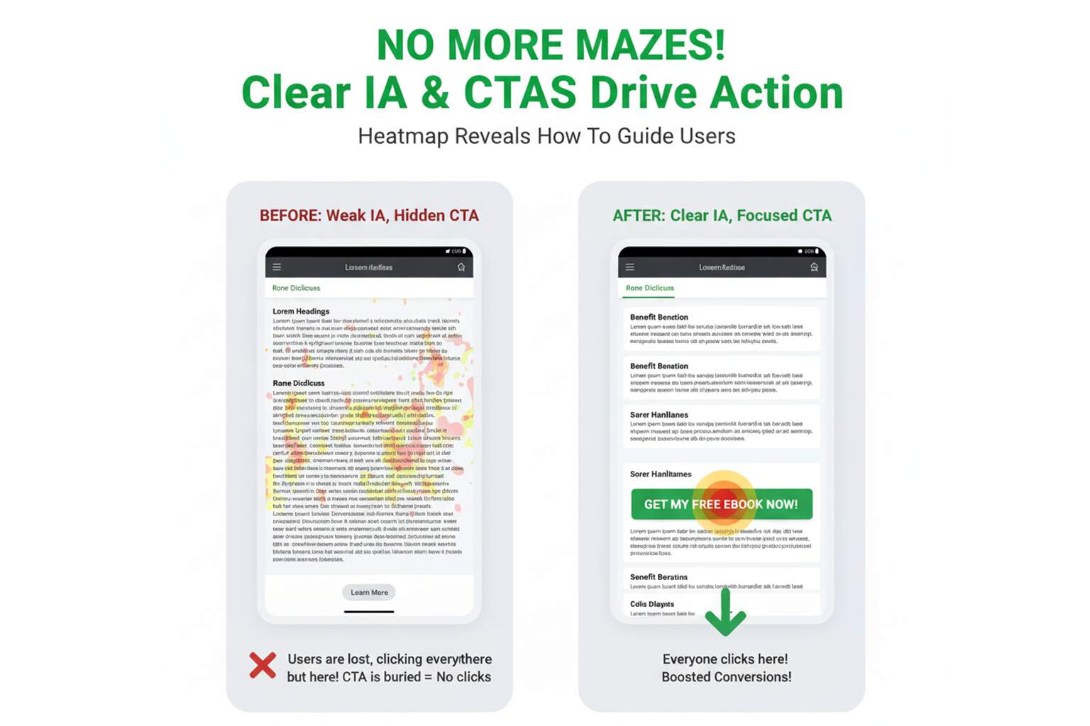
4. The “Where Do I Go Now?” Problem — Weak IA & Hidden CTAs
Visitors shouldn’t need a map to navigate your site. Yet many businesses bury their CTAs at the bottom of pages, surround them with clutter, or use vague copy that doesn’t inspire action. Poor information architecture (IA) forces users to hunt, which drains cognitive energy. The longer it takes to find the next step, the less likely they are to take it.
Strong IA builds momentum. That means one primary action per page, clear subheadings, and consistent CTA placement. If you’re asking people to download an ebook, don’t hide the button below 800 words of copy—put it in line with context. Use scannable section titles and benefit-driven bullets—classic UX best practices that reduce cognitive load. Use a technique called progressive disclosure—reveal the basics upfront, and allow users to expand for detail if they choose. This respects their time and decision-making process. This problem is both a usability flaw and a poor user interface issue. In website design & development, clarity and direction are as important as visuals.
What to do
- Limit each page to one main action; visually demote secondary ones.
- Label CTAs with outcomes, not just actions (“Get My Free Audit” > “Submit”).
- Add sticky navigation or jump links for long-form pages so users don’t lose their place.
Tools: Google Analytics 4’s funnel exploration and pathing reports to identify where users drop off. Pair that with micro-copy A/B tests using tools like VWO or Convert.
5. Leaky Checkouts and Form Fatigue
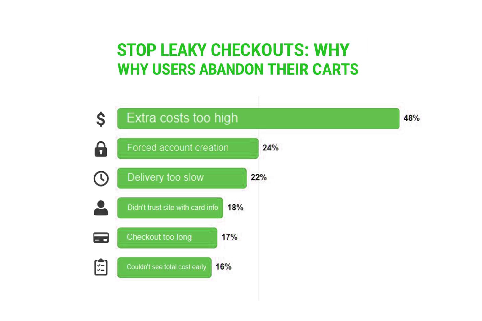
Cart abandonment averages nearly 70% across industries. Some shoppers will always bail, but many do so because of friction. Baymard Institute’s research reveals the top culprits: unexpected costs (48%), forced account creation (24%), and overly long or complex checkouts (17%). In fact, the typical checkout still asks for about 11 form fields—far too many for impatient mobile users.
If you’re hiding shipping costs until the last step, demanding accounts before checkout, or lacking popular payment options, you’re creating barriers. The solution is straightforward: enable guest checkout by default, reduce the number of form fields, and display total costs upfront. Offer wallets like PayPal, Apple Pay, or Google Pay—small checkout optimization wins that build trust. Every field you cut and every barrier you remove is a win for conversions. Checkout friction is one of the common website design mistakes across industries, and it is the clearest example of how a poor user interface directly impacts revenue. Addressing such common website design mistakes is key to ensuring smoother customer experiences and higher conversions. Simplifying the checkout experience isn’t just about convenience—it’s one of the most direct ways to boost Conversion rate optimization and customer satisfaction simultaneously.
What to do
- Allow customers to check out as guests, then invite them to create an account afterward.
- Use autofill, address autocomplete, and card scanning to speed data entry.
- Be transparent: display shipping and taxes upfront; never surprise customers at the final step.
- Provide multiple payment options; flexibility builds trust and confidence.
According to Baymard Institute, the top reasons for cart abandonment are:
- Extra costs too high (48%)
- Forced account creation (24%)
- Delivery too slow (22%)
- Didn’t trust the site with card info (18%)
- Checkout too long/complex (17%)
- Couldn’t see the total cost early (16%)
If your checkout has any of these issues, you’re creating barriers.
Micro-Playbooks You Can Run This Week
Fix speed where it counts
- Identify your top 10 landing pages and compress above-the-fold assets.
- Implement critical CSS and lazy-load elements below the fold.
- Check Search Console’s CWV report; aim for “Good” at the 75th percentile.
Make mobile the default design
- Increase tap targets to 44px or larger; keep buttons clear of sticky bars.
- Break forms into short steps with visible progress.
- Watch rage-click sessions weekly and address common frustrations.
Clarify the path
- Align CTA text with actual outcomes.
- Use subheadings and bullets to support skimming.
- Add trust signals, such as SSL badges, near payment fields.
Simplify checkout
- Enable guest checkout by default.
- Reduce checkout to ~7 essential fields.
- Show all costs before the final step.
Practical Tools to Fix a Poor User Interface
- PageSpeed Insights — Lab + field CWV (LCP/INP/CLS) and opportunities.
- Lighthouse (DevTools) — Audits for performance, accessibility, best practices.
- Search Console → Core Web Vitals — Real-user CWV trends at the 75th percentile.
- Hotjar / Microsoft Clarity — Heatmaps, scroll maps, session replays, rage-clicks.
- GA4 Funnel & Path Exploration — Drop-off analysis and pathing to weak CTAs.
- VWO / Optimizely / Convert — A/B tests for micro-copy, layouts, and CTAs.
- BrowserStack — Cross-device/mobile QA; verify thumb reach & tap targets.
- WebPageTest — Filmstrips, waterfall, and TTFB/origin hints for deeper perf work.
- Cloudflare (or Fastly) — CDN, image resizing (WebP/AVIF), and caching rules.
- Stripe / Apple Pay / Google Pay — Faster, trusted checkouts; cut form friction.
Final Note
Your website is more than a digital storefront—it’s the first impression, the decision-maker, and often the difference between gaining a customer or losing them to a competitor. Small flaws, such as slow load times, cluttered layouts, or confusing navigation, may seem minor, but they can quietly drain conversions and lower your site’s Conversion rate optimization potential over time. In today’s market, optimizing your website design & development is no longer a “nice to have”—it’s a direct growth driver.
At eSign Web Services, we’ve worked with startups, agencies, and small businesses to uncover these hidden leaks and transform websites into true growth engines. By focusing on practical fixes, such as enhancing Core Web Vitals, streamlining checkout processes, and delivering mobile-first experiences, we ensure that every visitor has a seamless journey from click to conversion.
Investing in design improvements isn’t just about aesthetics—it’s about turning your website into a 24/7 sales machine that builds trust, drives revenue, and scales with your business.
Ready to Boost Your Conversions?
Don’t let small design mistakes cost you big results. At eSign Web Services, we specialize in fixing the gaps that stop visitors from becoming customers. Whether it’s simplifying checkout flows, improving speed, or optimizing for mobile, we know what works.
Request your free website audit today and discover how the right design tweaks can turn traffic into revenue.
Frequently Asked Questions (FAQs)
How does accessibility impact conversions?
Accessible sites reduce friction for everyone. Meeting WCAG basics—keyboard navigation, sufficient contrast, descriptive alt text, labeled forms, and captions—improves clarity, trust, and task completion. Accessibility also lowers legal risk and often boosts SEO via better structure and semantics.
Do trust elements really influence buying decisions?
Yes. Prominent reviews, star ratings, media logos, security badges, guarantees, and clear return/shipping policies reduce uncertainty at decisive moments. Place them near CTAs and payment fields. Pair with plain-language microcopy explaining data usage to strengthen credibility and decrease abandonment.
What content fixes improve conversions quickly?
Tighten headlines to promise outcomes, front-load value in the first paragraph, and convert feature lists into benefit bullets. Use scannable subheads, short sentences, and visual cues. Add concise FAQs near CTAs to preempt objections without forcing users to leave the page.
How long should I run an A/B test?
Run until you reach statistical confidence and practical significance—usually at least one full business cycle. Avoid stopping early on volatility. Predefine primary metrics, minimize concurrent tests on the same audience, and ensure enough traffic for meaningful sample sizes.
Does site search matter for conversions?
Absolutely. High-intent visitors use search when navigation fails. Improve with typo tolerance, synonyms, autocomplete, merchandising rules, and zero-result fallbacks. Analyze queries to expose content gaps and create quick links to top tasks like pricing, shipping info, returns, or bookings.
What about privacy banners and consent prompts?
Intrusive banners can hurt conversions. Use compact, clearly worded consent with obvious choices, defer non-essential scripts until accepted, and provide a persistent manage-preferences link. Explain benefits (“analytics helps us improve your experience”) to maintain transparency without derailing the user journey.
Author Details

Ashwani Kumar Sharma
Ashwani has been actively involved in SEO services since 2005. His expertise and distinctive work approaches have made him one of the most experienced and trusted SEO experts in the industry. He is a certified SEO and Google Ads professional. He also has strong business development skills in advanced SEO, PPC, and digital marketing strategies.