



Why a Beautiful Website Can Still Deliver a Poor User Experience

Key Takeaways
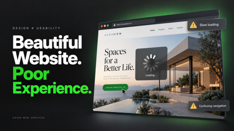
- A beautiful website can create confidence initially, while frustrating visitors once they try to complete tasks.
- Good user experience depends on whether the website supports the visitor’s purpose with reasonable effort.
- Clear content and navigation matter because visitors need to understand both their options and next steps.
- Minimalist design can become confusing when useful labels, instructions, and signs of progress disappear.
- Forms and interactive features need predictable behaviour, helpful feedback, and clear ways to correct mistakes.
- Mobile usability, accessibility, and performance determine whether the experience works beyond a desktop preview.
- Task-based testing reveals problems that compliments about a website’s appearance can easily conceal.
- Businesses should fix obstacles in important visitor journeys, then test whether those changes helped.
Imagine landing on a website with striking photography, elegant typography, and a polished layout. It looks like a business you could trust. Yet you cannot tell whether it offers the service you need. The menu labels reveal little, important details are missing, and the enquiry form rejects your submission without explaining why. You leave with your question unanswered, despite liking what you saw.
Today, we explain why an attractive website can still deliver a poor website user experience. Appearance can encourage confidence, but visitors also need to understand information, compare options, and complete tasks without unnecessary effort. We will follow that journey, examine how design and content create hidden barriers, and explain what changes on mobile devices or when accessibility needs are overlooked. You will also learn how to observe real visitors, interpret performance data, and prioritise improvements that make your website easier to use and more useful.
What Makes Visual Appeal Different From User Experience?
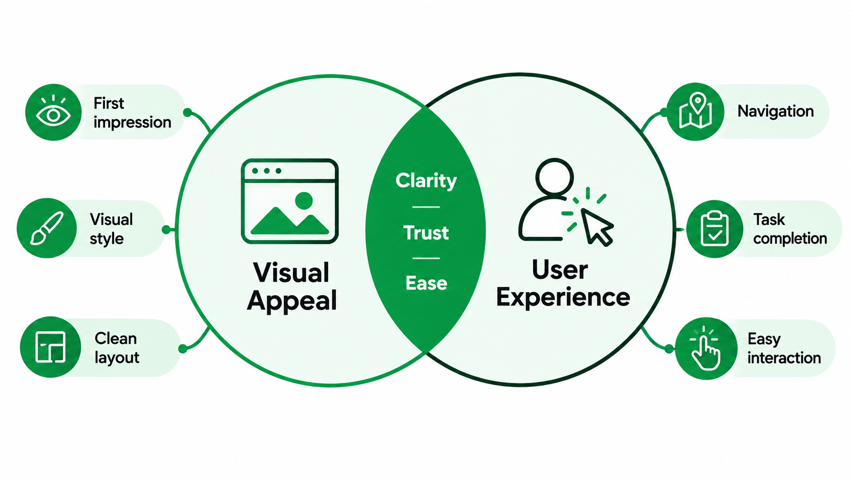
Visual appeal concerns how a website looks and the impression it creates. User experience includes how someone understands, uses, and feels about the website throughout a visit. The two work together, but a polished appearance cannot show whether visitors can accomplish what they came to do. Understanding the difference between UX and UI helps explain why a polished interface can still leave visitors struggling to complete a task.
Usability Becomes Clear When Someone Tries to Do Something
A homepage screenshot cannot reveal whether someone can find delivery information, compare service packages, or request an appointment. Those tasks expose the relationship between page structure, content, and functionality. A website may look organised while sending visitors through several pages for one straightforward answer.
Good website usability becomes visible when people can recognise their options, make informed choices, and act with reasonable effort. For example, a pricing page should help visitors understand what each package includes, rather than simply display attractive cards. Effective web design UX connects the visual presentation to the practical work a visitor needs to complete.
Why a Beautiful Site Can Seem Easier Than It Is
Aesthetic-usability effect – the tendency to perceive more attractive interfaces as easier to use. People might ignore small problems because they like the style. The Nielsen Norman Group says this response can also hide problems during usability testing, especially when positive comments about appearance drown out the struggles they see.
Imagine a visitor complimenting a website’s photography after stumbling through its menu a few times. That compliment is useful feedback about looks but doesn’t mean the navigation worked well. When a form cannot be submitted or an essential answer remains hidden, the practical problem still needs fixing. Evaluate website user experience through observed behaviour as well as opinions.
What Does a Good Website Experience Help Visitors Accomplish?
A useful website supports the visitor’s purpose in the circumstances of that visit. Before judging a layout or feature, identify what the person needs to understand or do. Otherwise, a business may improve the appearance of a page without improving its usefulness.
Visitors Arrive With Different Questions and Intentions
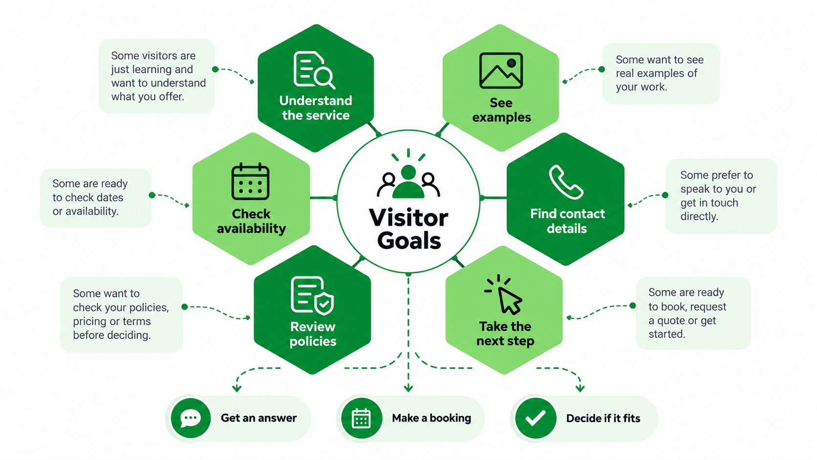
A first time visitor to a service might need a simple explanation, examples, and reassurance about the process. A visitor returning to your site may just be looking for availability or a phone number. The person ready to enquire wants a clear way to reach out to the business.
The different user goals should inform the information and options available on a page. A service page can describe the offering, communicate important information and provide a visible contact option without forcing every visitor down the same path. It’s about getting people to move forward from where they are, not assuming they all come in ready to buy.
Success Is Broader Than Filling Out a Form
A successful visit can end with a booking or purchase, but it can also end with an answer. Someone might find opening hours, check whether a service covers their area, understand a cancellation policy, or realise that a product does not meet their needs.
For example, a customer checking whether a replacement part fits their equipment benefits from a clear compatibility list. If it is unsuitable, leaving without buying can still represent successful task completion. A business should measure enquiries and sales while also asking whether visitors obtained accurate information. Useful websites help people make sound decisions, including decisions that do not produce an immediate conversion.
Where Can the Visitor Journey Break Down?
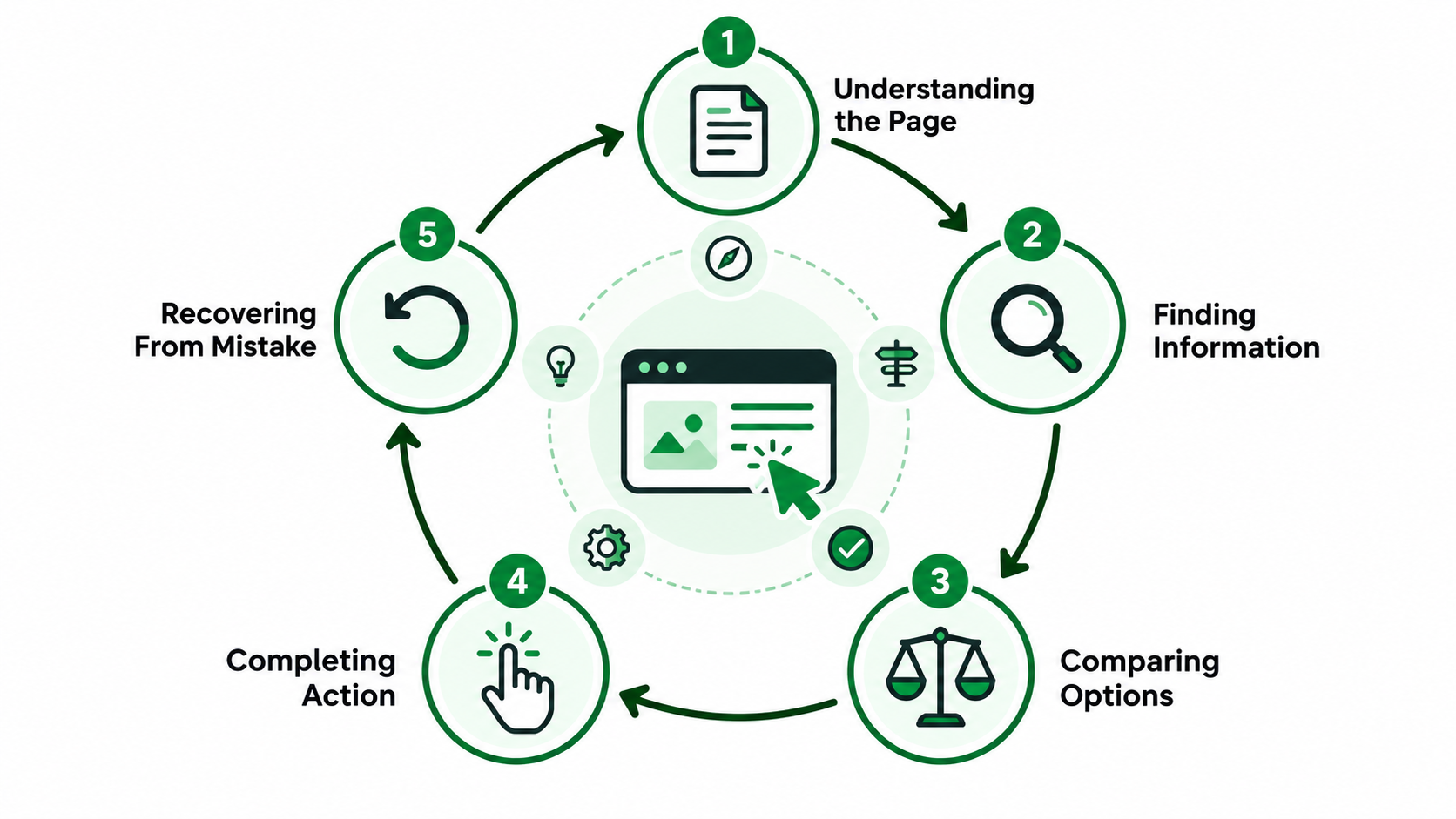
A visit involves several connected stages: understanding the page, finding details, weighing options, and taking action. Problems at one stage can affect everything that follows. Examining these stages separately helps a business locate the actual difficulty instead of labelling the entire website confusing.
Understanding the Page
The first question is often simple: “Am I in the right place?” A headline such as “Unlocking Tomorrow’s Possibilities” may communicate ambition, but it does little to explain the service. An unfamiliar visitor still needs to know what the business offers and whether it is relevant.
A clear headline and supporting introduction should establish the page’s purpose. A commercial cleaning page, for instance, could identify the types of premises served and the area covered before presenting a large brand story. Images can reinforce that explanation, but visitors should not have to interpret a photograph to work out what the business does.
Finding the Right Information
Visitors need both a route to the correct page and a way to find details within it. Menu labels, page groupings, and internal links guide the first part. Descriptive headings, well-placed summaries, and useful page sections guide the second.
Information architecture is the organisation of that content. If repair services sit under “Our World,” visitors may struggle to predict where to look. Even after reaching the repair page, they may miss coverage details hidden inside a long paragraph. Group information according to recognisable customer needs, then give important details headings that describe them clearly.
Comparing Options or Making a Decision
A website can be easy to navigate while still making difficult decisions. Visitors can see all the package pages but they don’t know which one has installation, how the support differs or whether there are extra fees. What is missing is information that allows for comparison.
Use consistent criteria to present the options. If one package explains pricing and the other explains only benefits, visitors cannot compare them with confidence. For a service business, useful criteria might be scope, eligibility, timescale, exclusions and ongoing support. Describe relevant differences near the options themselves, so readers don’t have to remember details spread across several pages.
Completing an Action
Once visitors decide to proceed, controls should make the next step understandable. A button labelled “Continue” can be uncertain if it is unclear whether it opens a form, confirms a booking, or starts a payment. The wording should reflect what happens next.
Forms should ask for information necessary to the task and explain unfamiliar requirements . A full address might be asking a little too much before someone can even ask a general inquiry. These small obstacles can contribute to lost leads through poor UX, especially when someone is ready to enquire. Clear interaction feedback, like a visible processing state once submitted, so that people know their action was received. Without it, they may click repeatedly or assume the website has failed.
Recovering From a Mistake
Errors become more frustrating when the website gives no useful way forward. “Invalid input” tells someone that something went wrong, but it does not identify the field or explain the required correction. Clearing every form entry makes the problem worse.
A helpful message should name the issue and describe how to fix it. For example, “Enter your email address in the format name@example.com” gives a clear next step. Retain valid entries, bring attention to the affected field, and confirm successful submission. W3C’s form guidance recommends clear notifications for errors and completed actions so users can understand what happened.
How Can Visual Design Make Tasks Harder?
Design decisions turn into barriers when they obfuscate meaning, break attention, or make controls hard to anticipate. Some common UX mistakes are often features that are great on a slide deck but have not been validated against a real visitor task.
Minimalism Can Remove Useful Guidance
Minimalism can declutter and highlight essential information. The trouble comes when the design gets rid of the guidance visitors need. Guesswork can arise from an icon without a label, a menu behind an unfamiliar symbol, or a form field identified only by disappearing placeholder text.
A clean layout can still include clear labels and short explanations. For example, a delivery calculator might ask for a sentence about what postcode to enter and what the estimate includes. Removing that sentence saves space but may make the reader more uncertain. Choose one of the following: 1. Click the checkbox to enable the option. 2. Select an option from the list. 3. Click the button to perform an action.
Visual Hierarchy Can Direct Attention to the Wrong Place
Visual hierarchy describes how size, contrast, spacing, and placement influence what people notice first and how design shapes their decisions. When a page points to sensible information in a sensible order, it supports a task. It puts friction when decoration is on top of important details.
A big animated banner could draw attention away from the availability of services, and the subtle booking button fades into the background. The visitor gets the promotional feature but misses out on the practical next step. Test the page against its purpose: The headline needs to create relevance, the supporting content needs to answer important questions, and the action needs to be visible when someone is ready to take it.
Motion Can Interrupt Reading and Control
Motion can demonstrate a process or communicate a change, but it can also interrupt concentration. An automatically rotating carousel may replace information before someone finishes reading it. A pop-up can cover a form, while an unexpected transition can make the page feel unpredictable.
Ask what each moving feature helps the visitor accomplish. Give people control where movement continues, and make interruptions easy to dismiss. Consider visitors who are sensitive to motion or who need more time to read. W3C’s accessibility principles address the ability to pause moving content and avoid interactions that make a website difficult to operate.
Inconsistent Patterns Make the Site Harder to Learn
Visitors build expectations as they use a website. If a colored button opens a form on one page, a similar button elsewhere should behave predictably. If the menu changes position or familiar controls suddenly perform different actions, people must stop and relearn the interface.
Consistency should cover behaviour as well as appearance. Use consistent labels, navigation patterns, and form conventions across the site. A service page and a product page can have different content but have familiar controls. Those differences are still unique branding but add unnecessary variation to everyday interactions, and add to the effort required to confidently cross between pages.
Why Might the Experience Fail Beyond a Desktop Preview?
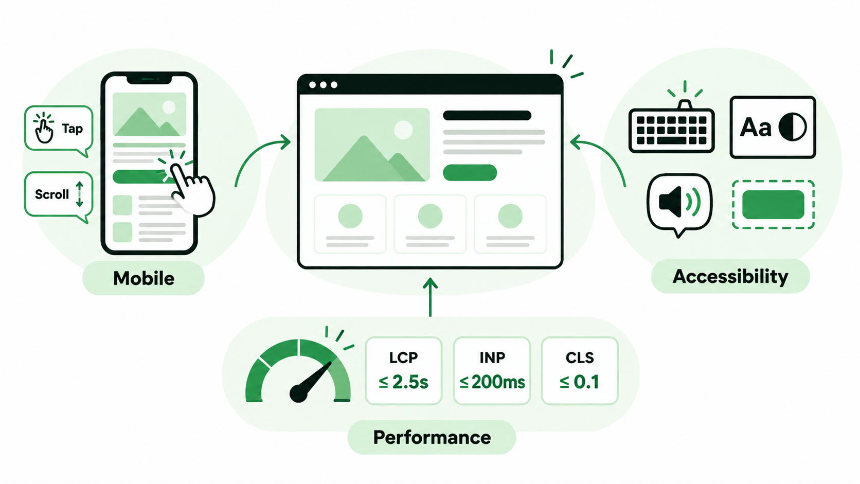
A design preview represents one screen size and a limited set of conditions. Real visitors use different devices, connection speeds, input methods, and accessibility settings. The experience needs to remain understandable and workable across those circumstances.
Mobile Visitors Face Different Constraints
Mobile usability involves more than fitting a desktop layout onto a smaller screen. People navigate by touch, have less space to compare details, and may need to type while switching between the page and an on-screen keyboard. Small controls, deep menu layers, and fixed banners can make ordinary tasks awkward.
Consider two service packages displayed side by side on the desktop. If mobile visitors must scroll far between them, comparing inclusions becomes harder. A compact comparison or clearly repeated criteria may help. Test the complete task on a phone, including opening menus, reading details, correcting form errors, and reaching the confirmation message.
Accessibility Barriers Prevent Some Visitors From Using the Site
Accessibility determines whether people with different abilities can perceive information and operate the website. Low-contrast text can be difficult to read. A menu that requires a mouse can block keyboard users. An unlabeled form field may leave a screen reader user unsure what to enter.
Practical checks include keyboard operation, visible focus indicators, meaningful control labels, readable text, and appropriate alternatives for essential images. W3C explains these requirements through principles covering perceivable information, operable interfaces, understandable content, and compatibility with assistive technologies.
These needs should influence content and interactions from the beginning. A visually polished page still fails its purpose if some visitors cannot reach its information or complete its actions.
Performance Problems Continue After the Page Loads
A page can appear loaded while remaining frustrating to use. Taps may respond slowly, banners may push content down unexpectedly, or heavy visual effects may interfere with scrolling. Someone trying to select a button can activate the wrong control if the layout shifts beneath their finger.
Core Web Vitals help investigate three aspects of performance: loading, responsiveness, and visual stability.
| Metric | What It Measures | Recommended Good Threshold |
| Largest Contentful Paint, or LCP | How quickly the largest visible content element appears | 2.5 seconds or less |
| Interaction to Next Paint, or INP | How quickly the page visually responds to interactions | 200 milliseconds or less |
| Cumulative Layout Shift, or CLS | Unexpected movement of visible elements | 0.1 or less |
Google recommends assessing these thresholds at the 75th percentile of visits, with mobile and desktop considered separately. Good scores do not establish that a menu makes sense or that a form asks appropriate questions. Combine performance reports with task observation to understand the broader experience.
How Can a Business Identify Poor UX?
Investigating website user experience means connecting observed difficulties with evidence about where and how they occur. Visitor testing, analytics, and technical checks each reveal different aspects of the problem. No single report provides a complete diagnosis.
Ask Representative Visitors to Complete Real Tasks
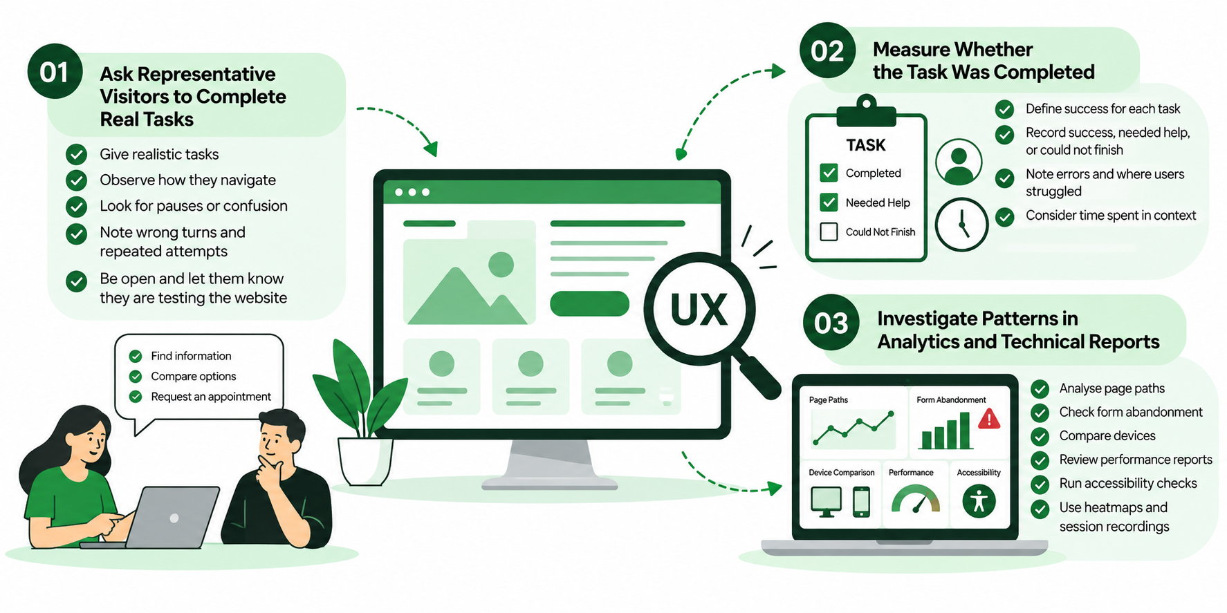
Recruit people who resemble the website’s intended audience in their needs and familiarity with the subject. Ask them to do something realistic, such as check whether a service covers their location, compare two options, or request an appointment.
Frame the task around their goal without revealing the route. “Find out whether installation is included” is more revealing than “Open the Packages menu and read the second card.” During user testing, observe pauses, wrong turns, repeated attempts, and requests for help. Nielsen Norman Group recommends realistic tasks and relevant participants, with care taken to avoid influencing their behaviour. Explain that the website is being tested so participants feel comfortable showing difficulties.
Measure Whether the Task Was Completed
Define success before the session begins. If the task is checking whether installation is included, success means finding and correctly understanding that information. Reaching the package page alone does not establish completion.
Record whether the participant succeeded independently, needed help, or could not finish. Note errors and the steps that created difficulty. For example, if several people reach the correct page but misunderstand an exclusion, the problem may lie in wording or placement rather than navigation. Time spent needs context: a longer visit can indicate careful comparison, confusion, or both. Interpret it alongside what happened during the task.
Investigate Patterns in Analytics and Technical Reports
Reports can help identify where to investigate, especially when they are connected to a particular task. Start with a question, such as why mobile visitors begin an inquiry but rarely finish it, then examine the evidence that could explain the gap.
- Page paths: Repeated movement between the same pages may suggest difficulty finding information, though it can also reflect deliberate comparison.
- Form abandonment: A concentration of exits at one step can point to unclear requirements, excessive effort, or a technical issue.
- Device comparisons: Differences between mobile and desktop can indicate interaction problems, but the audiences and their intentions may also differ.
- Performance reports: Slow loading or delayed interactions can explain some difficulties, particularly when they coincide with observed problems.
- Accessibility checks: Automated tools can identify certain barriers, while keyboard checks and testing with relevant users reveal issues that automation may miss.
Heatmaps and session recordings can add context by showing where visitors click, how far they scroll, and where they repeatedly attempt an action. Use these patterns to select journeys for closer review. A bounce rate or exit rate alone cannot establish why someone left or whether they accomplished their goal.
Testing reminder: Record the task, the point of difficulty, and what the visitor did next. “Could not understand whether delivery was included” is more actionable than “The page needs better UX.”
What Should You Improve First?
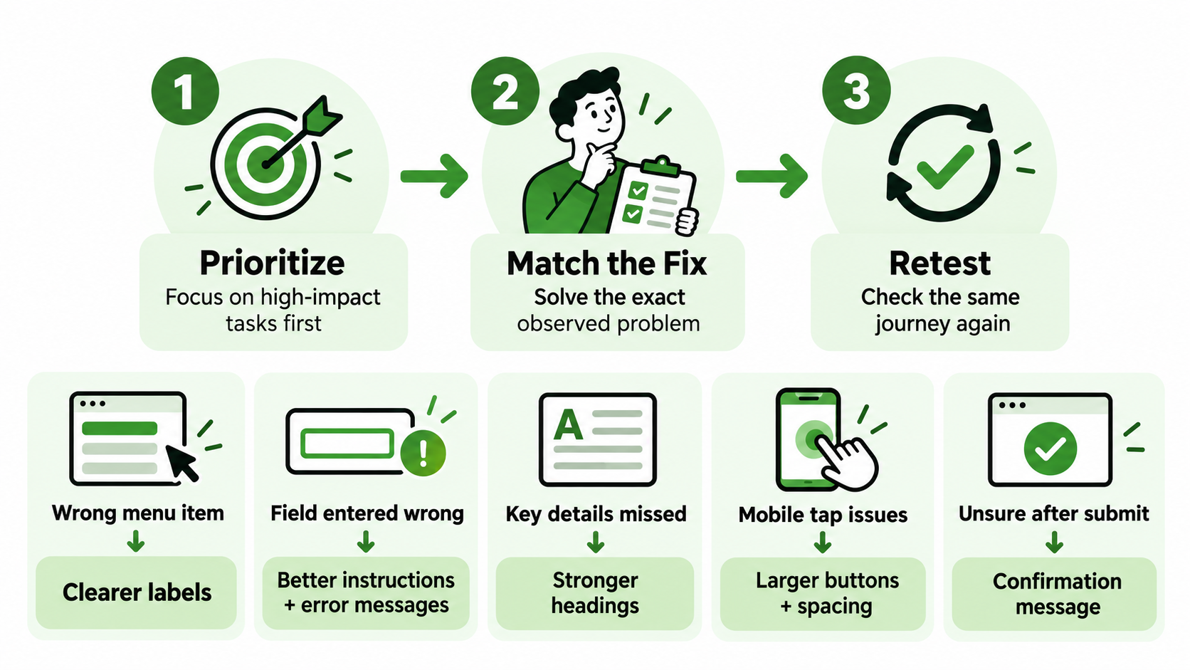
A review may uncover several problems, but they do not all deserve equal attention. Begin with barriers that prevent important tasks or create serious uncertainty. Then connect each change to evidence and check whether it improves the original journey.
Prioritise Important Tasks and Serious Barriers
Consider how often a task occurs, how severely the problem blocks it, and which visitors are affected. A broken appointment form usually needs attention before a decorative inconsistency. A keyboard barrier can be urgent even if it affects a smaller share of visitors, because it may prevent them from using an essential function.
Frequency helps determine reach, but severity matters too. For example, an unclear price label might cause widespread hesitation, while an inaccessible submit button completely blocks a particular group. Prioritise using the consequences for visitors as well as the business value of the task.
Match Each Change to an Observed Problem
Choose improvements that address the actual difficulty. If visitors understand a service but cannot find its price, rewriting the entire page may leave the problem unresolved. Moving or clarifying the price information is a more direct response.
| Observed Problem | Improvement to Test |
| Visitors choose the wrong menu item | Replace ambiguous labels and review page grouping |
| People repeatedly enter a field incorrectly | Add specific instructions and useful error messages |
| Essential service details are overlooked | Improve their heading, placement, and prominence |
| Mobile users struggle to select controls | Adjust control size, spacing, and surrounding elements |
| Visitors cannot tell whether submission worked | Provide a clear processing state and confirmation |
Conversion focused web design should make a useful next step easier while preserving the information visitors need to decide. Some problems require structural work, but many can be addressed through focused changes before committing to a complete redesign.
Retest the Same Journey After Making Changes
Repeat the original task after the change. Keep the success criteria and testing conditions comparable so you can assess whether the specific barrier has improved. Where possible, include fresh participants who have not already learned the old route.
Compare independent completion, mistakes, requests for help, and remaining confusion. Check related journeys too: simplifying one menu label could make a different destination harder to identify. Analytics can provide longer-term context, but small tests should be interpreted as evidence about observed problems rather than precise population estimates. Continue refining where difficulties remain, and keep checking important journeys as content and features change.
Conclusion
A beautiful website can make a first impression, but visitors judge its usefulness as they try to accomplish something. They need to recognise the right page, find relevant details, compare choices, and complete an action with confidence. Unclear labels, missing information, difficult forms, distracting motion, and inaccessible controls can interrupt that journey even when the design looks polished. Appearance contributes to website user experience, but it cannot demonstrate that the experience works. A better experience may produce more enquiries, but it can also help someone find an answer or make an informed decision. The strongest design makes those useful outcomes easier for the people you serve.
Want to understand where visitors struggle on your website?
A focused review with eSign Web Services can examine an important visitor journey, identify usability barriers, and recommend practical improvements to content, navigation, forms, and mobile interactions. Start with the task that matters most to your customers and your business today.
Frequently Asked Questions
Question: Can a website look professional but have bad UX?
Answer: Yes. Professional imagery and branding are good for first impressions, but navigation, content or forms can still be an issue. Judge the experience by what the visitor can do. Get someone to look up a service detail or submit an inquiry and see where they baulk, make mistakes or need help to proceed.
Question: What’s the difference between website design and user experience?
Answer: Website design is the visual presentation and the interface structure. User experience is how people understand and use the website to get what they want. Design affects experience as well as content, functionality, accessibility and performance. A well designed page should therefore communicate the brand and support useful actions.
Question: What is the aesthetic usability effect?
Answer: The aesthetic-usability effect states that an attractive interface appears easier to use than it really is. Visitors like the way it looks, and may not notice minor problems. But looks do not clear a task. Design feedback should be compared with real world behaviour to uncover problems that may be masked by good first impressions.
Question: What are the most common signs that visitors find a website hard to use?
Answer: Look for mistakes that are repeated, trouble finding basic information, abandoned forms, unexplained errors, and controls that behave unexpectedly. Device-specific problems may reveal additional barriers. Observation explains the problem, but analytics may help to find a pattern. A single bounce rate or a long visit does not mean that the website is confusing users.
Question: How can I test the usability of my website without a big research budget?
Answer: Choose a key task and recruit a small group that resembles your target visitors. Tell them to try it on their normal devices unaided. Write down completion, mistakes, requests for help, ask what feels unclear, resolve the recurring issues and test again. The small studies show problems, not population-wide statistics.
Author Details

Ashwani Kumar Sharma
Ashwani has been actively involved in SEO services since 2005. His expertise and distinctive work approaches have made him one of the most experienced and trusted SEO experts in the industry. He is a certified SEO and Google Ads professional. He also has strong business development skills in advanced SEO, PPC, and digital marketing strategies.


