



The Psychology Of Website Conversions: How Design Influences Decisions

Key Takeaways
- First impressions are built through feeling, earning trust before people begin reading your copy.
- Strong hierarchy guides users naturally toward action without making the experience feel forced.
- Proof works best beside hesitation; place it exactly where doubts usually surface.
- People experience a page emotionally before they read it, making thoughtful structure essential.
- Simplicity removes the friction that makes confident decisions harder to reach.
- When a page earns trust fully, the CTA feels like a natural next step, not a demand.
Think about the last time you landed on a website and just knew, within a few seconds, that it was not for you. You did not read the whole page. You did not give it a fair chance. You simply felt it and left.
That gut feeling is not random. It is the result of hundreds of small structural choices working together, or against each other. Every spacing decision, every headline, every button label is quietly telling people whether to stay or go. Layout is not decoration; it is behavioral architecture. A beautiful site that leaves people confused is still a site that does not get results.
The good news is that this is completely fixable. Once you understand how people actually experience a page, emotionally first, logically second, you can build around that reality instead of fighting it. That is exactly what a conversion psychology website strategy is built on: not pressure tactics, but a genuine understanding of how people make decisions online and what helps them feel confident enough to act.
The sections ahead break that understanding down, one principle at a time, with examples you can apply straight away.
Why design kills trust in milliseconds
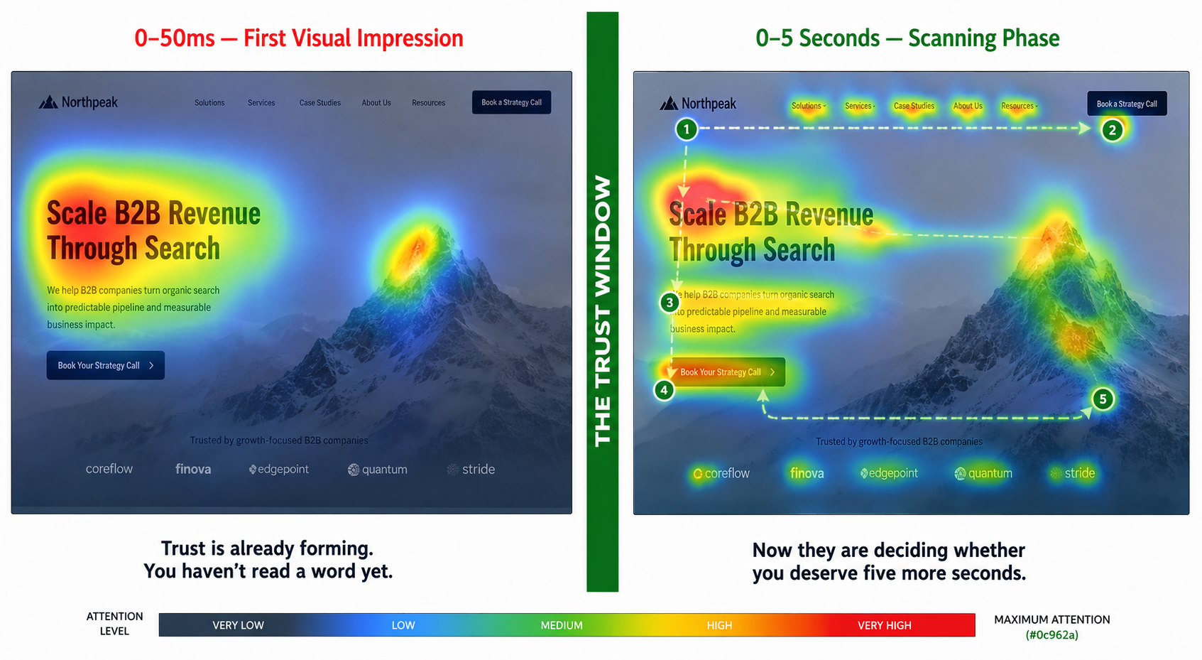
Nobody reads a website before judging it. Research confirms people form a visual opinion in just 50 milliseconds, faster than a blink. A well-built conversion psychology website leads with clean spacing, a clear value proposition, and a deliberate look. When a page looks polished, people assume the business behind it is competent and trustworthy too, often before reading a single word. That is UX psychology doing its quietest, most powerful work, earning the right to be read.
What the brain picks up before the eyes have finished scanning:
- The opening screen must show value and the next step at a glance, shaping decision-making online before a word is read
- Careless spacing makes even a strong offer look like it was thrown together in an afternoon
- A specific headline signals that this page was built for someone exactly like them
- Strong imagery builds quiet confidence before users ever reach the service details
- A cluttered above-the-fold section forces people to work out what you do before they can decide if they care
Nail the first impression, and people permit you to keep talking. Miss it, and no amount of clever copy further down the page will ever earn that chance back. The page has already lost them.
🧩Did You Know? The average user spends only 5.59 seconds reading a website’s written content before deciding to stay or leave. Layout communicates far more than copy in those first critical moments.
How to guide visitors toward action
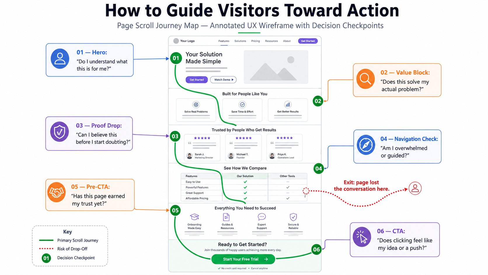
People do not read websites like books. They scan, skip, and the moment the path forward is unclear, they leave. When user behavior design gets hierarchy right, moving through a page feels almost effortless; even for complex offers. Size, contrast, and placement each quietly signal what matters most. Users should never have to stop and work out where to look next.
Where hierarchy tends to make the biggest difference:
- A headline stating a real outcome beats a clever tagline that makes someone think twice
- Dropping proof before people start questioning a claim keeps user experience optimization working at every scroll
- Navigation with too many options creates indecision, not exploration
- Placing a CTA before the page has earned it is like asking for commitment on a first date
- The right sequence: problem, value, proof, action, is what actually shows up in the numbers
- White space is not wasted space; it gives the eye somewhere to rest and the brain room to process
Good hierarchy is a conversation, not a layout decision. When a page speaks in the right order, people stop wondering what to do next and simply do it. That ease is what converts.
A well-structured conversion psychology website applies this to every scroll; showing each user exactly what they need, when they need it, and guiding them forward without a single push.
Where to place trust signals on a page
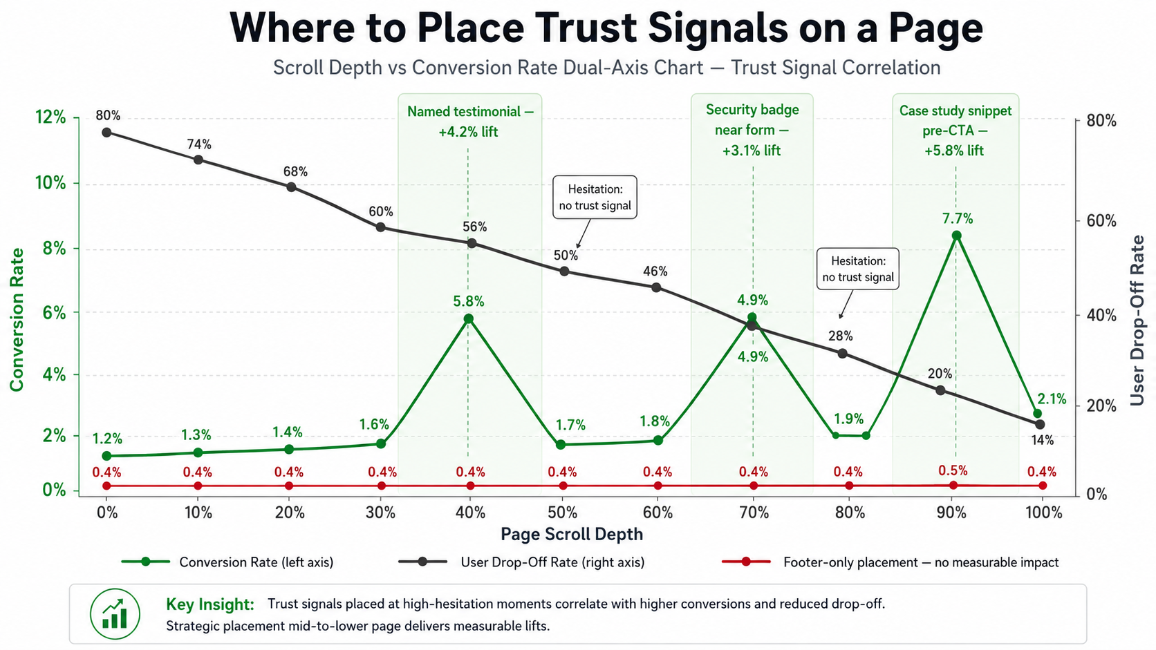
A logo wall in the footer does nothing for someone hesitating three scrolls above it. Getting trust signals UX right means placing proof where doubt actually lives: beside claims, next to forms, and near the CTA. The Baymard Institute reports an average cart abandonment rate of 70.19%, a reminder that even high-intent journeys can collapse when friction or uncertainty appears.
Signals that build credibility without people consciously noticing:
- Named testimonials with specific results feel real in a way that generic praise never does
- A security note near a form does more for completion rates than most copy rewrites
- Sharing expertise through useful content earns trust long before any direct pitch
- The best CRO strategies make the next step feel safe; they never manufacture urgency to force a hand
Credibility is not something you claim on an About page. It is earned scroll by scroll, placed in exactly the moments where people are quietly deciding whether to keep going or walk away.
Trust Signal Placement Guide
| Page Section | Trust Signal to Place Here | Why It Works |
|---|---|---|
| Hero / Above the Fold | Client logos, social proof count | Establishes credibility before users scroll |
| Service Description | Specific named testimonials | Validates the exact claim being made |
| Near the CTA | Star ratings, case study snippets | Removes last-second hesitation |
| Forms and Checkout | Security badge, privacy assurance | Calms anxiety at the most sensitive step |
| Footer | Certifications, awards, affiliations | Reinforces authority across the whole site |
When a website design conversion strategy puts proof at every point of doubt, rather than on a dedicated testimonials page; a conversion psychology website starts to feel trustworthy from the first scroll to the final click.
How emotion shapes buying decisions
People do not put their feelings on hold while evaluating an offer. A page feels rushed or calm, cheap or considered, within seconds; usually before anyone can explain why. Applying color psychology marketing with intention means using softer tones where focus matters, strong contrast where action is the goal, is a persuasive design principle working at its most practical. The aim is never pressure. It is removing the friction between someone and a decision they were already leaning toward.
Emotional cues that shape behavior before logic gets a vote:
- Colors matched to the emotional context of an offer land differently than colors picked for the brand
- Scarcity messaging that feels forced pushes people away faster than no scarcity at all
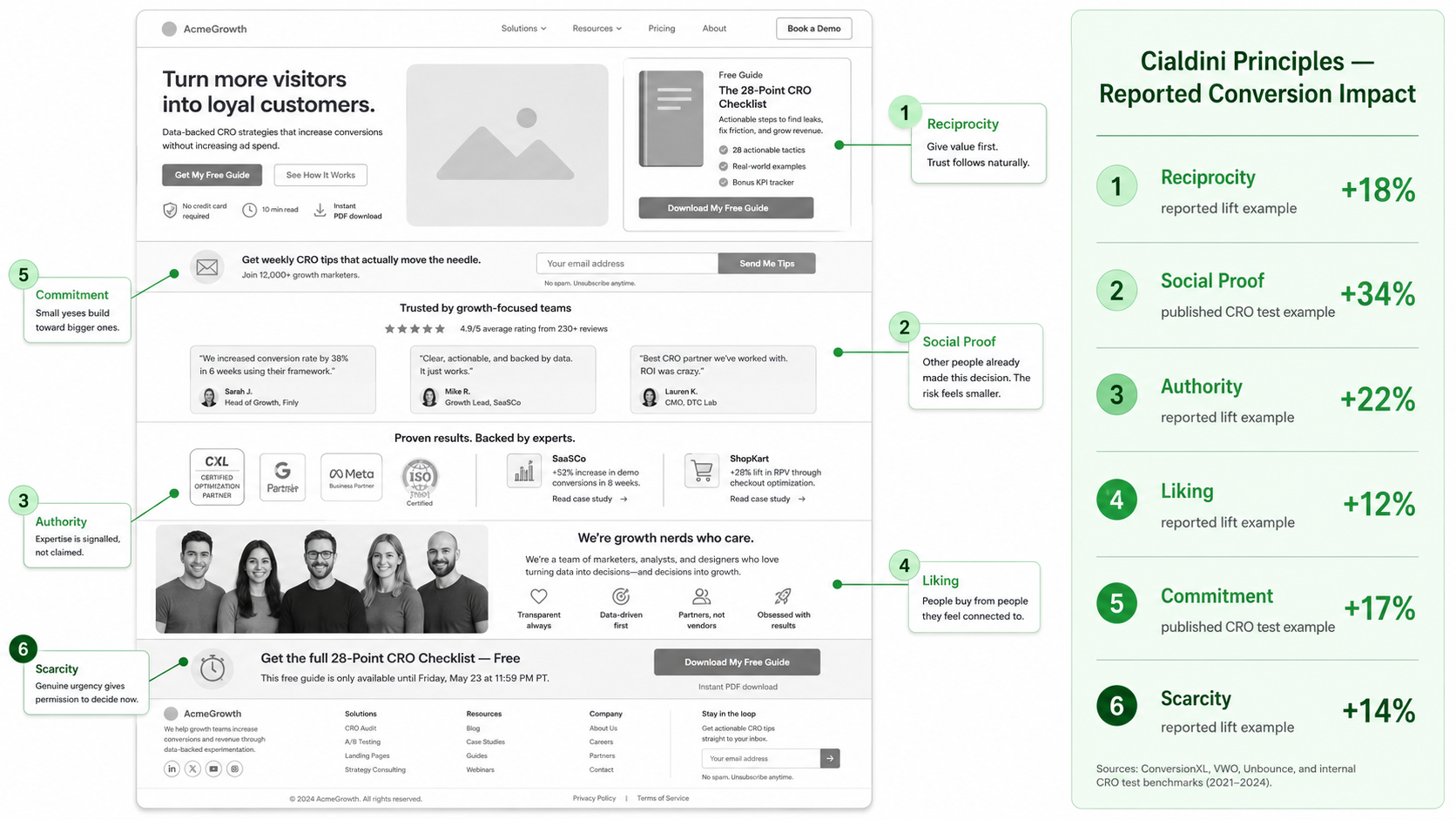
- The most effective conversion triggers feel like a natural conclusion, not a closing tactic
- Copy written for one specific type of person outperforms copy trying to speak to everyone
- Urgency that feels honest gives people a reason to decide now without feeling cornered
Emotion is not the opposite of logic in a buying decision; it always comes first. Get the feeling right, and the reasoning follows naturally, often without the person even realizing it happened.
To sustainably improve conversion rates, the emotional layer needs to feel relevant, not theatrical. A page that makes someone feel genuinely seen has already done most of the work before the CTA even appears.
Clarity, Simplicity, and Decision-Making
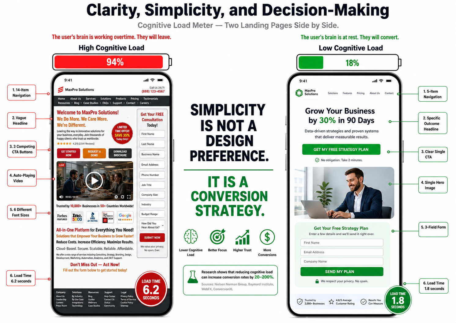
Confusion does not announce itself. It just quietly ends the visit. A strong conversion psychology website removes it before it forms, being precise about who the page is for and what to do next. Website usability factors like slow load times and long forms degrade performance across every device, often without anyone noticing why.
Where simplicity shows up in results:
- A headline answering the visitor’s most pressing question keeps them reading
- Shorter forms feel less like a commitment and get completed far more often
- Speed holds attention before anything else; this is where efforts to improve conversion rates truly begin
- Cleaner layouts make decisions feel manageable, not overwhelming
The best-converting pages are rarely the ones with the most to say. Clarity is what earns the click; every unnecessary element removed is one less reason for someone to hesitate.
Simplicity Checklist: Conversion-Friendly vs. Conversion Killer
| Page Element | Conversion-Friendly | Conversion Killer |
|---|---|---|
| Headline | Specific and outcome-focused | Vague taglines or brand slogans |
| Form Fields | 3 to 5 max fields | 10 or more fields upfront |
| Navigation | 5 to 6 clear, labelled links | 12 options with nested dropdowns |
| Page Speed | Under 3 seconds | 5 or more seconds to load |
| CTA | One clear primary action | Three competing buttons on one screen |
Call-to-Action Psychology
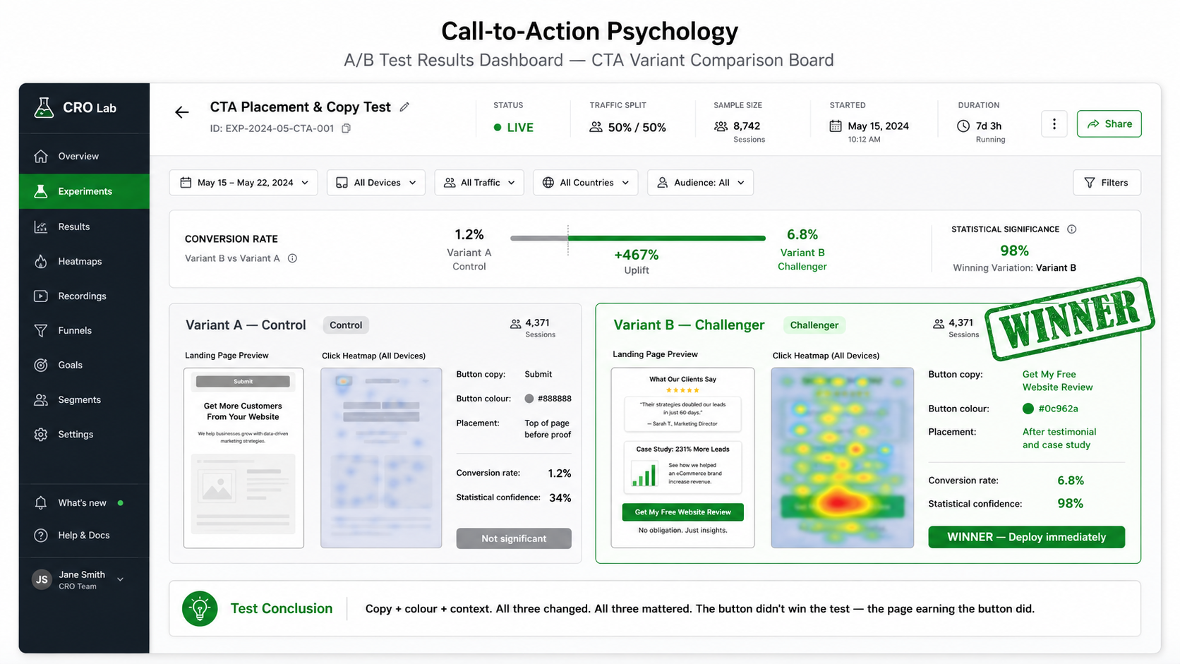
A CTA button is small on screen but enormous in the journey. Baymard found e-commerce sites could improve conversion rates by 35% through better checkout UX. Getting it right is entirely about whether the page has earned the click. The CTA collects everything that landing page psychology has been quietly building.
What separates CTAs that get clicked from ones that get ignored:
- A copy describing an outcome feels far safer than a generic instruction to act
- Placing a CTA next to relevant proof means doubt and reassurance share the same view
- UI design impact is highest when contrast, copy, and context all pull in the same direction
- A CTA before the page has built its case will rarely get clicked
“Submit” sounds like paperwork. “Get My Free Website Review” sounds like something genuinely worth doing. The words on a button carry more weight than most people expect, and testing them costs almost nothing.
When a conversion psychology website applies this to every CTA, outcome-focused copy, proof nearby, and right timing, clicking stops feeling like a request and starts feeling like the user’s own idea.
🧱Did You Know? CTAs in first-person phrasing, such as “Get My Free Guide” outperform “Get Your Free Guide,” by up to 90% in A/B tests. The word “My” creates a sense of ownership before the click even happens.
Before vs. After: Design Decision Comparison
Most problems with results come back to a short list of structural decisions that seem harmless until the data says otherwise. A vague headline, a CTA placed too early, a form with ten fields when three would do; none of these feel like deal-breakers in isolation, but together they quietly drain a page of its ability to convert. None of the changes below requires a full rebuild. Most can be tested and measured within a single week, making them some of the highest-return moves in any website design conversion effort.
| Design Element | Before (Weak) | After (Strong) |
|---|---|---|
| Headline | “Welcome to Our Website” | “Get More Leads Without Spending More on Ads” |
| CTA Copy | “Submit” / “Click Here” | “Get My Free Website Review” |
| Testimonial Placement | Buried in footer, away from context | Placed beside the specific claim it validates |
| Form Length | 12 fields requested at first touch | 3 focused fields, more gathered later |
| Page Speed | 6+ seconds on mobile | Under 2.5 seconds on all devices |
| Navigation | 14 links plus nested dropdowns | 6 clearly labelled, purposeful links |
| Social Proof | Generic logo wall in the footer | Named reviews and results placed near CTAs |
| Hero Section | Brand tagline with no clear offer | Specific outcome plus a defined target audience |
Every row in that table shapes whether someone feels confident or confused. Start with the headline and CTA, measure what shifts, then keep going. That is how a conversion psychology website audit becomes a repeatable process.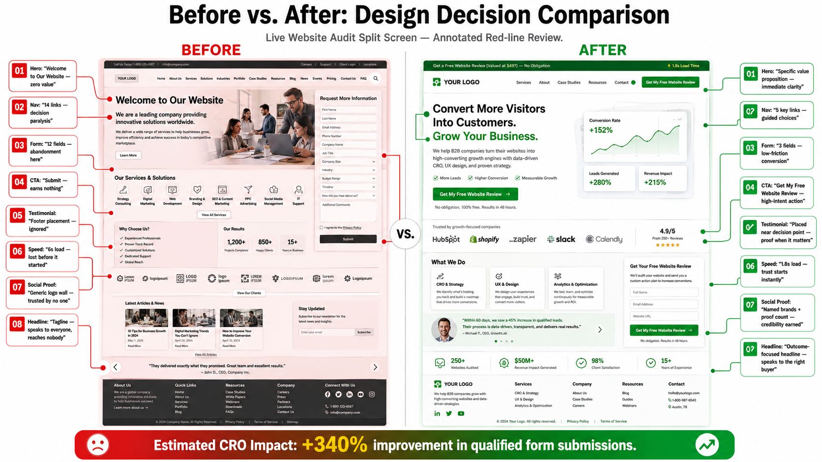
Conclusion: Design Drives Decisions
Website results are a human problem with a structural solution. People want to feel certain before they act, and the page either earns that certainty or it does not. What digital behavior insights keep confirming is this: the page exists for the person using it, not the brand behind it. When structure, copy, and layout all speak to what someone needs to feel confident, the gap between arriving and acting closes on its own.
If a site is pulling traffic but not turning it into leads, the problem is rarely the traffic itself. More often, it lives somewhere in the experience: a headline that does not land, a form asking too much too soon, a trust signal sitting in the wrong place on the page. Better UX psychology starts with watching how real people behave, finding where momentum breaks, and building thoughtfully around those gaps.
Test, refine, repeat ; always in service of making the experience feel natural rather than engineered. That is how user behavior design and genuine strategy come together to build something people act on, with confidence and intent.
Most websites lose leads not because of poor traffic, but because of avoidable friction. A free audit from eSign Web Services identifies exactly where results are slipping, and what to do about it.
Frequently Asked Questions (FAQs)
Question: What is conversion psychology in website design?
Answer: Conversion psychology in website design refers to understanding how users think, feel, and make decisions while interacting with a website. It focuses on applying psychological principles to influence behavior and guide users toward desired actions. Elements such as layout, colors, messaging, and trust signals impact perception. By aligning design with user expectations and emotions, businesses can improve engagement and conversions. Conversion psychology helps create experiences that reduce hesitation and encourage action. It ensures that design is not only visually appealing but also strategically effective in achieving business goals and improving overall website performance.
Question: Why do users decide quickly whether to stay or leave a website?
Answer: Users decide quickly because of cognitive shortcuts that help them process information efficiently. First impressions are formed within seconds based on design quality, clarity, and relevance. If a website appears confusing or unprofessional, users leave immediately. Clear structure and appealing visuals encourage users to stay. Attention spans are limited, so users prefer quick understanding. Meeting expectations early improves engagement. Businesses must focus on creating strong first impressions. Effective design captures attention and builds trust quickly, increasing the likelihood of continued interaction and conversion.
Question: How does visual design influence user trust?
Answer: Visual design plays a significant role in building trust by shaping perception. Clean layouts, consistent branding, and professional visuals create a sense of reliability. Users associate good design with credibility and quality. Poor design reduces confidence and increases skepticism. Elements such as typography, spacing, and imagery influence perception. Consistency across pages reinforces trust. Design also affects readability and usability. A well-designed website communicates professionalism and builds confidence. Strong visual design encourages users to engage and take action. Businesses should prioritize design quality to establish trust and improve conversions effectively.
Question: What role does color psychology play in conversions?
Answer: Color psychology influences emotions and decision-making. Different colors evoke different responses. For example, blue is associated with trust, while red creates urgency. Choosing the right color scheme helps guide user behavior. Colors can highlight important elements such as calls-to-action. Consistent color usage reinforces brand identity. Poor color choices can create confusion or negative perception. Understanding how colors affect emotions allows businesses to design more effective experiences. Strategic use of color improves engagement and increases conversions. Businesses should align color choices with their brand and user expectations.
Question: How can websites reduce user hesitation during conversions?
Answer: Reducing hesitation involves addressing user concerns and building confidence. Clear messaging and value propositions help users understand benefits quickly. Trust signals such as testimonials and certifications improve credibility. Simplifying processes reduces friction. Providing transparent information about pricing and policies increases trust. Fast loading speeds enhance experience. Clear calls-to-action guide users effectively. Removing unnecessary steps improves usability. Businesses should focus on creating a smooth and reassuring journey. Reducing uncertainty encourages users to take action. A well-designed experience increases confidence and improves conversion rates.
Question: Why is simplicity important in website design?
Answer: Simplicity is important because it improves usability and reduces cognitive load. Users prefer clear and easy-to-navigate interfaces. Complex designs can overwhelm users and reduce engagement. Simplified layouts help users find information quickly. Clear structure improves understanding and decision-making. Removing unnecessary elements enhances focus. Simplicity also improves mobile usability. A clean design creates a professional appearance and builds trust. Businesses should prioritize clarity and ease of use. Simple designs improve user experience and increase conversion rates. Focusing on simplicity ensures better performance and user satisfaction.
Question: How do calls-to-action impact user decisions?
Answer: Calls-to-action guide users toward specific actions such as signing up or making a purchase. Clear and compelling CTAs improve engagement. Placement and design influence visibility. Action-oriented language encourages users to respond. Weak or unclear CTAs reduce conversions. CTAs should align with user intent and provide clear benefits. Testing different variations helps improve performance. Effective CTAs reduce confusion and guide decision-making. Businesses should focus on creating strong and visible CTAs. This improves user experience and increases conversion rates significantly over time.
Question: What is decision fatigue and how does it affect conversions?
Answer: Decision fatigue occurs when users are overwhelmed by too many choices. This reduces their ability to make decisions effectively. Complex websites with multiple options can confuse users. Simplifying choices improves usability and engagement. Clear structure helps users focus on important actions. Reducing unnecessary options increases conversions. Businesses should guide users with clear paths and limited choices. This improves decision-making and reduces frustration. Understanding decision fatigue helps create better user experiences. Simplified design ensures users can act quickly and confidently.
Question: How can personalization improve website conversions?
Answer: Personalization improves conversions by making content more relevant to users. Tailored experiences increase engagement and satisfaction. Showing relevant products, content, or offers improves decision-making. Personalization helps users feel understood and valued. This builds trust and encourages action. Data analysis helps identify user preferences. Dynamic content enhances user experience. Businesses should use personalization strategically. Overuse may reduce effectiveness. Balanced personalization improves results. It ensures users receive meaningful interactions that align with their needs. Personalization is a powerful tool for improving conversion rates and user engagement.
Question: How can businesses test and improve conversion-focused design?
Answer: Businesses can improve design by testing different elements and analyzing performance. A/B testing helps compare variations. Tracking user behavior provides insights into engagement. Metrics such as conversion rate and bounce rate indicate effectiveness. Continuous optimization improves results. Gathering user feedback helps identify issues. Testing headlines, visuals, and CTAs enhances performance. Data-driven decisions ensure better outcomes. Businesses should adopt an iterative approach. Regular improvements ensure designs remain effective. Testing and optimization are essential for maintaining high conversion rates and achieving long-term success.
Author Details

Ashwani Kumar Sharma
Ashwani has been actively involved in SEO services since 2005. His expertise and distinctive work approaches have made him one of the most experienced and trusted SEO experts in the industry. He is a certified SEO and Google Ads professional. He also has strong business development skills in advanced SEO, PPC, and digital marketing strategies.


