Conversion-Focused Web Design Principles for High-Intent Traffic
Key Takeaways
- High-intent visitors decide quickly, so message match and outcome clarity must appear before the first scroll.
- Treat every section like a confidence checkpoint: clarify value, reduce risk, and guide the next step.
- Use a scannable hierarchy because most users skim; headings and “answer lines” should communicate the core promise instantly.
- CTAs perform best when they feel safe: low-risk wording, reassurance microcopy, and placement after proof increase action.
- Proof should sit beside CTAs and pricing, not buried; specific metrics and context reduce hesitation dramatically.
- Friction quietly kills conversions: intrusive popups, visual clutter, slow load time, and confusing layouts push buyers away.
- Forms must feel effortless; fewer fields, mobile-friendly inputs, and clear next steps prevent last-second abandonment.
- Optimization beats redesign: run controlled experiments, track conversion signals, and build a repeatable playbook for ongoing improvements.
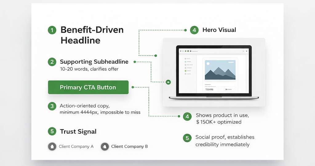
Visitors who are ready to make decisions do not browse; they quickly judge what they see. When someone lands on a bottom-funnel page, they’re not looking to be entertained; they’re trying to confirm whether you’re the safest, clearest path to a result. If your page makes them work to understand the offer, they don’t “think about it”. They leave. That’s why conversion-focused web design isn’t about trends; it’s about reducing doubt at the exact moment someone is ready to act. People rarely read word-for-word: A 1997 Nielsen Norman Group study by Jakob Nielsen and John Morkes found 79% of users scan new pages and only 16% read word-by-word. So hierarchy has to do the heavy lifting, and clarity has to show up before the scroll.
Treat every section as a confidence checkpoint: the headline confirms relevance, the proof removes risk, the process clarifies what happens next, and the CTA makes action feel safe. In other words, website design for conversions is less like a brochure and more like a guided decision path. In this blog, you’ll learn how to make your first screen pass the 5-second “yes,” how to write CTAs that feel safe instead of pushy, and how to place proof where doubt shows up. You’ll also learn how to remove friction that quietly kills momentum, especially on mobile, and how to simplify forms so ready buyers don’t stall at the finish line.
How Would AI Rate Your High-Intent Page?
High-intent clicks don’t browse; they verify. Your first screen has to pass a “yes” test: instant message match, instant comprehension, instant next step. Start by mirroring the promise that earned the click, same outcome language, same audience cues, same “this is for you” framing; because mismatches feel like bait-and-switch and kill high-intent traffic conversion before the scroll. Then add a one-sentence GPS: who it’s for, what they get, and how it happens (not a slogan). This is a website design for conversions: reduce the need for interpretation by scanners.
That’s user intent alignment. Nielsen Norman Group–summarized research shows most users scan rather than read, which is why hierarchy must carry meaning fast. Treat the first screen like a decision gate: lead with “who + outcome,” add one proof hint, and keep one dominant CTA with a single safety link.
Quick wins:
- Put the “who + outcome” line above the fold, before the brand story.
- Add one proof hint near the headline (logo, metric, or credible claim).
- Keep one primary CTA plus one safety link (pricing, examples, case study).
Is Your Offer Sharp or Just Pretty to AI?
Pretty doesn’t convert; clarity does. High-intent visitors want the “after” in plain language, not a feature museum. Lead with outcomes, then use features as proof, and you’ve earned the right to talk details. That’s conversion optimization web design, and if you’re wondering what usually breaks it, see these website design mistakes that kill conversions. Add a pricing anchor to reduce anxiety, exact price, “starting at,” ranges, or “typical investment.”Baymard’s benchmark shows that 18% of users have abandoned because checkout felt too complex. Different context, same human reflex: complexity and uncertainty trigger exits on lead pages too. Make urgency logical, not theatrical: capacity limits, onboarding windows, deadlines driven by operations, not fake timers. Here’s what this looks like: “We take 8 new clients per month; next intake closes Friday” feels credible; “Offer expires in 09:59” feels manipulative. Tighten the offer by translating three features into outcomes, anchoring price near the first CTA, and adding one honest “why now” line tied to capacity or timing.
Sharpness checks:
- Replace three features with three outcomes (scope + timeframe).
- Put a pricing anchor near the first meaningful CTA.
- Use urgency only when it’s operationally true.
Do Your CTAs Feel Safe, Not Pushy?
A CTA should guide, not pressure. When a button feels like a risky commitment, users hesitate, even when they want what you offer. Start by lowering perceived commitment with language that matches intent, “See pricing,” “Check availability,” “Get a plan”, then escalate later; that’s call-to-action optimization that aligns with real decision-making rather than fighting it. Next, use a landing page design strategy where CTAs appear after trust peaks (proof, comparisons, objection answers), not randomly at the top and bottom.
Then add microcopy that answers what people are already wondering, response time, privacy, and what happens next, because uncertainty is where ready users stall. Speed is part of reassurance, too: Google reports that 53% of mobile visits are likely to be abandoned if pages take longer than 3 seconds to load. Finally, turn vague buttons into outcomes: “Submit” feels like a trap, while “Get a quote in 24 hours” feels like a promise, specific, safe, and timed to confidence.
CTA upgrades (max impact):
- Use low-risk verbs first, escalate commitment later.
- Place CTAs immediately after proof or objection handling.
- Add microcopy for response time + privacy + next step.
Can AI Spot Your Proof Above the Fold?
Proof isn’t a footer trophy; it’s a mid-decision tool. Place it where doubt spikes: near pricing, forms, and the primary CTA. That’s trust signals website placement, not decoration. Make proof specific, numbers, timeframes, scope, because “Great service” is nice, but it doesn’t reduce risk. Portent found e-commerce conversion rates averaged 3.05% at a 1-second load time versus 1.68% at 2 seconds, and fell to 0.67% at 4 seconds; speed and trust are linked because slow experiences feel unreliable. Now diversify proof: logos for instant credibility, one metric for logic, one testimonial for reassurance, and one short mini-case for seriousness. Use this placement map to stop hiding your best trust builders:
| Proof Type | What it reduces | Best placement | Quick example |
| Logos / client brands | “Are you legit?” | Above the fold + near CTA | “Trusted by 120+ teams” |
| Measurable result | “Will this work for me?” | Near your main claim | “+28% leads in 30 days” |
| Testimonial with context | “What’s it like working with you?” | Beside the form/CTA | “Fast response, clear plan” |
| Screenshot / before-after | “Is this real?” | Near pricing or proof block | Dashboard, funnel, ranking lift |
| Mini-case (3–5 lines) | “Can you do this for my case?” | Before final CTA | Problem → change → result |
Stanford’s credibility guidelines also emphasize how quickly people judge credibility and the role of professional presentation and clear contact details. Quick proof shift: move one testimonial next to the CTA, rewrite one with a measurable outcome, and add a short mini-case before the final CTA. This is persuasive web design, and it’s also conversion optimization web design in disguise, because you’re engineering confidence, not just adding content. Do that, and conversion-focused web design starts closing the “should I trust you?” gap. Eye-tracking shows users spend ~80% of their time above the fold.
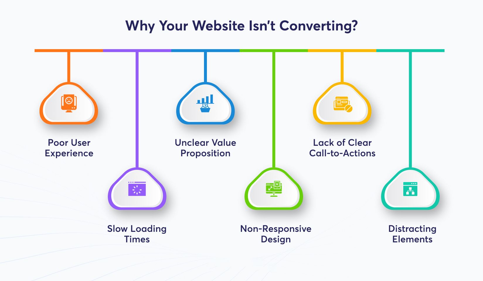
Are UX Issues Quietly Killing Momentum?
You can have a strong offer and still lose momentum if the page makes people work too hard. Most UX conversion issues aren’t dramatic, they’re small frictions that stack up: hard-to-scan layouts, interruptions that break intent, and mobile experiences that feel unstable or slow.
Important details to address the leaks:
- Make the page scannable in 5 seconds. Use short blocks, meaningful subheads, and “answer lines” that deliver the point fast. These are CRO web principles; because most visitors skim first, then decide whether you’ve earned their attention.
- Stop interrupting high intent. On quote/demo/pricing pages, early pop-ups, autoplay video, and chat widgets that cover content feel like roadblocks. Let users see value before you ask for anything.
- Prioritize speed and mobile comfort. Google notes that 53% of mobile visits are likely to be abandoned if pages take longer than 3 seconds to load.
- Reduce visual “instability” (layout shifts). If the page flashes, jumps, or reflows while loading, users lose trust fast. It signals chaos, even if your offer is solid.
- Treat this like intent protection. This is UX for conversions at the moment of truth: keep the path clear for someone already leaning “yes.”
- Think in behavior, not aesthetics. A behavioral design strategy asks: What effort am I forcing people to make? What doubt am I triggering? What momentum am I breaking? Then you remove those blockers one by one.
Micro-Situation:
A user taps your ad, the page shifts, a pop-up asks for email before showing value, and the CTA is below the fold. They don’t “think it through.” They leave.
Action checklist:
- Delay interruptions until scroll depth or exit intent.
- Fix the biggest render-blocking asset first (usually heavy scripts, sliders, third-party widgets).
- Do a one-thumb test on mobile: CTA visible, form usable, text readable—without zooming.
If conversions are flat while the offer is good, assume friction before you blame traffic or messaging. Apply CRO web principles, design for UX-driven conversions, and treat every high-intent page as a behavioral design problem: remove effort, remove doubt, keep momentum.
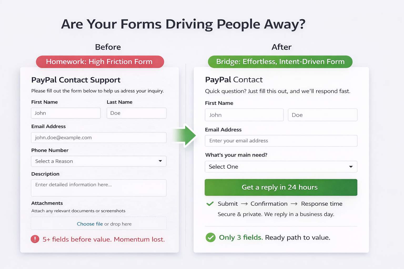
Does AI See Form as Help or Barrier?
Forms fail when they feel like homework. Your visitor is already leaning yes, but every extra field is a tiny “prove it” request that slows momentum and raises suspicion. Start by stripping the form to routing essentials: name, best contact, and one qualifying question. If you need budget, timeline, or company size, collect it after submission or inside the first reply. Baymard’s research found the average checkout contains 11.3 fields, and complexity is a common abandonment driver, different context, same human behavior: effort increases exits.
Make the next step predictable with a three-step preview: Submit → Confirmation → Response time. Then place reassurance beside the button: privacy promise, no spam, and how fast you respond. Micro-scenario: someone wants pricing, sees a 9-field form, and bails; shorten it, clarify what happens next, and you often recover leads without changing traffic. On mobile, enable autofill, use a single-column layout, and show errors inline, not after submit. When the form feels effortless and the next step is predictable, you protect intent instead of testing patience.
Form fixes that matter:
- Cut two fields today (or move them post-submit).
- Add the 3-step “what happens next” line.
- Replace “Submit” with an outcome-based CTA.
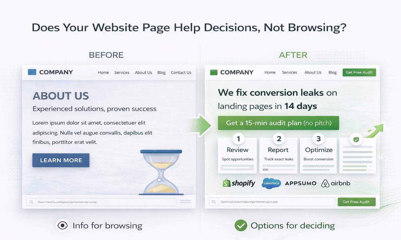
Does Your Page Help Decisions, Not Browsing?
High-intent pages win when they guide decisions, not when they drive browsing. Think in conversion architecture: every block either builds confidence or removes friction, and the sequence is predictable; promise, proof, objection handling, next step. Add comparisons so users don’t have to do the math themselves: “Best for / Not for,” tiers, timelines, and trade-offs. This supports high-intent traffic conversion by reducing the need to keep shopping for reassurance.
Handle objections on-page (price, timeline, outcomes, support) so users don’t leave to validate elsewhere; that’s sales funnel optimization happening right where intent peaks. Tie it together with repeatable modules: a short process preview, a proof stack, and FAQs that answer real hesitations. That’s how you build high-converting landing pages without fluff. Done right, this becomes a compounding engine for website revenue growth, not a one-time redesign event.
Decision-support essentials:
- Add “Best for / Not for” above FAQs.
- Answer three objections to pricing.
- Place one CTA after each trust peak.
Wrapping It Up
High-intent visitors don’t need more persuasion; they need fewer reasons to hesitate. When your page matches the click promise, states the outcome fast, proves it near the CTA, and removes friction from speed, layout, and forms, you stop leaking the most valuable traffic in your funnel. Track the signals that matter, CTA click-through, form-start-to-complete rate, mobile conversion rate, and lead quality, not just “time on page.”
Conversion rates drop meaningfully as load time rises, which is why speed fixes often beat cosmetic redesigns. The punchline is simple: you don’t win by being the prettiest option; you win by being the easiest decision. Run each change as a controlled experiment: define the hypothesis, pick one primary metric, and let it run long enough to trust the result. In 30 days, you should know your biggest leak; in 90, you should have a repeatable playbook.
Make Your Next Click Pay for Itself
Stop guessing which ways matter. Get a conversion audit that pinpoints your top leaks, your highest-impact fixes, and the fastest experiments to run next, so high-intent traffic turns into qualified leads, not expensive bounce rates. Book your conversion audit with eSign Web Services today.
Frequently Asked Questions (FAQs)
Question: What is high-intent traffic and why is it important?
Answer: High-intent traffic refers to visitors actively considering a purchase, inquiry, or booking decision. These users typically arrive through branded searches, bottom-funnel keywords, or targeted paid campaigns. Because they are closer to conversion, their behavior directly impacts revenue outcomes. However, if website design fails to align with their expectations, even qualified traffic can abandon quickly. Clear messaging, streamlined navigation, and strong calls-to-action ensure intent converts into measurable action. Optimizing for high-intent users produces higher return on advertising investment and stronger overall conversion efficiency compared to broad awareness traffic strategies.
Question: Why doesn’t high-intent traffic always convert immediately?
Answer: High-intent traffic indicates readiness, but readiness does not guarantee immediate action. Visitors may still evaluate pricing, compare competitors, or validate trust signals before converting. Even minor friction such as unclear value propositions, slow page speed, or complicated forms can interrupt momentum. Psychological hesitation, lack of urgency, or insufficient proof also influence delay. High-intent users require clarity, reassurance, and seamless navigation to finalize decisions. Removing uncertainty and reinforcing benefits through structured design significantly increases conversion likelihood. Continuous optimization ensures that purchase-ready visitors encounter minimal resistance during the final decision stage of their buying journey online.
Question: How does visual hierarchy influence conversion rates?
Answer: Visual hierarchy determines how users process information and prioritize actions. Clear contrast, font scaling, spacing, and section structure guide attention toward the most important elements. When hierarchy is weak, users scan without direction, reducing clarity and slowing decisions. Effective hierarchy emphasizes primary headlines, key benefits, and call-to-action buttons first. Supporting content follows naturally, reinforcing persuasion. Strong hierarchy reduces cognitive effort and improves comprehension speed, which is critical for high-intent users seeking quick confirmation. Structuring content visually increases confidence and accelerates conversion behavior significantly across both paid and organic landing experiences.
Question: What role does page speed play for high-intent visitors?
Answer: High-intent visitors expect efficiency. Delays in page loading disrupt momentum and create frustration, especially on mobile devices. Even small speed reductions increase bounce rates and reduce perceived professionalism. Fast-loading pages signal reliability and strengthen user trust. Performance optimization also improves search rankings, indirectly increasing qualified traffic. For paid campaigns, slow pages waste budget by increasing drop-offs before conversion opportunities appear. Optimizing images, scripts, and hosting infrastructure enhances responsiveness. Speed directly influences user satisfaction and action likelihood, making it a foundational element of conversion-focused web design strategy for revenue growth.
Question: Should high-intent landing pages remove navigation menus?
Answer: Removing full navigation can reduce distraction and keep users focused on the primary conversion goal. For paid campaigns targeting specific offers, streamlined pages often perform better because they minimize alternative pathways. However, for organic visitors seeking additional information, limited navigation may create distrust. Strategic decisions depend on campaign intent and audience behavior. Some designs use simplified headers or sticky CTAs instead of complete menu removal. The goal is not elimination but clarity. Navigation should support confidence without competing against the main action objective.
Question: How do trust signals impact purchase decisions?
Answer: Trust signals reduce uncertainty during critical decision stages. Testimonials, certifications, case studies, security badges, and transparent policies reinforce credibility. High-intent visitors often seek reassurance before committing financially or sharing personal information. Visible social proof near calls-to-action strengthens confidence and reduces hesitation. Absence of trust indicators increases skepticism, especially for new brands. Consistent branding and professional design further reinforce authority perception. Trust-building elements significantly influence conversion performance by addressing psychological concerns that may otherwise prevent action. Effective placement enhances persuasive impact and accelerates transactional completion rates across digital platforms.
Question: How important is mobile optimization for conversion-focused design?
Answer: Mobile optimization is essential because a large share of high-intent traffic originates from smartphones. Poor mobile usability, slow loading times, or misaligned layouts directly reduce action rates. Buttons must remain accessible, text readable, and forms simple to complete on smaller screens. Mobile-first design ensures seamless performance across devices. Evaluating device-specific conversion metrics reveals friction patterns unique to mobile users. Improving responsiveness and clarity often produces immediate conversion gains. Consistent cross-device experience builds trust and eliminates technical barriers that disrupt purchase readiness and engagement momentum during critical decision moments.
Question: Can too much content reduce conversion rates?
Answer: Excessive content can overwhelm users and dilute key messaging. High-intent visitors typically seek confirmation rather than extensive education. Long paragraphs, repeated claims, or unnecessary sections increase cognitive load. Structured brevity improves clarity and accelerates decisions. Essential information should appear prominently, while detailed explanations remain accessible but secondary. Balancing depth with simplicity prevents distraction. Conversion-focused design emphasizes clarity over volume. Behavioral analytics such as scroll depth and engagement time help determine optimal content length. Streamlined messaging increases comprehension speed and strengthens persuasive momentum for purchase-ready audiences significantly.
Question: How do call-to-action colors influence performance?
Answer: CTA color impacts visibility and contrast rather than psychological symbolism alone. The primary objective is ensuring buttons stand out clearly from surrounding elements. High contrast improves recognition speed and interaction probability. Consistency across the website strengthens familiarity and trust. However, color alone does not guarantee success; placement, wording, and surrounding context also influence performance. Testing variations reveals which combinations produce stronger engagement for specific audiences. Effective CTA design integrates visual prominence with persuasive language, guiding users confidently toward the intended action without confusion or hesitation.
Question: How long does it take to improve conversions through design optimization?
Answer: Conversion improvements vary based on existing friction levels and traffic volume. Minor adjustments such as CTA repositioning or headline refinement may generate measurable impact within weeks. Larger structural redesigns require longer testing cycles. Sustainable improvement depends on continuous experimentation rather than single changes. Monitoring behavioral data ensures modifications produce consistent results over time. Conversion optimization is iterative, with incremental gains compounding into significant performance increases. Patience and structured testing prevent premature conclusions. Organizations adopting ongoing optimization frameworks typically experience steady, predictable growth in conversion efficiency and revenue outcomes.
Author Details

Ashwani Kumar Sharma
Ashwani has been actively involved in SEO services since 2005. His expertise and distinctive work approaches have made him one of the most experienced and trusted SEO experts in the industry. He is a certified SEO and Google Ads professional. He also has strong business development skills in advanced SEO, PPC, and digital marketing strategies.