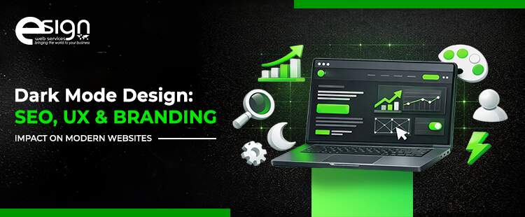
Dark Mode Design: SEO, UX & Branding Impact on Modern Websites
Key Takeaways
- Dark mode design enhances user comfort and modern appeal, but only when usability and accessibility remain priorities.
- Dark mode does not directly impact SEO rankings, yet poor implementation can harm performance and user engagement.
- Strong contrast, readable typography, and spacing are essential for maintaining clarity and reducing eye strain.
- Optional dark mode consistently outperforms forced implementations by respecting user preferences and varied usage contexts.
- Dark interfaces amplify UX strengths and weaknesses, exposing poor hierarchy, navigation, and interaction feedback quickly.
- Branding must guide dark mode decisions, ensuring emotional tone and visual identity remain consistent across themes.
- Dark mode works best for dashboards and tools, while long-form reading often performs better in light mode.
Dark mode design isn’t just something that lives on your preference list alongside a bunch of other toggles anymore; it’s becoming more of an expectation when diving into any aspect of the digital realm. Users now see dark interfaces all day long through operating systems, mobile apps, and productivity software, which quietly changes the way they evaluate websites. But when a site is perceived as not meeting these changing expectations, it can look visually dated or out of step with the times, even if it’s content remains strong. For companies vying for attention, this initial impression can be more important than design teams like to admit.
And yet, turning on dark mode is not a pure visual toggle. When sitting on a dark background, color contrast, typography, space, and emphasis will all work differently from how they do on light surfaces, with a direct impact on comfort and legibility. Something that looks nice in a design mockup can be hard to read in extended use or for users with website accessibility concerns. Some of these problems are relatively minor, such as a website lacking contrast or a font that is too thin, issues that are scarcely noticeable but gradually undermine trust and interest.
This post will discuss the impact of dark mode design on usability, dark mode SEO impact, and brand balance in modern web design. Instead of treating it as a bandwagon to mindlessly jump on, the goal is for businesses to understand when it enhances the experience and when it carries risk, and how to properly judge that. The goal here is to help teams make informed visual decisions that align with aesthetics, performance, and user needs, instead of simply following modern website design trends.
The Role of Dark Mode in Modern Design
Dark mode design is not just about flipping white screens to black. At its core, it is a way of redesigning a website so darker backgrounds replace light ones while text, buttons, and images remain easy to see. Instead of harsh whites, dark interfaces rely on layered shades of gray with subtle color highlights to guide attention. This approach reduces glare and helps the eyes stay comfortable, especially in low-light settings. When applied carefully, it improves website readability by preserving clear contrast, spacing, and visual hierarchy.
How Dark Mode Actually Works
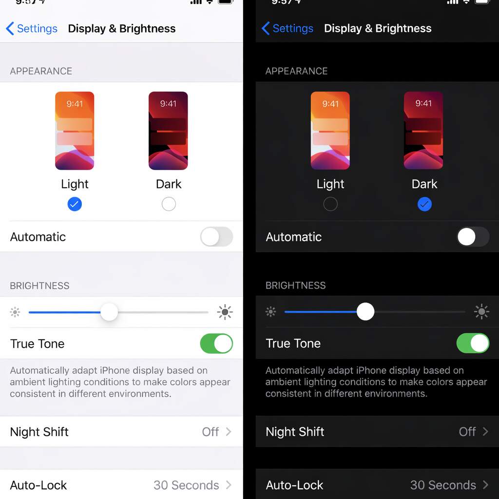
Light mode
- Bright background with dark text
- Works well in daylight environments
- Can cause eye strain in darker settings
Dark mode
- Dark background with light text
- Reduces glare and visual fatigue
- Feels calmer during long screen sessions
This contrast explains why dark interfaces must be intentionally designed rather than simply inverted.
From a technical perspective, modern websites can detect user preferences through browser and operating system settings. Designers then apply flexible color systems that adapt layouts without affecting performance. These approaches reflect current UI design trends, where comfort and adaptability matter as much as aesthetics. However, success depends on careful testing of colors, spacing, and text clarity across devices and screen sizes.
User behavior further highlights why choice matters. Some users prefer dark themes on mobile devices or at night, while others switch to light mode for extended reading. This is why dark mode design works best as an option rather than a default. When implemented this way, dark mode UX feels natural instead of forced. That flexibility reflects modern web design, where user comfort guides decisions more than visual trends alone.
Why Dark Mode Became Popular
Dark mode didn’t become popular by accident or trend pressure alone. Its rise reflects how people actually use screens today, across different lighting conditions, devices, and contexts. As operating systems and apps normalized darker interfaces, user expectations shifted from preference to familiarity. Understanding why dark mode gained traction helps businesses move past surface-level design decisions and evaluate whether it genuinely improves comfort, consistency, and perception for their audience rather than simply following visual fashion.
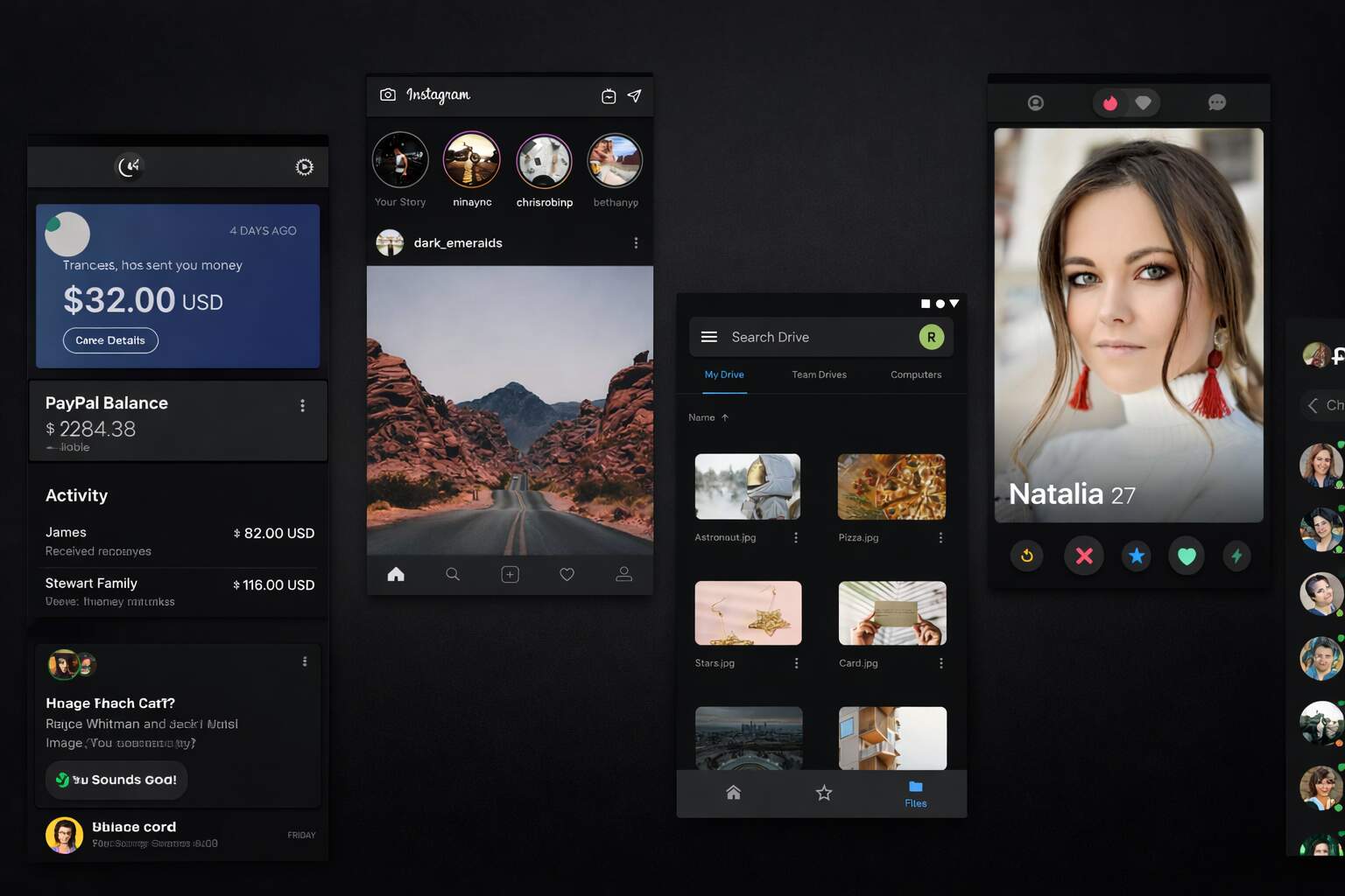
- Reduced eye strain in low-light environments: One of the biggest reasons dark mode design gained popularity is comfort during nighttime or low-light use. Bright screens can feel harsh on the eyes, especially on mobile devices used close to the face. Dark interfaces reduce overall luminance and glare, making short interactions like reading messages, checking dashboards, or reviewing stats feel less tiring. This comfort factor helped normalize dark mode UX beyond niche tools and into everyday digital habits.
- OS and app-level adoption shaped user expectations: When iOS, Android, Windows, and macOS introduced native dark modes, users began experiencing consistent visuals across apps and system interfaces. Over time, that consistency became an expectation. Websites that ignore system preferences can feel visually disconnected, even if their content is strong. Aligning with system-wide settings reflects modern website design trends and signals technical maturity rather than rigid, outdated design decisions.
- Perception of modern and tech-forward branding: From a branding perspective, dark interfaces often communicate focus, sophistication, and innovation. For SaaS platforms, creative tools, and developer products, this aesthetic aligns naturally with audience expectations. Website branding design benefits when dark mode reinforces brand personality instead of replacing it. Dark mode became popular not just because it looked modern, but because it combined comfort, consistency, and a clear signal of contemporary digital design.
Dark mode’s popularity is rooted in real behavior, not hype. Reduced glare, system-wide consistency, and modern brand signaling all contributed to its adoption. However, popularity should never be mistaken for universal suitability. The same factors that made dark mode appealing also highlight the need for flexibility and user choice. When businesses understand why dark mode resonated with users, they can decide more confidently whether it enhances their experience or introduces unnecessary friction.
UX Impact of Dark Mode Design
Dark mode doesn’t usually break user experience outright. Instead, it subtly changes how users read, scan, and interact with an interface. Small design weaknesses that go unnoticed in light layouts often become more visible in dark environments. That’s why dark mode should be evaluated less as a visual upgrade and more as a usability test. Understanding where dark interfaces help and where they introduce friction allows teams to make informed UX decisions rather than relying on assumptions or trends.
UX Behavior Comparison: Light vs Dark Interfaces
| UX Dimension | Light Mode Behavior | Dark Mode Behavior | What Teams Often Miss |
| Text readability | Supports long reading with stable contrast | Light text can blur or glow if contrast is poor | Thin fonts and tight line spacing fail faster |
| Visual hierarchy | Familiar emphasis through brightness | Requires rebalancing color and spacing | Headings and CTAs lose priority without adjustment |
| Navigation visibility | Menus and links are easily distinguishable | Interactive elements can blend into backgrounds | Hover and focus states need redesign |
| Form interaction | Error states and validation are obvious | Feedback can feel muted or unclear | Color-only signals reduce clarity |
| Accessibility tolerance | More forgiving for contrast errors | Smaller margin for WCAG compliance | Minor contrast issues exclude users |
| Cognitive load | Predictable scanning patterns | Increased effort if hierarchy is weak | Dark mode amplifies UX debt |
Dark mode amplifies user experience outcomes rather than redefining them. Well-structured, accessible interfaces often perform better in dark environments, while weak hierarchy and contrast issues surface faster. For teams considering dark mode, the goal shouldn’t be visual novelty but usability resilience. If an interface remains clear and intuitive in dark mode, it’s likely strong enough to perform well in any context.
SEO Impact of Dark Mode Design
From a search perspective, the dark mode SEO impact is not direct but very real, as specific implementation choices affect how pages are rendered, measured, and experienced. Search engines don’t evaluate color combinations, but they do render pages to check for layout stability, content visibility, and usability. Issues arise when dark mode design relies on hidden elements, conditional loading, or JavaScript-heavy toggles to switch between themes. Incorrect rendering can confuse crawlers and dilute technical signals, even if the content itself is strong.
Performance adds another crucial layer. Switching themes can trigger layout shifts if styles load late or if components resize during toggling. When handled correctly, this approach strengthens Core Web Vitals, especially by stabilizing CLS and improving FCP. A well-executed implementation preloads theme styles, avoids unnecessary CSS duplication, and ensures transitions don’t cause layout disruptions. When dark mode design is lightweight and stable, it maintains performance integrity rather than degrading it.
Mobile-first indexing only amplifies these concerns. While many mobile users prefer darker interfaces, touch targets, text clarity, and contrast must still be optimized across various lighting conditions. Poor visibility reduces engagement, increasing bounce rates and shortening user sessions. Over time, these behavioral patterns influence SEO results. Dark mode SEO impact is positive only when user experience design truly improves, not when friction is masked as `part of modern website design trends.
Branding and Visual Identity Considerations
1. Dark Mode Changes Brand Tone, Not Just Color
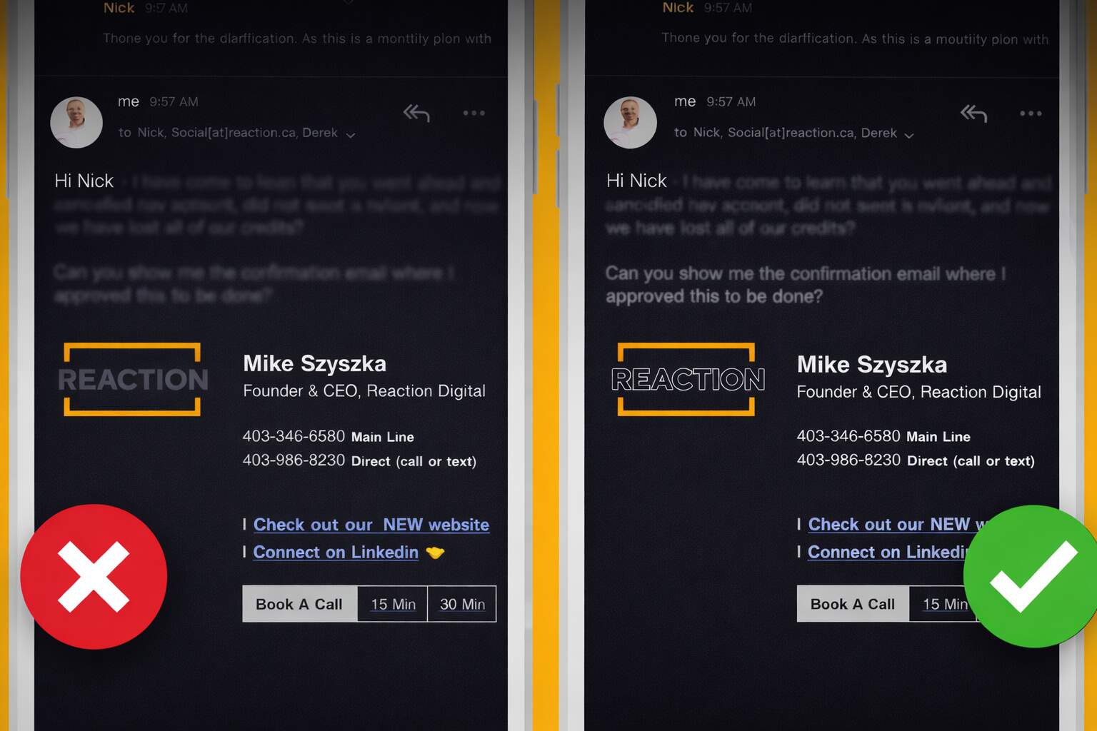
Dark interfaces don’t just alter how a website looks; they subtly change how a brand feels. That’s why website branding design should lead every decision around dark mode, not follow it. Colors that feel friendly or energetic on light backgrounds can appear muted, harsh, or emotionally flat on dark surfaces. Logos are often the first weak point. Marks built around thin strokes or dark tones may lose clarity unless alternate versions are designed. Brands that succeed treat dark mode as a tonal shift, not a cosmetic layer, ensuring identity stays recognizable even as visual mood changes.
2. Maintaining Consistency Across Light and Dark Themes
When two themes coexist, consistency becomes a systems challenge. Photography, illustrations, icons, and UI elements must communicate the same personality across both environments. Without defined rules, brands risk visual fragmentation instead of flexibility. This is where structured style guides matter more than taste. Clear guidance on how spacing, imagery, and color tokens adapt between themes prevents drift. Teams that approach this methodically align with modern website design trends while preserving familiarity and trust across every interaction.
3. Psychological Impact on Brand Perception
Dark interfaces often signal confidence, focus, and technical sophistication. This works well for SaaS, creative tools, and analytics-driven platforms. For brands built on warmth or reassurance, however, the same aesthetic can feel distant. Understanding audience expectations is critical. Dark mode builds trust when it reinforces brand values and weakens it when it conflicts. The real branding challenge isn’t choosing dark or light, but maintaining emotional consistency regardless of theme.
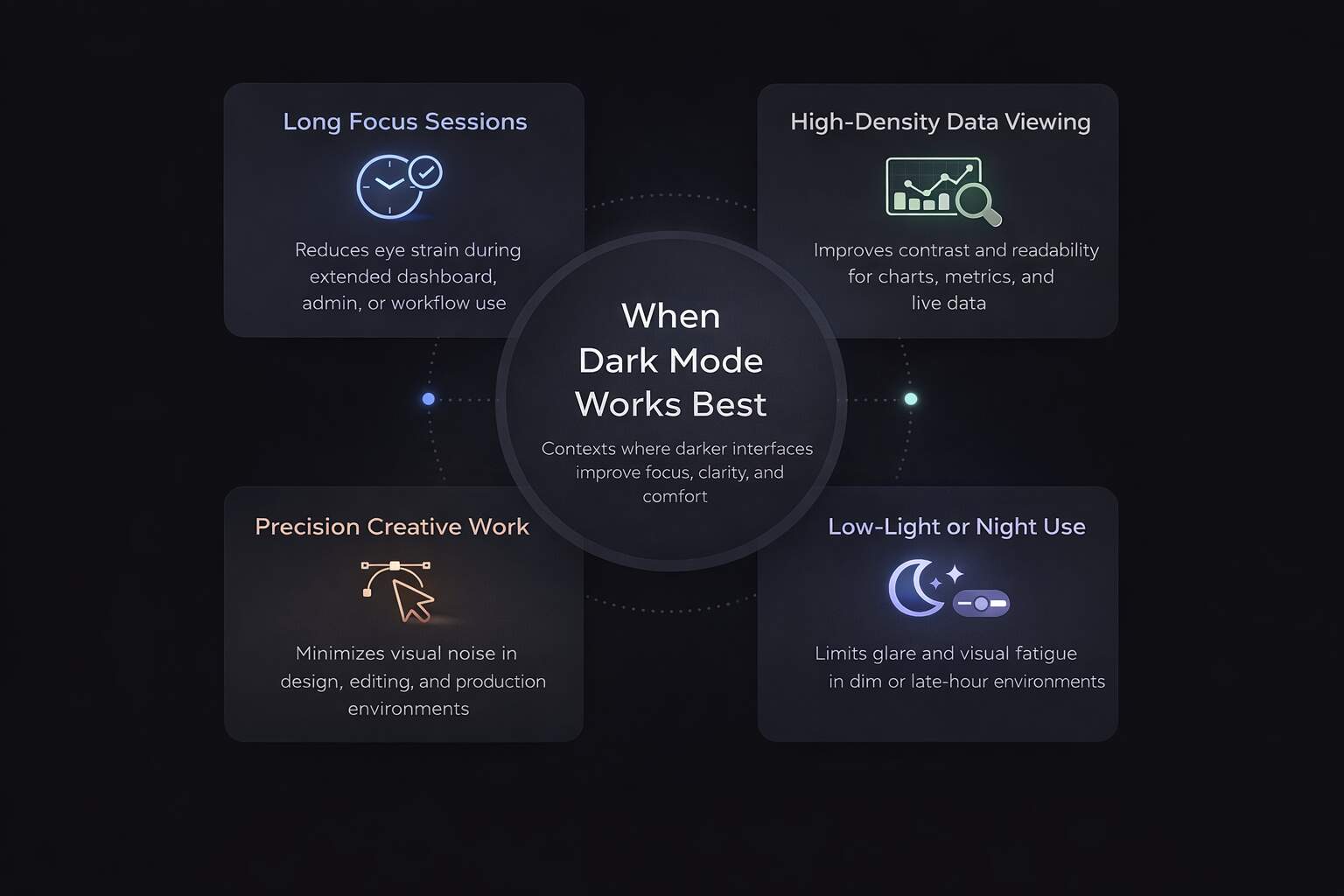
When Dark Mode Works Best
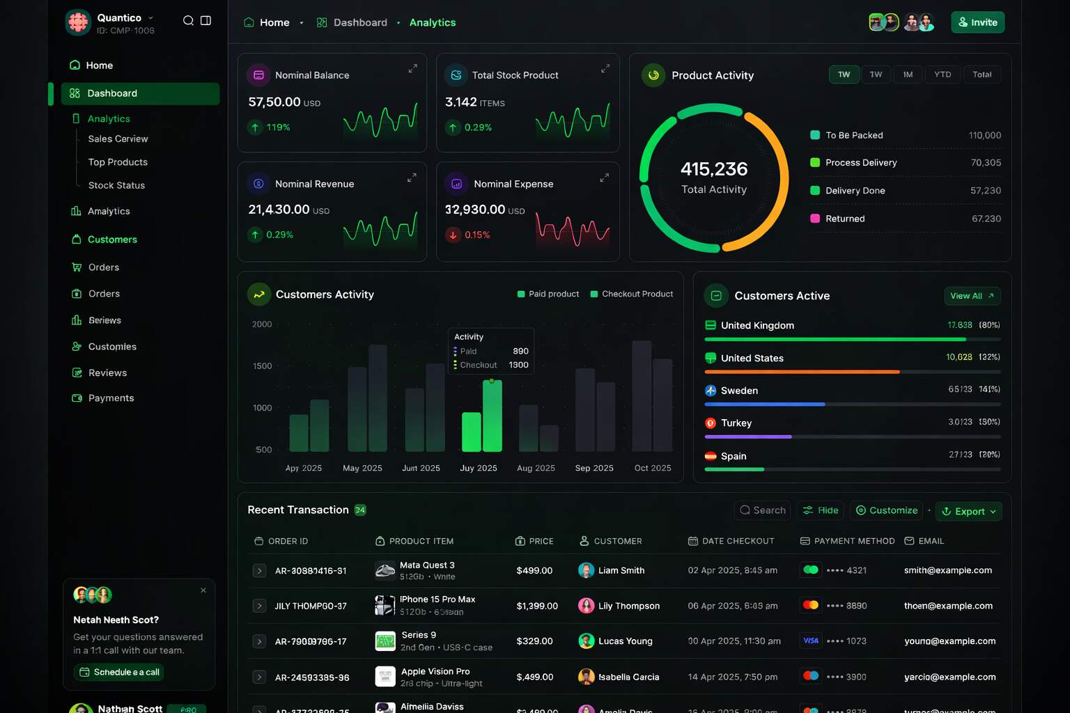
Dark interfaces seem best suited to situations where focus, contrast control, and short interaction loops are more important than sustained reading sessions. When it comes to tech products, SaaS solutions, and creative apps, dark mode design just feels natural with user expectations. These audiences spend hours in dashboards, editors, or analytics views, and the less glare, the better for staying focused. Darker surfaces help clarify what we see and reduce noise, without necessarily competing with content.
Even data-dense tools can benefit from a darker layout. Charts, graphs, and real-time metrics tend to pop more in dark mode, with accent colors playing an even more critical role. This allows for quicker scanning and smoother decision-making. For many teams, dark themes are a smart fit for monitoring interfaces, admin panels, and internal tools, environments where precision is far more important than warmth.
The best outcomes come when dark mode remains an option rather than a requirement. Giving users control honors personal preferences and different usage contexts. Some people switch based on time of day, while others switch depending on the task at hand. Optional implementations consistently outperform forced ones because they reduce friction instead of adding to it. Dark mode UX shines brightest when it adapts to the user, not the other way around.
When Dark Mode Can Hurt Performance
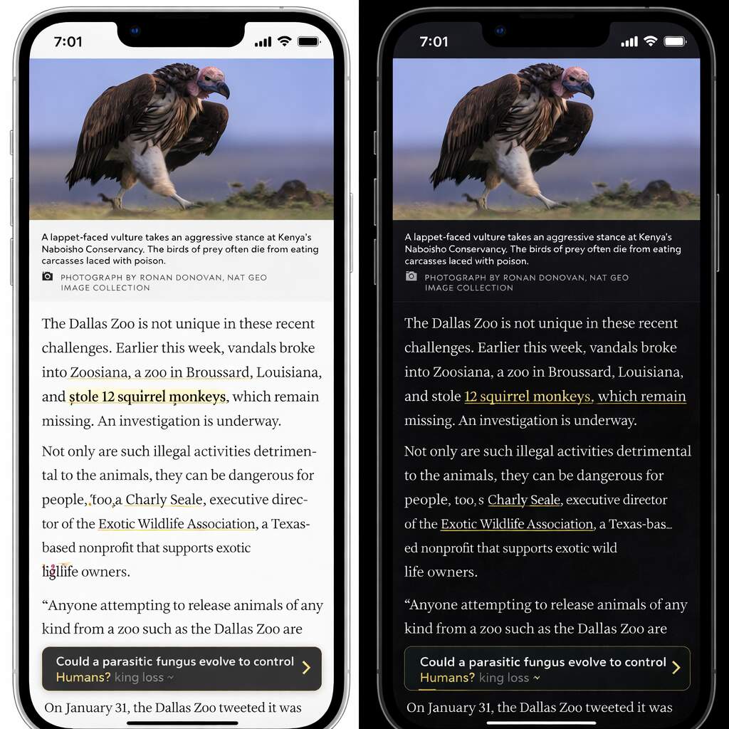
The appeal of dark interfaces can fade quickly when the goal is content consumption. For long-form reads, like articles, blogs, or educational materials, lighter backgrounds often lead the way. They offer better contrast for extended reading sessions, improving focus and website readability. While a dark theme may seem sleek at first, it can quickly become a source of fatigue, reducing comprehension over time.
Website accessibility is another area where dark themes can fall short. Weak contrast, overly thin fonts, or clashing color palettes can unintentionally exclude users with visual impairments. When accessibility is overlooked in UX decisions, poor user experience directly impacts trust and conversions. Inclusive design requires hands-on testing with real users, real assistive tools, not just assumptions about compliance.
The biggest misstep? Adding dark mode design purely for visual flair. A “design-first, UX-second” approach often neglects core essentials: clear navigation, responsive interaction feedback, and consistent performance. Skipping tests can introduce subtle friction users won’t always verbalize, but they’ll feel it, and they’ll leave. When visuals overpower function, dark mode stops enhancing and starts undermining the user experience.
Culmination
Dark mode design has become a meaningful part of how modern websites are built and experienced, but its value depends entirely on execution. From a performance perspective, dark themes do not directly influence rankings, yet they can shape engagement, stability, and perception in ways that matter over time. When implemented thoughtfully, dark mode supports clarity, focus, and consistency without disrupting technical foundations or search visibility.
From a usability standpoint, success comes from restraint. Strong contrast, readable typography, and inclusive testing ensure dark interfaces remain comfortable rather than demanding. Accessibility and performance should guide decisions before aesthetics. Brands that treat dark mode as a system rather than a visual style are more likely to improve retention and trust than introduce subtle friction users struggle to articulate.
From a branding perspective, dark mode works best when it reinforces identity instead of redefining it. Some audiences associate dark interfaces with professionalism and focus, while others value warmth and familiarity. Understanding those expectations is essential. Dark mode succeeds when it aligns with user context, technical discipline, and brand values working together.
Evaluate Your Dark Mode Strategy with Confidence
If you’re evaluating dark mode or want clarity on how your current design performs, an expert review can surface issues that aren’t immediately visible. Request a UX and SEO assessment from eSign Web Services to understand how accessibility, performance, and brand perception align across light and dark experiences.
Frequently Asked Questions
Question: Does dark mode improve SEO rankings directly?
Answer: No, dark mode does not directly influence SEO rankings. Google does not consider color schemes when ranking pages. However, if dark mode enhances user experience—such as readability, comfort, or engagement—users may stay longer on the site, reducing bounce rates. These indirect signals can support SEO. The main focus should remain on high-quality content, fast loading times, mobile responsiveness, and accessibility, as these are the factors that truly affect search engine performance.
Question: Is dark mode better for user experience?
Answer: Dark mode can improve user experience, particularly in low-light environments, by reducing glare and eye strain. It may also appeal to users who prefer a modern visual style. However, it isn’t universally better; poor contrast or small text can reduce readability. Long-form content may be harder to read in dark mode. The ideal approach is offering users a choice, ensuring typography, spacing, and contrast are carefully designed, allowing dark mode to enhance comfort without compromising usability.
Question: Can dark mode negatively affect accessibility?
Answer: Yes, dark mode can harm accessibility if implemented incorrectly. Low contrast, thin fonts, or poor color combinations make text difficult to read, especially for users with visual impairments or conditions like astigmatism. Without careful design, dark backgrounds can increase eye strain or reduce clarity. To prevent this, designers should follow WCAG standards, conduct thorough accessibility testing, and ensure users can adjust settings. Proper attention ensures dark mode is inclusive, supporting readability and user comfort across diverse audiences.
Question: Should every website offer dark mode?
Answer: Not all websites need dark mode. It benefits tech platforms, dashboards, and creative tools more than text-heavy blogs or educational sites. The decision should depend on the audience, content type, and usability testing rather than trends. Dark mode may enhance comfort and engagement for some users, but it may hinder readability for others. Evaluating user behavior, performing A/B tests, and understanding the context of your content ensures that dark mode provides meaningful value rather than being an unnecessary aesthetic feature.
Question: Does dark mode affect website loading speed?
Answer: Dark mode alone does not significantly impact loading speed. However, poorly implemented theme switching, redundant CSS, or large style sheets can slow pages. Lightweight, efficient coding ensures performance remains fast while offering multiple modes. Optimizing stylesheets, leveraging caching, and minimizing unnecessary scripts allows dark mode to function without affecting load times. With proper implementation, users can enjoy visual flexibility without sacrificing speed, keeping engagement and SEO signals strong. Performance testing across devices is recommended for smooth operation.
Question: How does dark mode impact branding?
Answer: Dark mode can subtly shift brand perception, often making a brand feel modern, premium, or tech-savvy. This works well for platforms seeking a sleek, high-end aesthetic but may conflict with brands that aim to appear warm, friendly, or approachable. Logos, brand colors, and visual assets need careful adaptation to maintain recognition and consistency in dark mode. Proper design ensures the brand remains identifiable while providing users with a comfortable and visually appealing alternative to traditional light-themed experiences.
Question: Is dark mode better for mobile users?
Answer: Many mobile users prefer dark mode, particularly at night, as it reduces glare and can be easier on OLED screens. It may enhance comfort during prolonged usage. However, readability on small screens still depends on font size, spacing, and contrast. Poor implementation can cause eye strain or make content difficult to scan. Testing across devices and screen types ensures dark mode improves mobile usability without compromising accessibility or engagement, giving users a visually comfortable experience across all devices.
Question: Should dark mode be the default setting?
Answer: Defaulting to dark mode is generally not recommended. Most users are accustomed to light mode for reading-heavy content. Forcing dark mode can frustrate visitors who prefer the traditional layout, potentially reducing engagement. A better approach is to offer a toggle, allowing users to choose their preferred theme. This respects user choice, improves satisfaction, and encourages longer visits. Letting users control the experience ensures dark mode is a helpful option rather than a mandatory one, balancing usability with modern aesthetics.
Question: Does dark mode affect conversion rates?
Answer: Dark mode can influence conversion rates positively or negatively, depending on audience preferences. Some users feel more comfortable and engaged, which may boost actions like sign-ups or purchases. Others may experience reduced clarity or unfamiliar visuals, decreasing conversion rates. Assumptions aren’t reliable; behavior should be measured through A/B testing, analytics, and user feedback. The key is monitoring real user responses to determine whether dark mode enhances engagement and conversions while ensuring it complements the overall site experience.
Question: What’s the best approach to implementing dark mode?
Answer: The best approach is to make dark mode optional, user-focused, and carefully tested. Provide a toggle so users can switch easily, ensure strong contrast and accessibility compliance, and test across devices for performance and readability. Monitor engagement metrics to assess its impact, and align the design with branding and usability goals. Dark mode should enhance user comfort and experience, not replace functional design principles, ensuring the feature adds value without compromising accessibility, performance, or site consistency.
Author Details

Ashwani Kumar Sharma
Ashwani has been actively involved in SEO services since 2005. His expertise and distinctive work approaches have made him one of the most experienced and trusted SEO experts in the industry. He is a certified SEO and Google Ads professional. He also has strong business development skills in advanced SEO, PPC, and digital marketing strategies.