


How to Design Landing Pages That Convert Traffic into Qualified Leads

Key Takeaways
- A successful landing page should optimize for qualified leads and business outcomes, not raw form submissions.
- Conversion starts with strong alignment between traffic source, search/ad intent, landing-page message, offer, and CTA.
- Visitors should understand what the business offers, who it is for, and why they should care within the first screen.
- A clear value proposition is more important than decorative design.
- Landing pages should answer the questions and objections a prospect needs resolved before taking action.
- Strong hierarchy, whitespace, readability, mobile UX, and page speed reduce unnecessary friction.
- CTAs should match the visitor’s level of intent rather than forcing every prospect into the same action.
- Lead forms should collect enough information to qualify prospects without creating unnecessary abandonment.
- Reviews, case studies, credentials, client logos, guarantees, and other relevant trust signals can reduce perceived risk.
- Landing-page messaging should remain consistent with the ad, keyword, social campaign, email, or other source that generated the visit.
- Conversion tracking should measure lead quality, sales opportunities, customers, and revenue, not just completed forms.
- High-performing landing pages are continuously improved through evidence, analytics, user behavior, and controlled testing.
Getting people to visit your website is only half the battle. Businesses invest in SEO, Google Ads, Meta Ads, social media, and email marketing, yet many still struggle to turn those visitors into genuine inquiries. Sometimes, a landing page looks impressive and receives plenty of form submissions, but most leads are irrelevant, outside the target market, or unlikely to become paying customers. This is where effective landing page design becomes important. The goal isn’t simply to encourage more people to click a button. It’s to help the right visitors understand your offer and feel confident about taking the next step.
In this blog, we’ll explore a practical approach to creating high-converting landing pages that attract qualified leads. From understanding visitor intent and writing clearer messages to improving forms, building trust, and tracking results, we’ll cover the elements that help businesses turn website traffic into meaningful customer opportunities.
What Makes a Landing Page “High-Converting”?
A successful landing page is one where a high percentage of visitors do what you want them to do. This can be as simple as filling out a form, requesting a quote, booking a consultation, or making a purchase. But there’s a big thing businesses tend to forget. A high conversion rate doesn’t necessarily mean the page is bringing in valuable customers.
An effective conversion-focused landing page connects what visitors need with a relevant message, a clear offer, convincing evidence, and a suitable next step. It should make inquiries easier for interested prospects without encouraging people who are unlikely to benefit from the service.
The process generally looks like this:
Visitor Intent → Relevant Message → Clear Value → Trust → Low Friction → Appropriate CTA → Qualified Conversion
Every step counts. But even the most well-designed page can bomb if the offer doesn’t meet visitors’ expectations or the inquiry process seems needlessly complicated.
Conversion Rate Alone Can Be Misleading
A high conversion rate might look great in a monthly report, but it doesn’t always tell the whole story. Imagine two landing pages receiving 1,000 visitors each:
- Landing Page A: Converts 10% of visitors and generates 100 leads. However, only 20% are qualified, leaving 20 potentially valuable inquiries.
- Landing Page B: Converts 6% of visitors and generates 60 leads. With 70% qualifying, it produces 42 potentially valuable inquiries.
Although Page B has a lower conversion rate, it brings in more than twice as many qualified prospects. That’s why businesses need to look beyond submission numbers. The real question is whether those inquiries come from people who need the service, fit the target audience, and have a reasonable chance of becoming customers.
Measure the Entire Lead Funnel
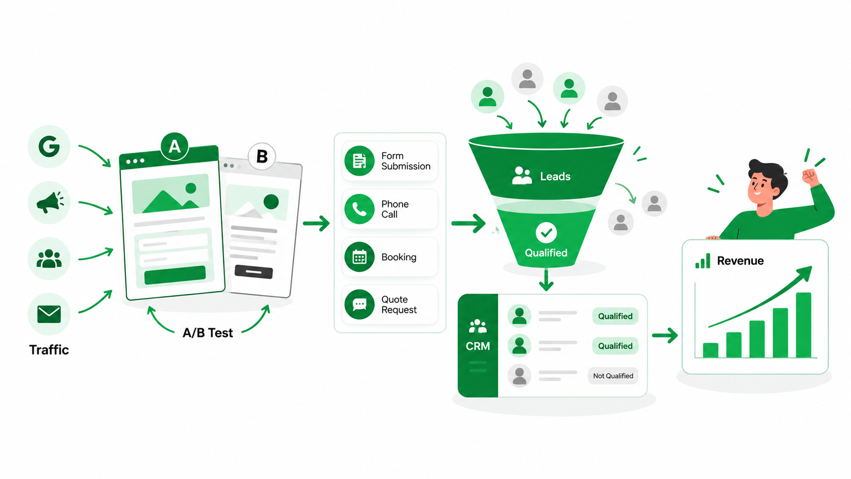
A form submission is a useful starting point, but it doesn’t tell you whether the visitor eventually became a customer. To understand the real value of a landing page, businesses need to follow what happens after someone enquires. Instead of measuring only traffic and submissions, look at the complete conversion funnel:
Traffic → Lead → Qualified Lead → Sales Opportunity → Customer → Revenue
For instance, a marketing agency might receive 80 inquiries from a single landing page. But if only 10 businesses have the right budget and needs, then those 10 prospects are far more valuable than the total number of submissions. By tracking these stages you can see which pages are bringing in serious customers and which just create activity. That distinction should influence every design and optimization decision.
How to Design a Landing Page That Generates Qualified Leads: A 10-Step Process
Building a successful landing page for lead generation takes more than selecting a template, adding a few images, and placing a contact form near the top.
The best pages are designed around how customers make decisions. They look at where visitors are coming from, what they’re after, what might stop them in their tracks, and what would get them to take the next step. Here are ten practical things you can do to help convert the right traffic into valuable business inquiries.
STEP 1: Understand Traffic Source & Visitor Intent
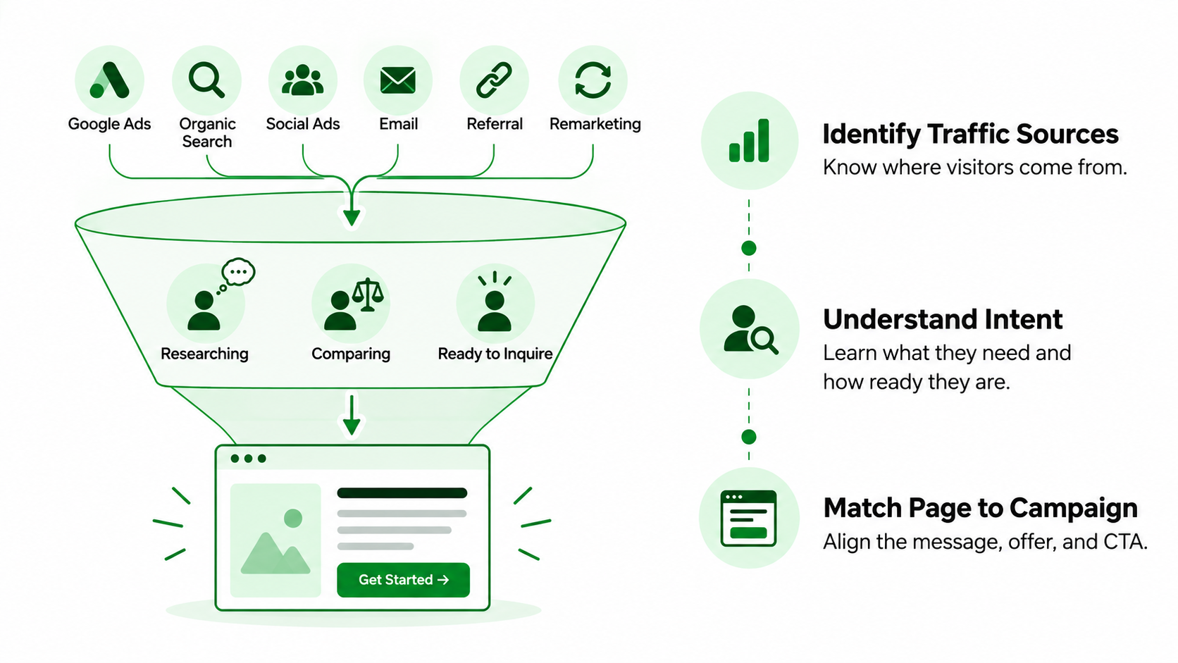
Think about the people who will be visiting the page first, not the colors, layouts, or design elements. Someone searching for a service on Google may be ready to connect with a provider. Social media may lead a customer to the same business, but he may need more information before he will make an inquiry. These differences are related to the message, offer, page structure, and conversion action.
Identify Where Traffic Comes From
Not every traffic source brings visitors with the same expectations or level of interest.
Common sources include:
- Google Search Ads: Often bring people who are actively looking for a particular product or service.
- Organic search: May attract visitors researching problems, comparing providers, or preparing to buy.
- Meta Ads: Can introduce an offer to people who weren’t actively searching for it.
- LinkedIn Ads: May reach professionals researching business services or solutions.
- Email campaigns: Often bring visitors who already know something about the business or its offer.
- Remarketing: Reconnects with people who have previously visited the website or interacted with the brand.
- Referral campaigns: May attract visitors who already have some awareness or recommendation.
A dedicated PPC landing page may need a direct offer and an obvious conversion option. An SEO landing page, meanwhile, may need more detailed information to help visitors understand their options. Knowing where traffic comes from makes it easier to build a page that meets visitors’ expectations.
Understand Search or Audience Intent
Knowing the traffic source is useful, but understanding why people arrived is even more important.
Before designing the page, ask:
- What problem is the visitor trying to solve?
- How much do they already know about the service?
- Are they researching options or ready to make a purchase?
- What result are they hoping to achieve?
- What concerns might stop them from inquiring?
For instance, someone searching for “commercial cleaning services near me” may already be comparing providers and looking for a quote. Someone reading about office hygiene standards may still be learning about the issue. Both visitors could become customers, but they’re not at the same stage. The landing page should reflect that difference.
Match the Page to the Campaign
Visitors should find what they were promised in the advertisement, keyword, or campaign that brought them to the page. Someone who searches “emergency plumber near me” is looking for immediate help, contact information, and details about availability. People searching for “how to prevent plumbing leaks” are probably more interested in practical advice before calling a professional.
If you send both visitors to the same generic page, they may be wondering if they got to the right place. When the landing page content matches the campaign message, visitors can immediately identify the relevance of the offer. This helps clear up confusion and gives them a better reason to stay around.
STEP 2: Create a Clear and Specific Value Proposition
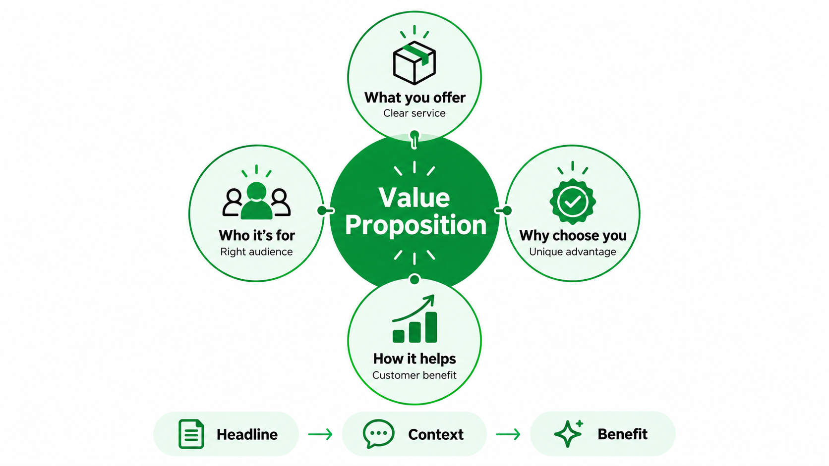
Visitors shouldn’t have to spend several minutes figuring out what a business offers or why they should choose it. A strong value proposition answers four simple questions: What do you provide? Who is it for? How does it help? Why should someone choose you instead of another provider? Ideally, visitors should understand these answers within the first few moments of arriving.
Make the Headline Specific
The first thing visitors notice that has any meaning at all is the headline. While statements like “Solutions Designed for Your Success” sound professional, they don’t tell you what the business actually does. A better headline would be
“Professional Bookkeeping Services for Small Businesses That Need Accurate Financial Records.”
This instantly tells you what the service is and who it’s for. Specific headlines help the right visitors realize they’re in the right place. They also prevent people with unrelated needs from wasting time exploring an offer that doesn’t apply to them.
Use the Supporting Copy to Add Context.
The supporting text should complement the headline, not rephrase it in different words. It can make clear for whom the service is, what problem it solves, what customers can expect, or what makes the offer unique. For example, a bookkeeping company could provide monthly reporting, expense tracking, and ongoing support for the business owner. You want to give visitors enough information to understand what you’re offering without dragging it down with superfluous detail.
Focus on Customer Value
Businesses naturally want to talk about their services, experience, and capabilities. But visitors are usually more interested in what those things mean for them. It provides customers with more transparent financial information without spending hours generating reports.
Good landing page conversion optimization turns business features into benefits people can understand and appreciate. A strong value proposition should give visitors a clear reason to keep reading instead of returning to the search results.
STEP 3: Design the Hero Section around One Primary Conversion Goal
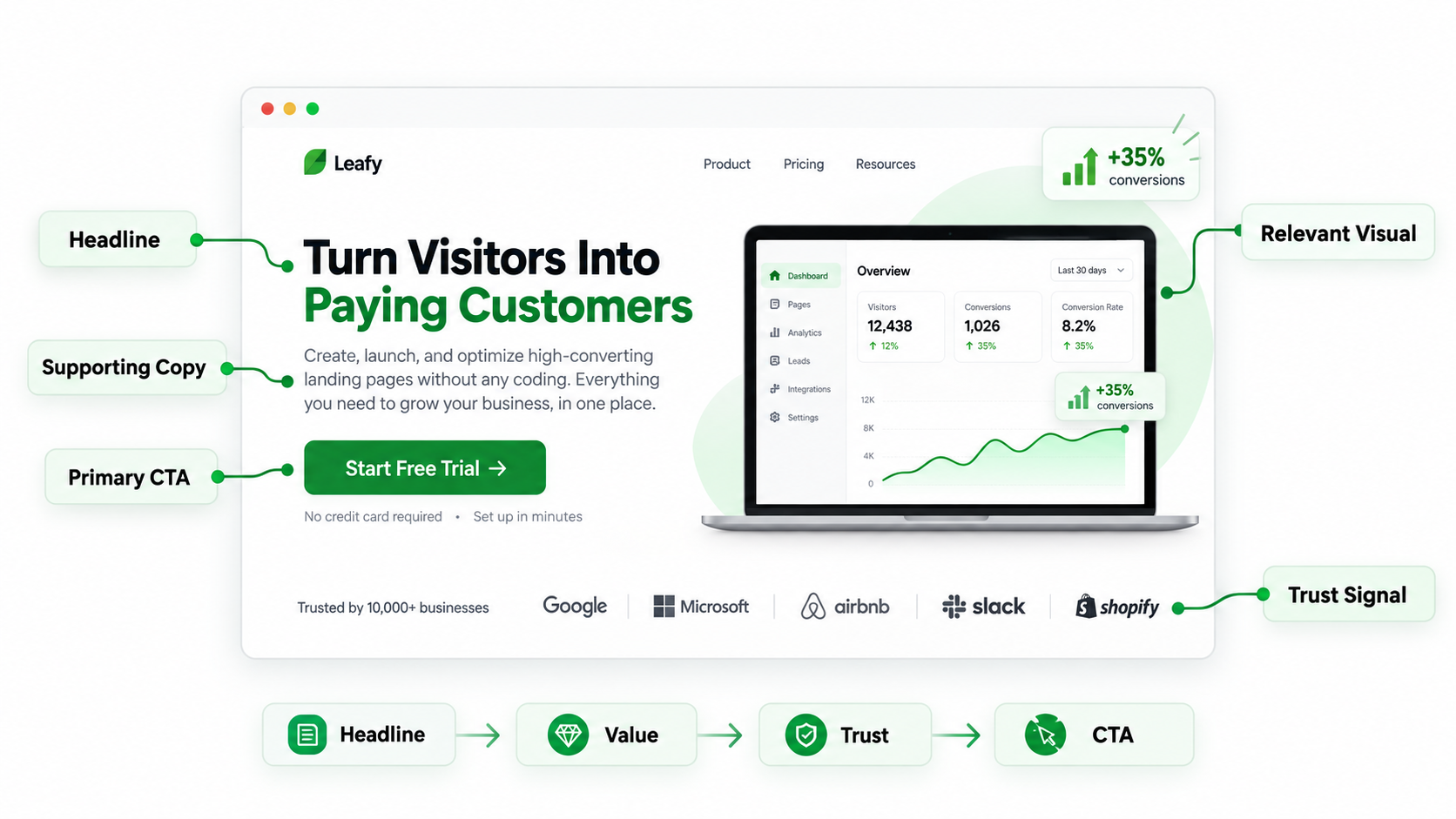
The hero section is the first big chunk of page visitors will see. It needs to explain the offer, show why it’s relevant, give some reassurance, and make the next step easy to understand. A pretty design can help, but clarity rules.
Include the Essential Information
A useful hero section usually contains a few important elements:
- Headline: Clearly explains the service or offer.
- Supporting copy: Adds context about the main benefit and intended audience.
- Primary CTA: Tells visitors what they can do next.
- Relevant visual: Helps people understand the product or service.
- Key trust signal: Provides reassurance through credible evidence.
The elements do not have to appear in the exact same order for all businesses. The right layout depends on the offer, the audience, and the device. The important thing is that the visitors can understand the page without having to work for the information.
Establish a Clear Visual Hierarchy
Visual hierarchy determines what visitors notice first and where their attention goes next.
A useful sequence is
Headline → Value → Trust → CTA
Typography, spacing, contrast, and layout should support this flow. The main headline should be larger than smaller supporting details. You want the primary button to stand out and not be in competition with other equally visible items. Good landing page UX helps visitors find what matters without making them search through the page.
Avoid Too Many Choices
Visitors can be overwhelmed by too many choices, turning a simple decision into a complicated one. If the primary goal is to generate consultation requests, surrounding the main CTA with several unrelated buttons may confuse people.
A service page might use “Book a Consultation” as its main action while keeping a phone option available for visitors who prefer direct contact. The goal isn’t to remove every alternative. It’s to make the most important next step obvious.
Make the CTA Visible
Visitors shouldn’t have to hunt for the button or link that allows them to inquire. The primary call to action should appear where people naturally look after understanding the offer.
More CTAs can be added after relevant information on longer pages. For mobile users, buttons should be legible, easy to tap, and conveniently placed. Even a strong offer can lose potential customers when the next step is difficult to find.
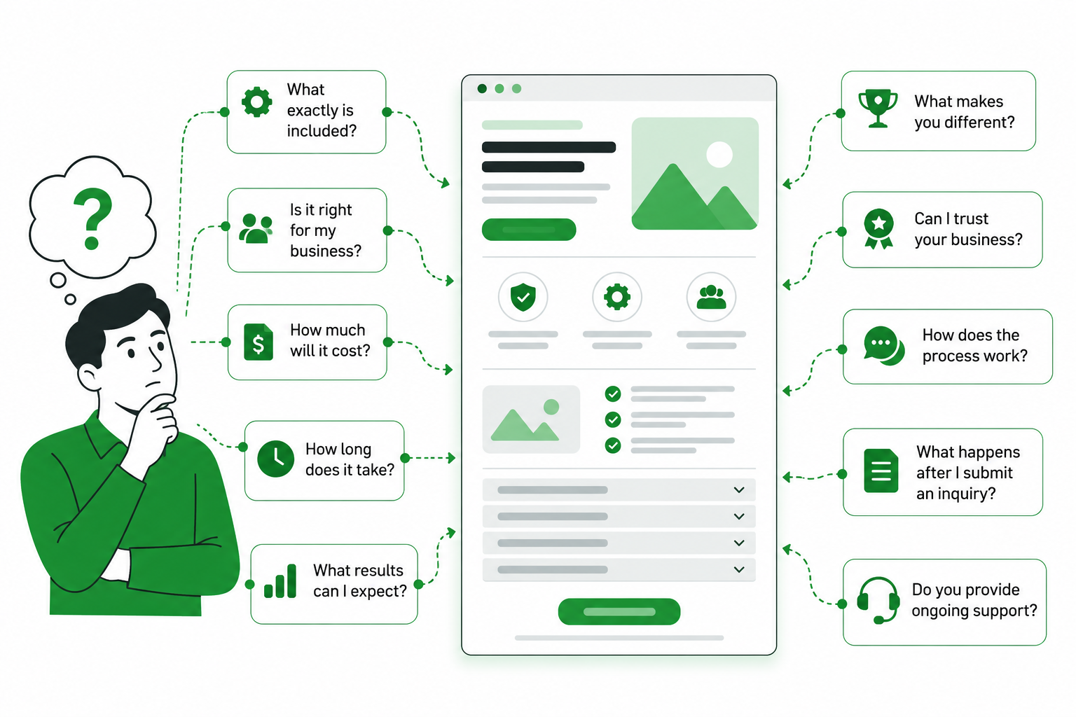
STEP 4: Build the Page around Customer Questions and Objections
A landing page shouldn’t read like a company brochure. Its real purpose is to help visitors decide whether the offer is right for them. Most people have questions before contacting a business. They may want to know about pricing, suitability, expected results, reliability, or what happens after they submit an inquiry. Providing answers to these questions can help put visitors at ease and help generate higher-quality leads.
Identify Pre-Conversion Questions
Start by thinking about what prospects usually ask before becoming customers.
Common questions include:
- What exactly does the business provide?
- Is the service suitable for my situation?
- How does the process work?
- What results can I reasonably expect?
- How much will it cost?
- How long will the process take?
- What makes this provider different?
- Can I trust the business?
- What happens after I submit an inquiry?
These questions can help shape the content of a lead generation landing page. For example, someone considering website development may want to understand project timelines, pricing factors, revision policies, and the consultation process before requesting a proposal.
Organize Sections around Decision-Making
The page should present information in an order that makes sense to visitors.
A useful sequence might be
Problem → Solution → Benefits → How It Works → Evidence → Differentiation → FAQs → CTA
However, this isn’t a fixed formula.
An emergency service might want contact details straight away, but a complex B2B solution might need detailed explanations, case studies, and qualification information before visitors are ready to inquire. The best structure depends on the offer and what the customers need to know before they make up their mind.
Remove Unnecessary Content
More info doesn’t always make a better landing page. Each part should have something to occupy. It should educate, demonstrate value, instill confidence, qualify prospects, or elicit action. If a section isn’t serving any of those purposes, think about simplifying or deleting it.
For instance, a lengthy company history may be less helpful than a clear explanation of how the service works. Effective landing page design best practices focus on making decisions easier rather than filling every available space with content.
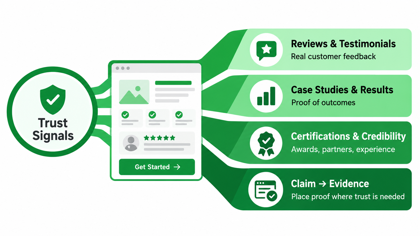
STEP 5: Use Trust Signals Where Visitors Need Reassurance
Even when visitors understand an offer, they may hesitate because they aren’t sure whether the business can deliver what it promises. This is where trust signals make a difference. Reviews, case studies, certifications, and other forms of credible evidence help people feel more comfortable about taking the next step.
Use Customer Reviews and Testimonials
Customer reviews are more convincing when they describe a real experience. A testimonial saying “Great service!” doesn’t tell visitors very much. A review explaining the customer’s original problem, their experience with the business, and the outcome provides something more useful.
For example, a client might describe how an accounting service helped organize overdue records and made monthly reporting easier. Relevant testimonials help potential customers picture what working with the business might actually be like.
Add Relevant Case Studies or Results
Case studies give visitors evidence that the business has handled situations similar to theirs. A useful case study explains the problem, what the business did, and the outcome.
For example, a digital marketing agency could demonstrate how it raised inquiry quality by tweaking campaign targeting and landing-page messaging. But there should always be real evidence behind the results, there should always be enough context to prevent false hope, and the results should always be accurate.
Use Credibility Signals Appropriately
Different businesses need different forms of reassurance. Depending on the industry, useful credibility signals may include:
- Professional certifications and memberships
- Recognized partnerships
- Industry awards
- Years of experience
- Verified client numbers
- Security certifications
- Relevant guarantees
- Media recognition
The important thing is choosing evidence that matters to the customer. One relevant certification may be more persuasive than several unrelated badges placed on the page simply to make it look impressive.
Position Trust throughout the Page
Trust signals are most effective when they are placed near the claims or decisions they support. For example, a customer result relevant to a service benefit might be presented after it. A consultation form may contain a brief review or professional credential.
The idea is simple:
Claim → Evidence
Rather than making several promises and placing all the proof at the bottom, give visitors reassurance when they’re most likely to need it.
STEP 6: Design Forms to Balance Conversion and Lead Quality
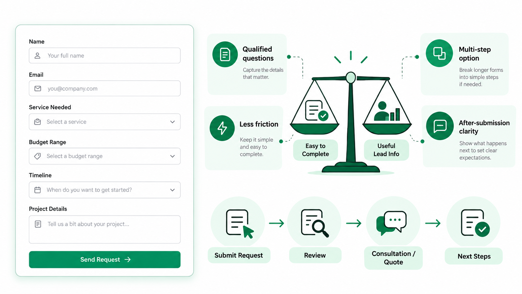
Forms are where interested visitors often turn into actual inquiries. But designing a good form isn’t simply about making it as short as possible. A useful lead form should feel easy to complete while collecting enough information to help the business identify suitable prospects.
Don’t Automatically Minimize Every Form
It is tempting to assume that fewer fields are always preferable. Short forms may bring more submissions, but they may also attract people who don’t understand the service or have little intention of buying.
For a complex B2B service, it can help to ask a few more qualification questions. However, an emergency service may only require a name, phone number, and a brief description of the problem. The number of fields you need depends on your offer, your audience, and your sales process.
Ask Questions That Help Qualify the Lead
Qualification questions should give the sales team useful information about the inquiry.
Depending on the business, relevant fields might include
- Service required
- Customer location
- Company size
- Project type
- Approximate budget range
- Expected timeline
- Specific requirements
For example, a web design company may ask about the type of website, budget, and estimated launch date. These details can help you to find the right projects before the first sales conversation. But there should be a reason for every other question.
Avoid Unnecessary Friction
Visitors may abandon forms if they request information that appears to be excessive or irrelevant. Don’t gather information the sales team doesn’t need at the first step. Forms are easier to fill out when they have clear labels, simple instructions, sensible drop-downs, and helpful error messages. The aim is to ask for useful information without making the inquiry process feel like a long application.
Consider Multi-Step Forms for Complex Enquiries
There are some services that really need more information before you can prepare a meaningful consultation or proposal. With a multi-step form, you can break those questions down into smaller, more digestible steps. For example, the first step could be asking about the service, the second about project requirements, and the last about contact information. While this can make a longer form seem more organized, it’s still wise for businesses to test whether it performs better than a single-page form.
Explain What Happens After Submission
People may hesitate when they don’t know what happens after completing a form.
Here is a short explanation:
Submit Request → Requirements Review → Consultation or Quotation → Next Steps
If the business typically responds within a certain timeframe, mention it accurately. Good form is a balance between ease of completion and useful qualification. It should help the business to identify the right leads and at the same time provide a comfortable and easy experience to the visitors.
STEP 7: Create CTAs That Match Visitor Intent
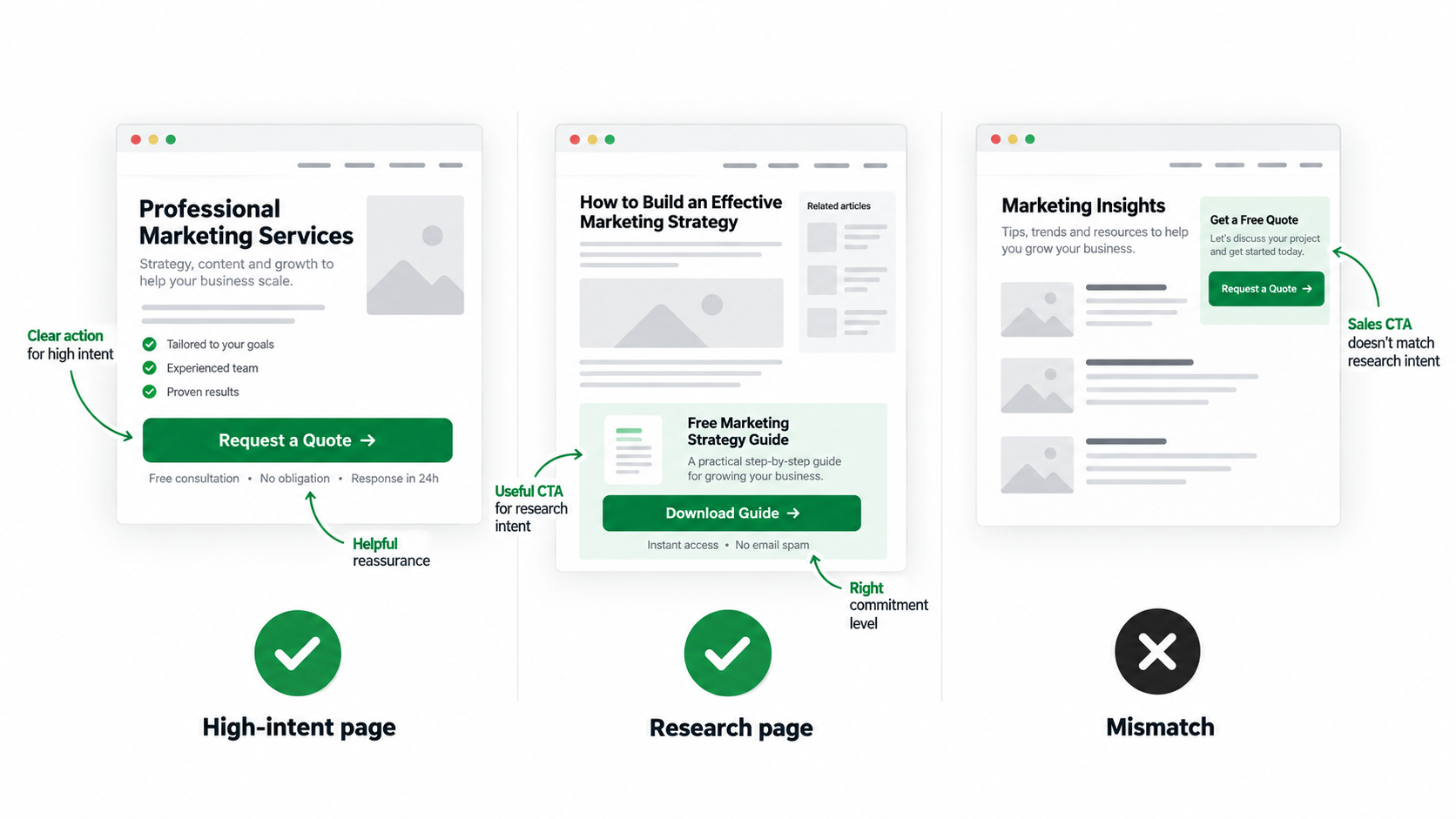
A CTA tells visitors what to do next, but not every CTA gives them a convincing reason to act. Generic text such as “Submit” might technically work, but it doesn’t tell the visitor what they will get. The best CTAs are clear, relevant, and appropriate to the visitor’s level of interest.
Make the Action Clear
CTA wording should describe the next step rather than simply instructing someone to click.
Depending on the offer, suitable examples include
- Request a Quote
- Book a Consultation
- Get Your Free Audit
- Check Availability
- Request a Proposal
These phrases tell visitors what they can expect. For example, “Request a Proposal” is more meaningful to a business customer than “Submit” because it explains the purpose of the action.
Match CTA Commitment to Funnel Stage
Not everyone arriving on a landing page is ready to make the same commitment. Someone who is comparing providers may feel comfortable asking for a quote. A visitor still weighing up their options may wish to see pricing, download a guide, or request an initial assessment. When the action matches the visitor’s intent, the next step feels more natural. Not by putting different buttons all over the page. This means selecting an action that’s right for your audience and your offer.
Repeat CTAs Strategically
Long landing pages need more than one opportunity to convert. Having the same button after each paragraph can get repetitive and too promotional for the page. It’s better to put CTAs after meaningful parts.
For example, visitors may be primed to ask questions after reading about service benefits, case studies, or answers to common questions. Place each CTA in a logical place in the customer journey.
Use Supporting Microcopy
Small bits of text around buttons and forms can answer questions that might otherwise stop someone from asking.
Useful microcopy may explain:
- Expected response time
- Whether the consultation is free
- Whether the request involves any obligation
- How contact information will be used
- Who is eligible for the offer?
- What happens after submission
These details should be accurate and relevant. Clear supporting text can make a conversion-focused landing page feel more reassuring without adding unnecessary content.
STEP 8: Remove UX Friction and Distractions
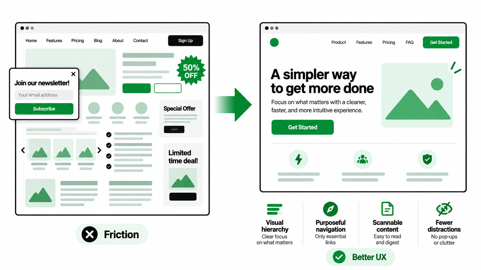
Even excellent copy can struggle when the page itself is difficult to use. Confusing navigation, cluttered layouts, poor spacing, and unnecessary effects can interrupt the visitor’s experience. Good UX design removes these barriers and helps people find the information they need.
Create a Clear Visual Hierarchy
Visual hierarchy allows visitors to see what’s important. Headings, typography, spacing, contrast, and section structure should naturally guide attention. The headline states the offer, supporting text states its value, and the CTA states what to do next. Whitespace matters too. The page is more scannable, and the elements don’t compete for attention by giving important elements lots of breathing room.
Keep Navigation Purposeful
Landing pages that are dedicated to an advertising conversion goal often benefit from limited navigation. However, for some, it’s not always best to remove all navigation options. An organic service page may require internal links, related service info, and other navigation elements to keep visitors exploring more. What is the right approach depends on what you want the page to do. Remove distractions that serve no useful purpose, but keep the navigation visitors genuinely need.
Make Content Scannable
Most people scan a page before deciding whether to read it carefully. Long blocks of uninterrupted text can make useful information harder to find. Use descriptive headings, shorter paragraphs, relevant bullet points, tables, icons, and supporting visuals where it adds value. Highlight key details, but don’t try to make every sentence a showstopper. Good formatting enables visitors to quickly understand the offer and find the answers that matter to them.
Avoid Visual Overload
Animations, sliders, pop-ups, decorative graphics, and too many effects can make a page feel unnecessarily busy. They can also distract from your main conversion objective. For example, a moving banner may distract visitors away from the explanation of the service or inquiry form.
Visual elements should help explain the offer rather than simply make the page look more elaborate. Good user experience is about making decisions easier, not adding as many design features as possible.
STEP 9: Optimize Mobile Experience and Page Performance
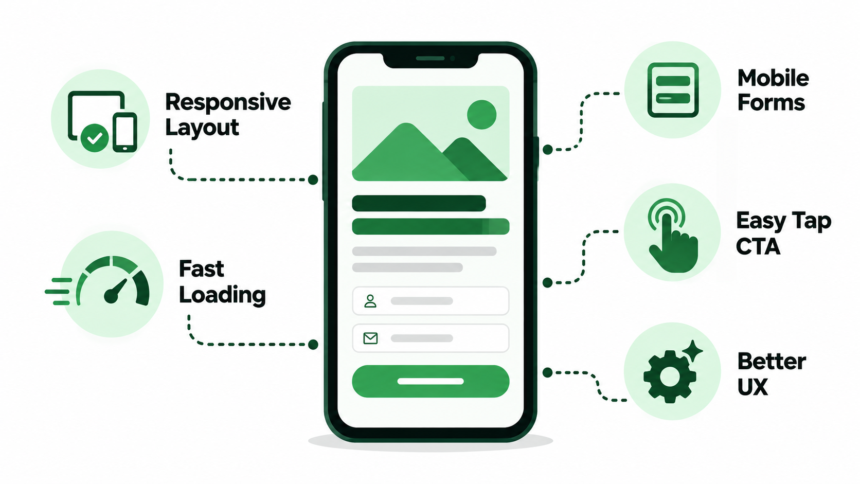
Sure, a landing page might look beautiful on a computer but be a pain to use on a phone. It’s not just about fitting your layout into a smaller screen; mobile optimization is about… Visitors should be able to read, navigate, and take important actions comfortably and without too much effort.
Prioritize Mobile Hierarchy
The most important information on smaller screens should be easy to see and understand. Headlines should be readable, copy should support and be clear, and the primary CTA should be easy to find. What works as a layout on the desktop may need to be arranged differently on the mobile.
For example, a large image beside the headline might look nice on a desktop but be cluttered on a smartphone. It could be better to place it below the main message.
Make Forms Mobile-Friendly
Mobile forms should be designed for people using touch screens.
Review details such as
- Field sizes and spacing
- Appropriate mobile keyboard types
- Dropdown usability
- Clear validation messages
- Autofill support
- Button accessibility
- Readable labels and instructions
For example, a phone-number field should bring up a suitable numeric keyboard instead of forcing visitors to switch input types. Little improvements like this can make forms massively easier to fill in on mobile.
Improve Loading Performance
Slow pages can lose visitors before they ever see the offer. Common issues include large images, unnecessary scripts, heavy videos, too many tracking tools, and badly optimized code. Businesses should periodically revisit these and remove anything that adds loading time but no meaningful value. Better page speed creates a smoother experience, especially for mobile visitors using slower connections.
Protect Core Web Vitals and UX
Core Web Vitals measure key aspects of user satisfaction, including loading, interactivity, and visual stability. If a page changes unexpectedly during loading or is slow to respond to clicks, visitors get frustrated.
These problems matter even more when businesses are paying for every click. Poor performance can waste valuable traffic before potential customers reach the form or CTA.
STEP 10: Track Lead Quality and Continuously Test the Page
A landing page shouldn’t be considered finished the moment it goes live. Visitor behavior, campaign performance, customer expectations, and business needs can change over time. Ongoing landing page CRO helps businesses understand what’s working, where visitors struggle, and which improvements are worth testing.
Track Important Conversion Events
Different businesses need to track different actions. Relevant conversion events may include:
- Form submissions
- Phone calls
- Appointment bookings
- Quote requests
- Purchases
- Resource downloads
- Meaningful interactions
Tools such as GA4 and Google Tag Manager can support conversion tracking by helping businesses understand how visitors interact with the page. However, tracking needs to be configured carefully so the same action isn’t counted multiple times.
Connect Marketing Data with Sales Outcomes
Form submissions tell you how many people asked for more information, but not if those people became customers. Link marketing information with CRM and sales data whenever possible. This allows you to see which campaigns, keywords, audiences, and landing pages are generating qualified opportunities.
For example, two pages may generate similar enquiry volumes, but one may consistently attract prospects with larger budgets and stronger buying intent. Without sales feedback, that difference may never become obvious.
Run Controlled A/B Tests
A/B testing compares different versions of a page to see whether a particular change improves performance. Useful testing areas include headlines, offers, hero layouts, CTAs, form length, testimonials, page structure, imagery, pricing presentation, and trust signals.
For example, a business might compare “Book a Consultation” with “Request a Free Assessment.” The goal isn’t to keep changing the page until the numbers look better for a few days. It’s to understand which changes genuinely influence visitor behavior.
Test One Meaningful Hypothesis at a Time
Random redesigns make it difficult to know why performance changes.
A better testing process follows:
Data → Hypothesis → Test → Result → Learning → Next Test
Maybe your analytics show that a lot of visitors are starting a form but not finishing it. One good hypothesis is that the form asks for too much information. The business could test a shorter version and compare not only submission numbers but also the quality of leads that result. This results in useful learning rather than guessing.
Optimize for Revenue, Not Just Conversion Rate
The final goal should go beyond increasing form submissions. A more useful measurement sequence is:
Conversion Rate → Qualified Lead Rate → Opportunity Rate → Close Rate → Customer Acquisition Cost → Revenue
A landing page generating fewer but more valuable enquiries may contribute much more to business growth. That’s why conversion rate optimization should consider the entire customer journey rather than focusing only on the moment someone clicks a button.
What Sections Should a High-Converting Landing Page Include?
There isn’t one layout that works for every business. A local emergency service, a software company, and a professional consulting firm may all need different landing-page structures. However, many successful high-converting landing pages include similar types of information because visitors often need clarity and reassurance before taking action.
A practical structure may include:
- Hero / Value Proposition: Explain the offer, intended audience, and main benefit.
- Trust Signals: Provide early reassurance through relevant reviews, credentials, or evidence.
- Customer Problem: Show that the business understands the visitor’s situation.
- Solution / Service: Explain how the offer addresses that problem.
- Key Benefits: Highlight outcomes that matter to the customer.
- How It Works: Describe the process and what visitors can expect.
- Why Choose Us: Explain meaningful differences from competing providers.
- Case Studies / Results / Reviews: Support important claims with evidence.
- Qualification / Offer Details: Clarify suitability, requirements, pricing, or other important conditions.
- FAQs / Objection Handling: Address concerns that may prevent inquiries.
- Final CTA: Give visitors a clear opportunity to take the next step.
This structure is a helpful starting point, but it shouldn’t become a rigid template.
For example, an emergency plumbing page might immediately ask for your phone number and availability. A visitor to a B2B consulting site might need to read detailed case studies and process descriptions before they’re ready to submit an inquiry. The right structure is a reflection of how the customer decides. It should provide people with the information they want in the order they are most likely to want it.
Landing Pages for SEO vs Google Ads vs Social Ads: Should They Be Different?
Visitors from organic search, paid search, and social advertising aren’t always at the same level of awareness or buying intent. That doesn’t mean every campaign needs a totally separate page. But the content and structure should meet the expectations of visitors for each source.
SEO Landing Pages
An SEO landing page often needs to satisfy both search intent and broader informational needs. Visitors may arrive while researching a topic, comparing providers, or looking for a particular service.
The page may need more detailed explanations, relevant headings, internal links, FAQs, and supporting information. A commercial cleaning service’s organic page, for instance, may include information about the services they offer, their service areas, industries they serve, and how to get a quote. The difficulty is to balance organic visibility with a clear path to conversion.
Google Ads Landing Pages
A Google Ads landing page generally needs close alignment between the keyword, advertisement, offer, and CTA. Someone clicking an advertisement for “office cleaning services in Melbourne” should arrive on a page that clearly addresses that service and location.
Sending them to a generic homepage may force them to search again for the information promised in the advertisement. A well-matched PPC landing page avoids that disconnect by making the offer and next step immediately relevant.
Social and Meta Ads Landing Pages
Visitors arriving from Meta Ads or other social campaigns may not have been actively looking for the product or service. They may need more context before considering an inquiry. For example, someone seeing an advertisement for a business productivity tool might first need to understand the problem it solves and why that problem matters.
Social landing pages may therefore benefit from stronger problem awareness, visual explanations, benefit-focused messaging, and credible evidence. The page should help visitors move from initial interest toward a more informed decision.
Don’t Use One Generic Landing Page for Every Campaign
The generic page for all audiences can reduce relevance. You may see various campaigns for services, locations, industries, or stages in the buying process. For instance, a campaign promoting SEO services to a local business would need different messaging than a campaign promoting SEO services to an enterprise e-commerce brand.
However, creating dozens of nearly identical pages isn’t necessarily helpful either. Separate pages should exist if they serve meaningfully different needs. When the audience and offer are similar, it can be better to improve one strong page than to create unnecessary duplicate pages.
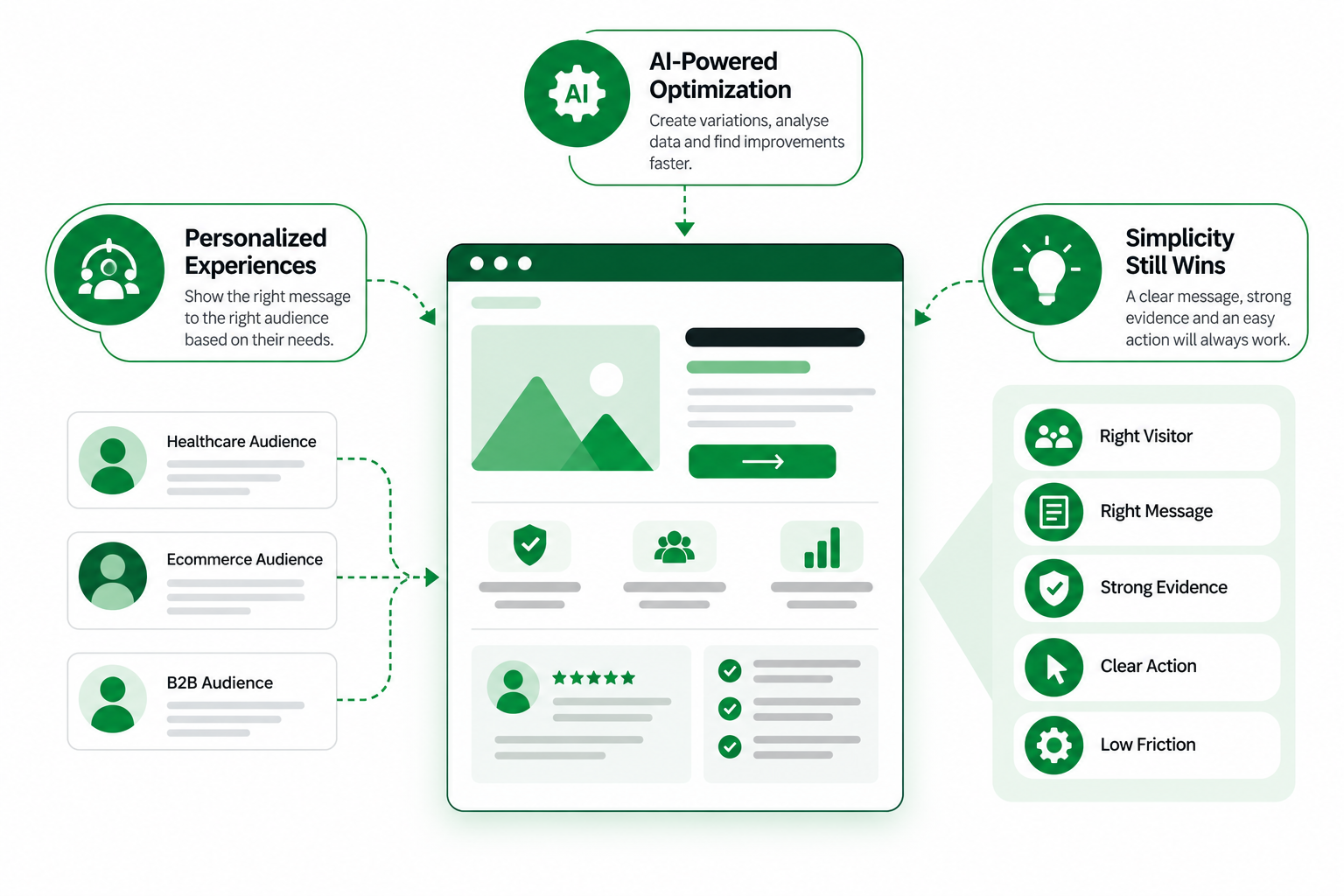
How AI Can Help Improve Landing Page Conversion
Artificial intelligence is becoming a helpful tool in landing page research, content development, and performance analysis. However, AI should be supporting the optimization process, not replacing customer understanding or proven evidence.
Analyze Large Amounts of Feedback
Businesses may collect feedback through surveys, support conversations, sales notes, and website behavior reports. Reviewing all of this manually can take considerable time.
Artificial intelligence can assist in summarizing common issues and finding trends to explore. However, a complaint that is repeated doesn’t automatically translate into a specific design change that will improve conversions. Testing is still to be done.
Keep Human Judgment in Control
AI-generated content should never invent customer testimonials, statistics, guarantees, case-study results, or product capabilities. Those claims need genuine evidence.
The most useful approach combines:
Real Customer Data + AI Assistance + Human Strategy + Controlled Testing
AI can help teams work faster, but businesses still need people who understand their customers, evaluate the evidence, and make responsible decisions.
Common Landing Page Mistakes That Reduce Lead Quality and Conversions
Many landing pages fail because of small issues that add up during the visitor’s journey. A confusing headline, a weak CTA, a slow page, or an unnecessary question on a form may seem like small things on their own. All of these can cause a visitor to stop or turn away.
Common mistakes include:
- Sending every campaign to the homepage: Visitors may struggle to find the specific service or offer they expected.
- Using weak or vague headlines: Generic wording makes it difficult to understand the page’s purpose.
- Poor message match between ad and page: Inconsistent promises can create confusion and reduce trust.
- Focusing on the company instead of customer value: Visitors want to know how the offer helps them.
- Multiple competing conversion goals: Too many choices can distract from the main action.
- Generic “Submit” CTAs: Unclear wording gives visitors little reason to act.
- Asking for too much information unnecessarily: Excessive form fields can discourage inquiries.
- Removing all qualification to increase conversion rate: More submissions may come at the expense of lead quality.
- Hiding important information: Unclear pricing, processes, or service details can create hesitation.
- Making unsupported marketing claims: Promises without evidence can damage credibility.
- Using weak or fake social proof: Generic or misleading reviews offer little genuine reassurance.
The common mistake behind these mistakes is friction that need not be there. Each added question, perplexing message, distracting element, delay, or inconsistency is yet another reason for visitors to stop and think. A good landing page removes those barriers but still provides enough information to attract the right prospects.
How to Measure Whether Your Landing Page Is Actually Working
A landing page should be evaluated through more than its conversion rate. Businesses need to understand who visits, how people interact with the page, which actions they complete, and whether those actions lead to meaningful sales opportunities. A useful measurement approach looks at four areas.
Conversion Performance
Next, measure the actions visitors actually take. Useful metrics include CTA clicks, form starts, form completions, calls, bookings, and conversion rate.
Comparing form starts to completed submissions allows you to see where people are dropping off. If many visitors click the CTA but only a few fill in the form, the issue may be the form’s length, confusing questions, or technical problems. These insights help businesses identify where landing page conversion optimization efforts should focus.
Lead Quality
Businesses will have a sense of the quality of inquiries, and the submission figures will be more useful. Track: spam submissions, qualified lead rate, sales accepted leads and opportunities, and disqualified leads. For example, a campaign might produce 100 inquiries, but only 15 of those are prospects. Another campaign might bring in 50 inquiries, 30 qualifying. The 2nd campaign may get fewer submissions but may be more valuable for the business. This is why qualified lead generation should remain a central goal.
Commercial Performance
Ultimately, landing pages should contribute to actual business results.
Important commercial metrics include:
Cost per Qualified Lead → Cost per Opportunity → Customer Acquisition Cost → Conversion to Sale → Revenue → ROAS / ROI
These measures are particularly important in the paid advertising space, where each click comes with a price. For instance, a landing page that reduces cost per form submission but attracts less qualified leads can increase the workload of the sales team without increasing revenue. Linking landing page data to sales results helps companies identify which changes are worth making.
The Future of High-Converting Landing Page Design
Landing-page technology will keep evolving, particularly as AI, analytics, and personalization become more accessible. But the fundamental reasons for conversion are unlikely to change. Visitors still want to see relevant information, credible proof, clear benefits, and an easy way to take the next step.
Personalization Will Become More Accessible
Even more ability for businesses to customize the landing page experience based on the context of the campaign, characteristics of the audience, and the intent of the visitor. For example, a company that serves multiple industries may serve more relevant messaging to visitors coming from industry-specific campaigns. Personalization can improve relevance when it is based on real audience needs. But businesses should seek to avoid unnecessary complexity, or the collection of personal information without a good reason.
AI Will Accelerate Optimization
AI can make landing-page research, creative development, feedback analysis, and experimentation faster. Marketers might be able to produce more headline variations, organize customer concerns, and uncover potential usability issues with less manual effort. But faster testing doesn’t automatically lead to better outcomes. Businesses still need reliable data, clear hypotheses and careful evaluation before changes are adopted.
Simplicity Will Remain Powerful
Despite improvements in technology, effective landing pages will still depend on a few basic principles.
Right Visitor + Right Message + Strong Evidence + Clear Action + Low Friction
A page doesn’t need complex animations, over-personalization, or a dozen conversion elements to perform well. It needs to know its audience, have a relevant offer, be believable, and make the next step easy. Technology can help with these basics, but it can’t substitute them.
Conclusion
A high-converting landing page isn’t simply an attractive webpage with a form and a brightly colored button. It’s a carefully planned experience that helps the right visitors understand an offer, recognize its value, and take a meaningful next step. Effective landing page design begins with visitor intent and continues through clear messaging, a focused hero section, helpful information, credible evidence, well-designed forms, relevant CTAs, mobile usability, and ongoing testing. Every element should make the decision easier rather than adding unnecessary friction.
More importantly, businesses need to look beyond traffic and form submissions. A successful landing page should contribute to qualified enquiries, genuine sales opportunities, and revenue. That requires accurate tracking, feedback from sales teams, and regular improvements based on evidence. When design decisions reflect real customer needs and business goals, landing pages become more than conversion tools. They become reliable contributors to long-term business growth.
Getting traffic but struggling to turn visitors into qualified enquiries?
A stronger landing page can make a real difference. At eSign Web Services, we combine landing page design, UX, SEO, paid advertising, and conversion optimization to help businesses improve lead quality, remove friction, and generate more meaningful customer opportunities.
Frequently Asked Questions
Question: What is a landing page, and how is it different from a website page?
Answer: A landing page is a page that is designed for a specific audience, offer, or conversion objective. For example . . . Request a quote. Or book a consultation. A generic page on a website can have different purposes like navigation, information, etc. Landing pages tend to be more targeted, with the aim of getting people to take a specific action.
Question: What makes a landing page high-converting?
Answer: A high-converting landing page aligns visitor intent with a clear offer, relevant messaging, credible proof, and an easy next step. It should load fast, be mobile-friendly, and have answers to key customer questions. Most importantly, it should attract suitable prospects rather than simply increasing the number of form submissions.
Question: What is a good landing page conversion rate?
Answer: There’s no one conversion rate to aim for for landing pages. Performance is tied to industry, traffic source, offer, audience, and conversion action. If more leads convert to customers, a lower conversion rate can still be better. Businesses should consider lead quality, acquisition costs, and revenue alongside conversion rates.
Question: How do you design a landing page for qualified leads?
Answer: First understand the targeted audience and what they are looking for. Utilize a clear headline that addresses the offer. Make sure you understand the deal. Answer common questions. Display the right trust signals. Add qualification questions that help identify good prospects, but don’t make the form too cumbersome. Track what happens after submission to understand actual lead quality.
Question: How many form fields should a lead-generation landing page have?
Answer: The ideal number of form fields depends on the service, target audience, and sales process. For simple enquiries, basic contact details may be enough. More complex services might require information about budget, project requirements, or timelines. Every field should have a clear purpose, helping businesses collect relevant details without discouraging potential customers from submitting an enquiry.
Author Details

Ashwani Kumar Sharma
Ashwani has been actively involved in SEO services since 2005. His expertise and distinctive work approaches have made him one of the most experienced and trusted SEO experts in the industry. He is a certified SEO and Google Ads professional. He also has strong business development skills in advanced SEO, PPC, and digital marketing strategies.


