Why Poor UX Is Costing Your Business Leads and How to Fix It

A poor website user experience doesn’t just feel “a bit off.” It quietly bleeds money from your pipeline. Visitors land on your site ready to evaluate you, but then something small breaks the flow: slow loading pages, confusing navigation, a cluttered layout, or a form that feels like work. They don’t send an angry email. They simply close the tab and try someone else.
This is why UX is one of the most expensive blind spots for small businesses, startups, and agencies. You keep spending on SEO, Google Ads, and social campaigns, but you’re leaking leads at the point where the decision is made. The worst part? Most UX issues aren’t dramatic. They’re subtle friction points that stack up until users decide, “this feels like work,” and drop off.
The good news: you don’t need a complete redesign to stop the damage. Most problems can be diagnosed with real data and fixed with small, strategic moves. In this guide, we’ll look at the financial impact of poor UX on business, the warning signs your site is quietly pushing customers away, the less obvious poor UX examples, and practical steps for how to improve website UX without burning your entire budget on design.
The Real Price of Poor Website Design
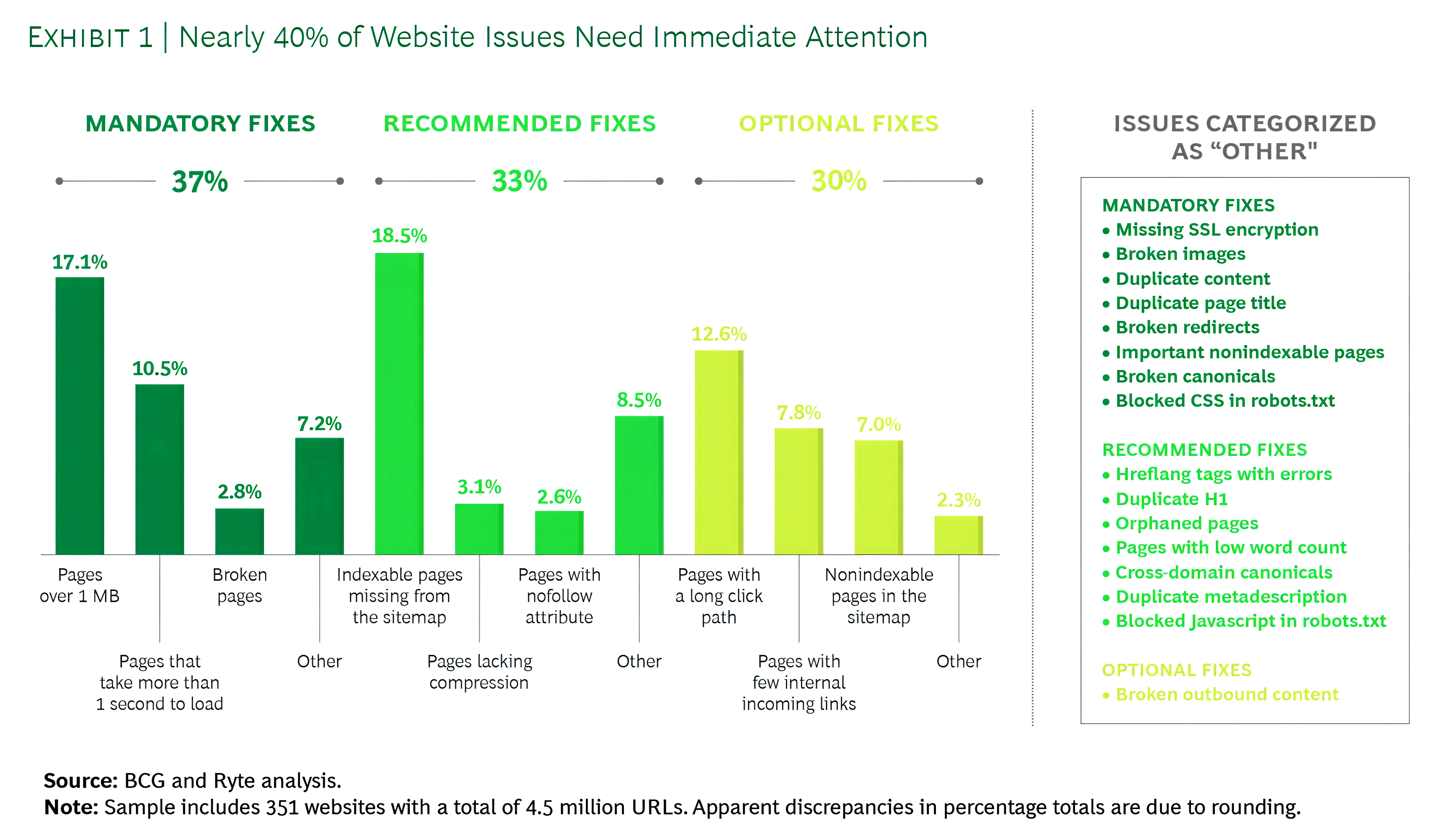
When UX breaks, revenue slips through cracks that don’t show up on a simple dashboard. Confusing menus and a cluttered layout cause users to bounce before they ever see your core offer. Slow loading pages kill intent on mobile, where people simply won’t wait. Industry studies show that even a one-second delay can significantly affect conversions, and cart abandonment averages around 70% across e-commerce, much of that tied directly to friction in forms and checkout flows. These are classic bad user experience on website scenarios that quietly erode profits. And it’s not rare; large-scale audits consistently find that a big portion of sites have issues that need immediate fixes, especially around speed, broken pages, and trust basics.
Beyond immediate sales, bad UX damages your brand in ways that are harder to quantify but very real. A buggy interface, broken links, or awkward layout make your company feel careless. People judge the quality of your service by the quality of your site. If your site looks outdated, unstable, or hard to use, it signals risk. Visitors may not consciously analyze every detail, but they feel that something is “off” and opt for a competitor that simply feels easier and safer.
Then there’s customer lifetime value. Frustrated users rarely come back. Even those who convert once are unlikely to return if the experience felt like work. You end up spending more to acquire new customers than to retain existing ones, and you lose referrals because no one recommends a site that was painful to use. That long-tail revenue loss is the real impact of poor UX on business: lower conversions today and weaker loyalty tomorrow.
Warning Signs Your Website Is Pushing Customers Away
Most sites don’t fall apart dramatically; they quietly underperform. Metrics are your first warning system. A consistently high bounce rate on key pages tells you that visitors either didn’t get what they expected or found the page too slow, confusing, or irrelevant. Short average session durations and low engagement metrics are additional signs that users aren’t willing to explore. Tools like GA4, heatmaps, and scroll tracking help you see whether people are even reaching your value proposition or CTA before leaving.
Low conversion rates across key actions; such as demo requests, quote forms, sign-ups, or checkouts, are another red flag. If traffic volume is healthy but enquiries stay flat, something in the journey is breaking trust or momentum. This is where UX mistakes that hurt conversions show up most clearly: long forms, unclear steps, missing feedback when something goes wrong, or CTAs that don’t stand out. A pattern of UX issues that reduce leads usually won’t fix itself; it needs deliberate diagnosis and testing.
Customer feedback is the third signal; and it’s often brutally honest if you’re paying attention. Complaints about “not finding pricing,” “the form not working,” or “the site being too slow on my phone” are not minor remarks; they’re UX diagnoses in plain language. Support tickets, chat logs, and sales calls often describe website UX problems more clearly than any internal meeting.
When Customer Feedback Becomes Your UX Roadmap
Before guessing which layout change will help, look closely at recurring complaints from support tickets, emails, and sales calls. Users are often pointing at the exact friction points that drive them away.
Common feedback patterns that signal serious UX problems include:
- “I couldn’t find what I was looking for.” Often a sign of confusing navigation or poor information hierarchy.
- “Your form didn’t go through.” Indicates broken validation, unclear error messages, or layout issues on smaller screens.
- “The site was too slow.” Usually tied to heavy assets, unoptimized code, or slow loading pages.
- “It didn’t work properly on my phone.” Clear proof of mobile usability issues that need urgent attention.
- “I wasn’t sure what to click next.” A direct indictment of vague CTAs and unclear visual flow.
Turn these patterns into a prioritized list of fixes, and you’ll improve both UX and lead generation faster than guessing based on internal opinions.
The Hidden Ways Poor UX Kills Leads
Poor UX rarely shows up as one huge failure. It’s usually a pile-up of small frictions that quietly drain intent. A menu that feels cluttered, a label that’s slightly unclear, a form field that feels unnecessary; each one adds cognitive load. Visitors have to think harder than they should, and that “extra effort” feeling is what triggers exits. On desktop, people sometimes push through. On mobile, they don’t. They aren’t diagnosing your site; they’re reacting to friction and backing out from a poor website user experience.
Trust can collapse even faster. When a page feels slow, visuals load late, or the layout shifts while someone is trying to read, your site starts to feel unreliable. Buttons that don’t respond instantly, awkward spacing, and inconsistent branding create subtle doubt: If the website feels messy, will the service be messy too? Even strong offers lose to competitors that feel cleaner, clearer, and more stable. What looks like a “design detail” becomes a trust problem; and trust is what turns visits into enquiries.
The final blow is distraction and fatigue. People browse with notifications, multiple tabs, and a dozen alternatives one click away. Autoplay videos, aggressive pop-ups, and heavy animations don’t increase interest; they break attention and create irritation. Confusing navigation, slow pages, poorly placed CTAs, and overwhelming forms all lead to the same outcome: users feel tired before they feel convinced. The most damaging poor UX examples aren’t always obvious bugs. They’re the patterns that make your site feel unclear, untrustworthy, and harder than it needs to be.
Common UX Problems That Crush Conversions
Most website UX problems fall into a small set of patterns that repeat across industries. Navigation is one. When menus are overloaded, labels are vague, or key pages like “Pricing” and “Contact” are buried, visitors feel lost before they even begin evaluating your offer. Strong UX flattens that path: logical categories, simple wording, and clear entry points for different segments of your audience.
Messaging and hierarchy are another. Users skim, not study. If your hero section doesn’t clearly say what you do, who you do it for, and why it matters, people won’t dig for answers. Walls of text without headings, bullets, and visual structure lead to low engagement metrics and quick exits. Visual hierarchy; bold headings, clear subheads, and strategically placed CTAs; guides the eye and reduces mental effort so that people can understand your offer in seconds rather than minutes.
Forms are the third big leak. They’re where intent turns into action, and also where many leads die. Overly long forms, unclear error messages, or vague outcomes make users hesitate. These are classic UX issues that reduce leads that can often be fixed faster than most design projects.
Why Your Forms Quietly Destroy Conversions
Instead of assuming “people just don’t want to fill forms,” examine how much effort your current setup demands.
Classic form problems that reduce leads include:
- Too many fields that feel unnecessary or intrusive, especially on mobile.
- No clear explanation of why information is needed or what happens next.
- Poor layout and spacing make forms feel cramped or confusing.
- Weak feedback when errors occur, forcing users to guess what went wrong.
- Lack of trust cues (privacy notes, SSL indicators, reassurance around data usage).
Shorter, better-explained forms with friendly microcopy and visible reassurance often outperform fancy redesigns. In many cases, trimming just a few fields and clarifying the outcome can significantly boost conversions.
Mobile UX: Where Most Lead Loss Happens
If your mobile experience isn’t smooth, you’re almost certainly leaving money on the table. For many businesses, more than half of traffic now comes from smartphones, yet the site is often designed with desktops in mind first. On small screens, small mistakes become big ones. Buttons that looked fine on a monitor become tiny tap targets. Sticky elements that seemed helpful end up covering key content or CTAs. Users who have to zoom, pinch, or scroll horizontally interpret the experience as “this site isn’t built for me”; textbook mobile usability issues that kill trust.
Performance is even more unforgiving on mobile. Large, uncompressed images, third-party scripts, and unoptimized code all combine into slow, jittery pages. When visitors are on 4G or patchy Wi-Fi, slow loading pages of just a few extra seconds are enough to trigger abandonment. For paid campaigns directing traffic to these pages, that means your ad budget is literally evaporating before users even read your headline. Mobile page speed tools, real-user monitoring, and basic image compression should be non-negotiable in your optimization stack.
CTAs are another recurring failure point. If “Call Now,” “Book a Consultation,” or “Get a Quote” buttons appear only at the bottom or blend into the design, many users will never reach them. Strong mobile UX brings key actions into view early, makes them thumb-friendly, and keeps them visible without being obnoxious. Small tweaks here often deliver large gains in mobile conversions.
UX and Trust: Why People Hesitate to Contact You
Trust is the real currency of online conversion, and UX either amplifies it or erodes it. When your site lacks visible proof; reviews, testimonials, case studies, or recognizable certifications; users hesitate. They may like your offer, but they don’t see evidence that others have had a good experience. In competitive categories, the absence of trust signals can be the deciding factor that pushes them to a more “proven” competitor. One of the overlooked benefits of good UX design is how naturally it showcases social proof in the right places, without overwhelming visitors.
Clarity around pricing and process also plays a huge role in whether someone reaches out. People don’t like uncertainty, especially when it involves money. If visitors can’t understand roughly what your service costs, what the steps look like, or how long things will take, they default to caution. Even simple elements like “Here’s how it works” timelines or “What to expect after you submit this form” copy can dramatically reduce anxiety.
Finally, CTAs themselves signal how much you respect your users. Generic buttons like “Submit” feel low-value and cold. Thoughtful CTAs like “Get My Free Audit” or “Talk to a Strategist” feel tailored and helpful. When CTAs are buried, inconsistent, or vague, people don’t feel guided. The combination of missing proof, unclear process, and weak CTAs creates a quiet but powerful force: hesitation. And hesitation is where leads die.
How to Diagnose UX Problems (Without Guessing)
While anyone can sense when a site isn’t working, only a UX designer has the trained eye and tools to diagnose the deeper experience gaps and turn insights into meaningful improvements. Start with behavioral data rather than internal opinions. Analytics will show you where people enter, where they exit, and which pages act like dead ends. High drop-off at key funnel steps points to UX issues that reduce leads; even if stakeholders think “that page is fine.” Heatmaps and session recordings add context, revealing rage clicks, ignored sections, and confusing layouts in action.
Next, audit your money pages first. These are your main service pages, landing pages, and contact or checkout flows; the paths with the highest commercial intent. Don’t waste time polishing blog archives before fixing a broken quote form. For most businesses, a small set of URLs controls a large share of revenue. Prioritizing UX work there multiplies the ROI of every improvement and immediately supports both organic and paid channels.
Finally, avoid the temptation to redesign everything at once. Instead, think like a CRO specialist. Test small, specific changes; headline clarity, CTA placement, form length, trust badges, mobile spacing; and measure impact. Over time, this iterative approach naturally pushes you toward UX best practices for websites, proven by your own data, not just generic checklists. UX isn’t a one-time project; it’s a continuous feedback loop.
Fix Plan: Improve UX and Lift Leads
A practical UX plan doesn’t start with wireframes; it begins with clarity. Make the first screen of each key page ruthlessly focused: what you do, who it’s for, why it matters, and what the next step is. Strip away distractions that compete with your primary action. This alone can dramatically influence how UX affects conversion rates, because users no longer have to decode your offer before deciding what to do.
Then, reduce friction and increase confidence in parallel. Shorten forms to the minimum required, especially on mobile. Add reviews, ratings, client logos, and clear microcopy around privacy near your CTAs. Fix slow loading pages and visual instability so people feel safe interacting with your site. These are foundational moves that support every channel you invest in. They’re also at the core of how to improve website UX in a way that’s measurable and commercially meaningful.
Finally, align UX with your marketing. If your Google Ads promise “Free SEO Audit,” your landing page should lead with that; not generic agency messaging. If blog posts drive organic traffic, give readers a clear path to relevant services. Keep design, tone, and CTAs consistent across pages so users don’t feel like they’re jumping between different brands. When your UX, messaging, and traffic strategy are aligned, every click becomes more valuable—and your site finally starts working like the conversion engine it’s supposed to be.
Wrapping It Up
A poor website user experience isn’t just a design flaw; it’s a silent profit killer. It drives up acquisition costs, depresses conversions, and weakens long-term loyalty; often without obvious errors to blame. The combination of confusing navigation, slow loading pages, vague messaging, demanding forms, and weak trust signals quietly trains users to leave before they ever experience your actual value. You might look at your traffic numbers and think your marketing is working, but if people aren’t submitting forms, booking calls, or completing checkouts, your UX is working against you.
The upside is that UX is fixable, and often faster than you think. You don’t need a dramatic redesign to start winning back leads. Begin with data: analyze high bounce rate pages, watch recordings, listen to support complaints, and map where users drop out of your funnel. Then focus on the pages that matter most; your top service pages, landing pages, and contact or checkout flows. Simplify journeys, clarify actions, surface social proof, and treat mobile as your primary experience, not an afterthought.
In a crowded digital landscape, the businesses that win aren’t the ones shouting the loudest; they’re the ones that make acting on intent feel effortless. When you commit to better UX, every marketing dollar works harder, every visit has a clearer path, and every serious visitor has a fair chance to become a lead.
Give Your Users a Smoother Story to Follow
UX isn’t guesswork; it’s a trail of micro-signals showing where users struggle or glide. eSign Web Services follows that trail to uncover what’s slowing people down. Study the journey, remove friction, and let your website become the quiet engine that moves users forward rather than losing them mid-scroll.
Get your free consultation today and start turning poor UX into better business results.
Frequently Asked Questions
Question: How do I know if UX is the reason I’m not getting leads?
Answer: If your website receives traffic but generates few enquiries, UX is often a key issue. Warning signs include high bounce rates, short session durations, low scroll depth, and users abandoning forms before submission. These patterns usually point to confusion, trust gaps, or usability friction. Poor messaging clarity, slow load times, or unclear next steps can all stop users from converting, even when interest in your offer exists.
Question: What UX fixes usually create the fastest improvement in leads?
Answer: The quickest UX wins typically come from improving page speed, clarifying above-the-fold messaging, making calls-to-action more visible, and shortening or simplifying forms. These changes remove common friction points that block conversions. They directly show how UX affects conversion rates without requiring a full website redesign. Because they target immediate usability barriers, these fixes often deliver noticeable lead improvements within weeks rather than months.
Question: Is poor UX worse for mobile users?
Answer: Yes, poor UX impacts mobile users more severely. Small screens magnify problems like cluttered layouts, confusing navigation, slow loading pages, and long forms. Mobile users also tend to have less patience and are more likely to abandon a site after a single frustrating interaction. As a result, UX issues that reduce leads on desktop usually cause even higher drop-off rates on mobile devices.
Question: Can I improve UX without completely redesigning my website?
Answer: Absolutely. Many major UX problems can be fixed without a full redesign. Improving page speed, simplifying navigation labels, adjusting spacing and layouts, refining form fields, and improving content clarity often produce strong results. This step-by-step approach is cost-effective and lower risk, while still addressing the biggest usability barriers. It’s one of the smartest ways to learn how to improve website UX incrementally.
Question: How does UX affect SEO and paid ads?
Answer: UX influences engagement, conversions, and bounce behavior, all of which affect SEO and paid advertising performance. Poor UX often leads to higher bounce rates, lower Quality Scores, and increased cost per click. For SEO, weak engagement signals can limit ranking potential. In contrast, good usability supports stronger rankings, better ad efficiency, and higher returns, highlighting the real business impact of UX decisions.
Question: How do I know which UX problems to prioritize first?
Answer: Start by focusing on pages with the highest traffic or strongest revenue potential. Use analytics to identify drop-off points, form abandonment, and low engagement areas. Reviewing user behavior helps reveal which UX issues are causing the largest conversion losses. Prioritizing fixes where the most users are affected ensures improvements deliver faster, more measurable gains instead of spreading effort too thin.
Question: How do I improve UX without hurting my website’s branding?
Answer: Good UX actually strengthens branding rather than weakening it. Improving clarity, spacing, hierarchy, and flow helps your visual identity stand out more clearly. UX refinements remove confusion and highlight your tone, values, and messaging. When done well, usability improvements enhance trust and professionalism, delivering the benefits of good UX design without stripping away personality, style, or brand character.
Question: Which pages should I fix first to get more leads?
Answer: Prioritize high-intent pages such as service pages, PPC landing pages, pricing pages, and contact forms. These pages attract users who are already considering action, so even small UX improvements can lead to noticeable increases in leads. Issues like unclear CTAs, form friction, or confusing layouts on these pages often cause the most damaging conversion losses.
Question: What tools can I use to find UX problems quickly?
Answer: Analytics tools help identify high exit rates, low engagement, and form abandonment. Heatmaps show where users click, scroll, or hesitate, while session recordings reveal real interaction struggles. Used together, these tools provide fast, data-driven insight into usability problems. They allow you to align improvements with UX best practices for websites rather than relying on assumptions or guesswork.
Question: How often should I review UX on my website?
Answer: At a minimum, UX should be reviewed quarterly. Websites running paid ads, publishing frequent updates, or launching new services benefit from monthly checks. Regular reviews help catch small usability issues before they quietly reduce conversions. Since user behavior, devices, and expectations change over time, ongoing UX evaluation ensures your website continues to support lead generation effectively.
Author Details

Ashwani Kumar Sharma
Ashwani has been actively involved in SEO services since 2005. His expertise and distinctive work approaches have made him one of the most experienced and trusted SEO experts in the industry. He is a certified SEO and Google Ads professional. He also has strong business development skills in advanced SEO, PPC, and digital marketing strategies.