



10 Critical Technical Web Design Mistakes to Avoid


In designing websites, designers often commit technical mistakes that should be avoided at all costs to make the website well-designed and effective. Knowing about the 10 biggest technical web design Mistakes that you should avoid will help.
Your website might look good, but technical errors can make it hard to use. Slow pages, bad readability, broken navigation, browser issues and unnecessary effects can quickly turn visitors away. Good web design is a blend of look and usability. Visitors should be able to easily read the content, navigate between pages without confusion and use the site properly on different browsers and screen sizes.
Understanding the most common technical mistakes can help designers create websites that are cleaner, faster, and easier to use. Here are seven important Mistakes to avoid.
Mistake 1: Choosing Fancy Fonts over Readability
Typography is also an important part of visual design and trust, because font choice, spacing, and hierarchy can influence how professional and readable a website feels. An unusual typeface may look impressive to the designer while making paragraphs difficult for visitors to read. Very small text can create the same problem. Font availability also needs consideration.
A typeface installed on one computer may not be available on another, so designers should include suitable fallback fonts. Text should remain clear even when the first font choice cannot be displayed. Readability should always come before decoration. Visitors should be able to recognize headings, understand navigation labels, and read page content comfortably. A visually interesting font has little value if users have to struggle to understand the words on the screen.
Mistake 2: Taking Unnecessary Control of the Browser Window
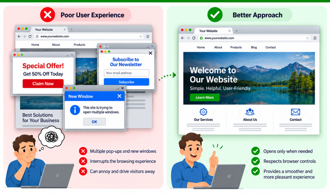
Visitors generally expect their browser to behave in a familiar way. Automatically opening several new windows, forcing pop-ups, or resizing the existing browser window can interrupt that experience. There may be situations where opening another window has a practical reason, but it should not become the normal method of navigation. Ordinary links should usually behave in the way visitors expect.
Designers should also avoid techniques that interfere with browser controls. People rely on the back button, bookmarks, tabs, and normal browser navigation while moving around the web. A website that tries to control these functions can quickly become irritating. Good web design works with the visitor’s browsing habits instead of forcing them to learn a different way of using the website.
Mistake 3: Overusing Flash and Heavy Visual Elements
Flash does offer animation and interactive features, but basing large parts of a website on it can lead to a number of problems. Large Flash introductions, animated navigation, and complex effects can increase load time and some visitors may not have the necessary plugin available. Another important consideration is that of mobile devices. Not all devices can play Flash content so some visitors may not be able to access key navigation, text or contact information.
Animation should therefore be used only when it adds something useful to the page. Essential information should not depend entirely on Flash. Large animated GIFs and other decorative effects should be treated in the same way. Movement can attract attention, but too much of it makes pages distracting and increases the amount of data visitors must download. Simple HTML, CSS, and properly optimized images are often more suitable for ordinary website content.
Mistake 4: Making Navigation Complicated or Unpredictable
Visitors need to know where they are on a website and how to get to another page without having to experiment. Complicated drop down menus, links with ambiguous names, broken back button behaviour, unnecessary redirects and navigation based on quirky effects can all make a site harder to use. If people can’t find the information they’re looking for quickly, they’ll just go away.
Navigation should remain consistent from one part of the website to another. Main sections should be clearly identified, and important pages should not be hidden behind several layers of menus. It is also worth testing menus without relying only on a mouse. Touchscreen users interact with navigation differently, so a menu built entirely around mouse-hover actions may become awkward on a phone or tablet. Simple and predictable navigation often works better than a complicated system designed mainly to impress.
Mistake 5: Allowing Poor HTML and CSS to Build Up
Visual website editors can make it easier to create the pages, but if you rely only on the automatic tools, you may end up with code that is unnecessary or poorly structured. Too much inline styling, repeated tags, wrongly nested elements and unnecessary layout code can make pages harder to maintain. Sometimes a website will look right, but will have errors that cause problems when the design is changed, or seen in a different browser.
Designers do not need to write every page manually, but understanding basic HTML and CSS is extremely useful. Looking at the source code can reveal problems that are not obvious in the visual editor. Tables should also be used for presenting tabular information rather than simply controlling the entire page layout when CSS can handle presentation more appropriately. Clean, organized code is easier to update, debug, and reuse. An editor should help the designer work efficiently rather than fill pages with code that nobody understands later.
Mistake 6: Ignoring Cross-Browser Compatibility
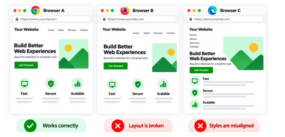
A website that works perfectly in one browser may behave differently in another. HTML, CSS, JavaScript, forms, and other page elements are not always handled identically by every browser. For example, a layout that appears correctly in Chrome or Firefox may develop spacing or positioning problems in Internet Explorer. Menus may behave differently, scripts may stop working, or images may move away from their intended position.
Cross-browser testing should therefore take place throughout development rather than being left until the final day before launch. Check important pages in commonly used browsers and pay particular attention to forms, navigation, images, tables, scripts, and page layouts. Older browser versions may also need consideration depending on the website’s visitors. Using standard HTML and CSS wherever possible can reduce the need for complicated browser-specific fixes.
Mistake 7: Designing Only for Large Desktop Screens
Websites are no longer viewed only from desktop computers. Visitors increasingly use smartphones, tablets, laptops, and screens of many different sizes. A fixed-width layout that looks comfortable on a desktop monitor may force someone on a smaller screen to scroll left and right just to read a paragraph. Large images, wide tables, advertisements, and fixed-width page elements can make the problem even worse. Responsive web design provides a more flexible approach. Layouts can adjust to different screen widths so content remains readable and navigation remains usable without requiring a completely separate experience for every device.
Designers should test pages at several sizes rather than assuming that one screen resolution represents every visitor. Important information should remain visible, text should remain readable, and buttons or links should be easy to select on smaller screens. A website that adapts well gives visitors a much smoother experience regardless of the device they use.
Mistake 8: Adding JavaScript Where It Is Not Needed
JavaScript can add useful interaction to a website, but adding scripts simply because an effect is available can create unnecessary complexity. Several libraries, sliders, pop-ups, animations, counters, and other scripts can increase page size and introduce more things that can go wrong. If an essential part of the website depends completely on JavaScript and that script fails, visitors may lose access to content or navigation.
Designers should consider whether each script provides genuine value. A feature that can be handled simply with HTML or CSS may not need another JavaScript file. Scripts should also be tested carefully in different browsers. One error can sometimes affect several other functions on the same page. JavaScript is most useful when it improves an already usable website. It should enhance the visitor’s experience rather than become a requirement for completing every basic action.
Mistake 9: Failing to Properly Test Links, Forms, and Redirects
A website should be tested for more than appearance. Links need to reach the correct pages, contact forms need to send messages successfully, downloadable files must actually exist, and redirects should take users to the right destination. Broken links are particularly frustrating because they stop visitors while they are trying to move through the site. Problems can appear when pages are renamed, moved, or deleted without updating existing links.
When an old page has permanently moved, an appropriate redirect can guide visitors to the new location instead of leaving them at a dead end. A useful custom 404 page can also help visitors recover when a page cannot be found. Forms need equally careful testing. Submit them yourself, deliberately leave required fields empty, enter incorrect information, and check whether the error messages make sense. Form labels should clearly explain what information belongs in each field. Testing these small details before launch can prevent much larger problems for visitors later.
Mistake 10: Ignoring Page Loading Time
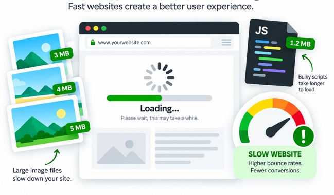
Website performance should be considered while the design is being created rather than after everything has been completed. Large photographs, heavy Flash files, animated images, unnecessary scripts, and badly organised code can all increase loading time. Images should be resized to the dimensions actually needed on the page and compressed appropriately. Scripts and visual elements should be included because they serve a purpose, not simply because they are available.
Accessibility deserves similar attention. Not every visitor interacts with a website in exactly the same way. Images that contain useful information should include meaningful ALT text. Form fields should have clear labels, headings should organise the content logically, and important information should not depend only on colour. Keyboard navigation is also worth testing. Try moving through links, forms, and important controls without relying completely on a mouse.
Many accessibility improvements also make a website easier for ordinary visitors to use. Clear text, sensible headings, straightforward navigation, and properly labelled forms improve the experience for a much wider audience.
Better Web Design Starts With Strong Technical Basics
Technical web design should always support the visitor. A technically impressive feature has little value if it makes the site harder to use. Web designers should therefore focus on practical design decisions that help people find information, understand the content, and complete the action they came to perform.
A website should be tested regularly because even small technical problems can affect usability. If your website needs improvements in layout, compatibility, navigation, or overall performance, let our professional web design team support help create a cleaner and more reliable experience for visitors.
Comments
Author Details

Ashwani Kumar Sharma
Ashwani has been actively involved in SEO services since 2005. His expertise and distinctive work approaches have made him one of the most experienced and trusted SEO experts in the industry. He is a certified SEO and Google Ads professional. He also has strong business development skills in advanced SEO, PPC, and digital marketing strategies.


Every weekend i used to go to see this website, because i want enjoyment, for the reason that this this site conations really nice funny data too.