How Design Helps Communicate Complex Ideas in Modern Digital Marketing
Key takeaways
- Design turns complex marketing ideas into clear, usable experiences people actually understand.
- Good visual structure helps readers find the point before attention starts slipping.
- Clear hierarchy makes important information easier to scan, trust, and remember quickly.
- Strong design reduces confusion, lowers effort, and keeps readers moving confidently forward.
- Visual storytelling makes dense ideas feel simpler, relatable, and easier to follow.
- UX choices shape whether content feels smooth, frustrating, helpful, or forgettable overall.
- Better design builds trust because people understand faster and hesitate much less.
- When clarity improves, stronger engagement and better conversions usually follow naturally too.
Modern digital marketing is full of ideas that sound simple until you try explaining them: attribution paths, SEO signals, funnel leaks, audience intent, campaign sequencing, and performance trade-offs. The problem is rarely that the audience is not smart enough. The problem is that the message often arrives as a dense block of text with no visual logic. That is where design for complex ideas becomes useful. It gives the message structure before the reader gives up on decoding it.
That matters because people judge pages fast. Research on webpage appeal found that users can form an aesthetic impression in as little as 50 milliseconds, and Stanford’s web-credibility guidelines are based on three years of research involving more than 4,500 people. Together, those findings tell a blunt story: the page starts earning or losing trust almost immediately. Strong visual communication in marketing helps hard ideas land before attention slips and skepticism takes over.
The real win is not making complexity disappear. It is making complexity easier to understand at first glance. When the layout signals what matters, when visuals support the explanation, and when the reader can move without friction, even technical ideas start feeling usable. That is what this blog is built to show.
What readers really want from content like this is simple:
- A fast grasp of the point
- A clear path through the detail
- A next step that feels obvious
Why Do Complex Ideas Need Clarity?
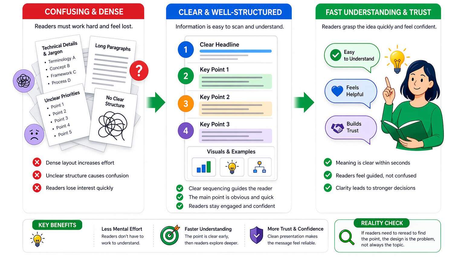
Complex ideas usually break down long before the reader reaches the end. They start breaking down when a page asks the brain to do too many jobs at once: decode structure, interpret jargon, rank importance, and still remember the main point. That mental strain is exactly why difficult topics need better presentation, not less depth. This is where design for complex ideas becomes genuinely useful, because it reduces the effort required to convey the message before confusion sets in.
- Dense layouts make readers work harder before they even understand the core message.
- Unclear structure turns useful information into something that feels heavier than it is.
- Weak presentation increases mental effort and reduces engagement before trust can be built.
Readers also do not want to work harder than the value justifies. They want the meaning quickly, then the option to explore deeper if it feels worth their attention. That is why design for marketing clarity is not a surface-level upgrade. It is a communication advantage. A page that reveals the point early feels helpful. A page that hides it inside abstraction feels like effort, and effort is rarely persuasive in digital marketing.
- Clear sequencing helps readers absorb the message without stopping to mentally reorganize it.
- Fast understanding creates momentum and keeps readers moving toward action with less hesitation.
Clarity also shapes confidence. A study on website evaluation found that aesthetics influenced first impressions most strongly, while usability and content shaped broader judgments and the intent to recommend. In simple terms, people read professionalism through presentation. When the structure feels clean, the message feels more believable. When the structure feels messy, even good ideas start looking weaker, riskier, and less dependable than they actually are.
- A clean presentation increases trust because readers feel guided rather than left to decode.
- Better clarity supports stronger decisions by reducing doubt at the moment of evaluation.
Can Design Make Complex Ideas Simple?
Visual design simplifies information by doing something text alone cannot: it shows priority at a glance. Size, contrast, spacing, and placement tell readers what deserves attention first, which is exactly what visual hierarchy marketing is supposed to do. That instant ordering effect matters because design for complex ideas works best when readers do not have to guess what matters. They should feel guided, not abandoned in a wall of information.
The second job of design is compression. A useful diagram, a well-placed icon, or a side-by-side comparison can replace several sentences of explanation when it clearly shows relationships. That is where content visualization earns its keep, and where simplify complex concepts design becomes practical instead of theoretical. A good layout does not just hold information; it conveys it. It shortens the distance between “I see this” and “I get this.”
Color and contrast finish the job when they are used with intention rather than decoration. Google recommends aiming for good Core Web Vitals, including LCP within 2.5 seconds, INP under 200 milliseconds, and CLS below 0.1, because fast, stable pages support a better experience. Smart marketing design principles help the page feel readable, calm, and directional instead of loud and busy.
Smart Move / Bad Move
- Smart move: use one strong visual that clearly explains the process, supports the message, and speeds up understanding without adding clutter.
- Bad move: use five decorative visuals that look impressive at first glance but explain very little.
Why Do Visual Stories Sell Faster?
Storytelling gives complex information a shape people can follow. Instead of presenting facts as isolated fragments, it turns them into movement: problem, tension, shift, result. That is why visual storytelling marketing works so well in modern digital content. It helps the reader feel the logic rather than just inspect it. Design for complex ideas becomes much stronger when the message flows, because readers remember sequences better than scattered points.
- For example, a messy lead-generation report becomes much easier to understand when presented as “traffic came in, drop-off happened here, and conversions improved after this fix.”
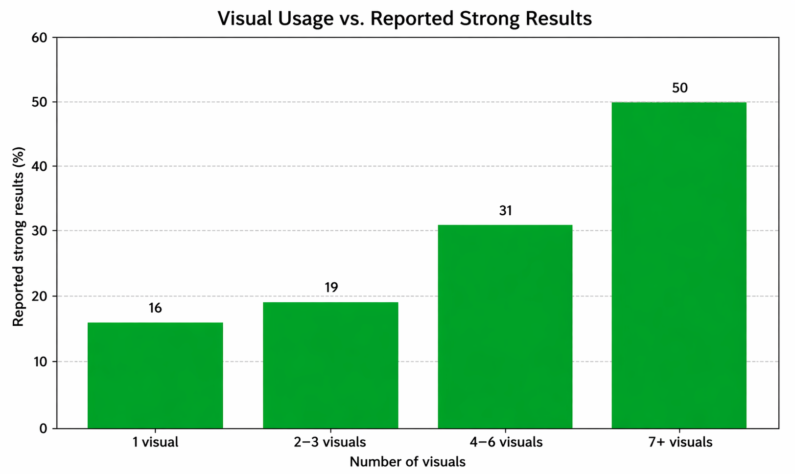
This is also why infographics keep earning their place. Orbit Media’s 2025 blogging survey found that bloggers using seven or more visuals per post were the most likely to report strong results at 50%, compared with a 21% benchmark. That does not mean every page needs visual confetti. It means infographic design strategy and data visualization marketing work when the visual carries meaning, not just color. Use a full hyperlink or consistent source format after the sentence.
- Think of it this way: a single comparison infographic can explain performance gaps faster than five long paragraphs of explanation.
Sequential design matters too. When information appears in the right order, the reader does not have to mentally backtrack to understand the point. That creates momentum, and momentum is underrated. Readers stay longer when the page keeps rewarding the next scroll with clarity instead of extra work. That is where visual storytelling marketing shifts from “nice touch” to real communication advantage.
- A simple example: a funnel audit becomes much easier to follow when presented as a clear journey, first the problem, then the leak, then the fix, rather than a pile of disconnected screenshots with no explanation.
Is Your UX Confusing the Audience?
A page can have excellent ideas and still feel exhausting if the layout keeps getting in the way. Long lines, tight spacing, uneven rhythm, weak contrast, and awkward grouping all make readers expend energy on navigation rather than meaning. That is why UX design for content matters so much. It is not just about making a page usable. It is about making a message feel smooth enough to follow. Strong UI UX communication reduces the visual drag that slows comprehension.
Navigation is part of that clarity, too. Readers rarely describe the problem in technical terms, but they leave when navigation feels confusing. Good user understanding design anticipates those expectations and makes the route feel natural. That is especially important when a page contains layered ideas, because every extra moment of uncertainty makes the content feel harder than it is.
Responsive design raises the stakes even more. Statcounter’s worldwide figures for February 2026 show mobile at 52.26% and desktop at 47.74%, indicating that clarity now has to survive on smaller screens and shorter attention spans. Good design for engagement keeps the meaning intact even when space gets tighter, and that is exactly where design for complex ideas proves whether it is truly working.
Fast Fix
- Shorten paragraphs that look fine on desktop but feel heavy on mobile.
- Group related ideas tightly
- Make the next click obvious before the reader starts hunting for it.
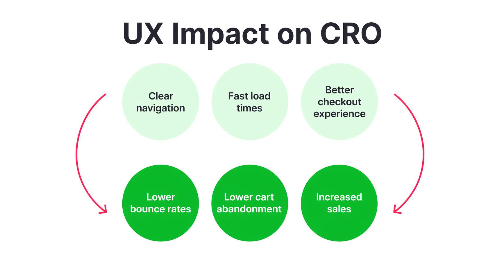
Can Better Design Boost Conversions?
Conversion behavior is not shaped solely by design; design determines how much friction stands between interest and action. A strong CTA feels like the next logical step because the page has already reduced confusion, surfaced proof, and made the offer understandable. That is why design for complex ideas affects outcomes so directly. When the message feels easier to grasp, the decision feels easier to make. Clarity does not guarantee action, but confusion almost always delays it.
Trust signals matter just as much. Baymard reports that 19% of U.S. online shoppers abandoned a checkout in the past three months because they did not trust the site with their credit card information. That is where design psychology becomes commercially important. Layout consistency, visible reassurance, readable proof, and orderly presentation do more than make the page look polished; they instill confidence. They make the experience feel safer, clearer, and more trustworthy. They make the experience feel safer.
Friction is the final conversion killer. Baymard also reports that 18% abandoned because checkout was too long or complicated. In contrast, the average U.S. checkout flow still shows 23.48 form elements by default, even though ideal flows can be much shorter. That is why conversion-focused design is so practical. It protects intent while it is still warm, rather than letting complexity cool it off.
| Smart Move | Costly Move |
| Use one clear CTA tied to a benefit instantly understood and trusted. | Show three competing CTAs that split attention, confuse priorities, and delay action. |
| Place trust cues near the action point so hesitation drops before clicking. | Bury proof far from the decision moment, forcing readers to search reassurance. |
| Keep visible fields minimal so the process feels shorter and easier immediately. | Use long intimidating forms that feel exhausting before users even start typing. |
| Guide the eye with spacing so action feels natural, timely, and low friction. | Crowd the layout with distractions that weaken focus and interrupt decision momentum. |
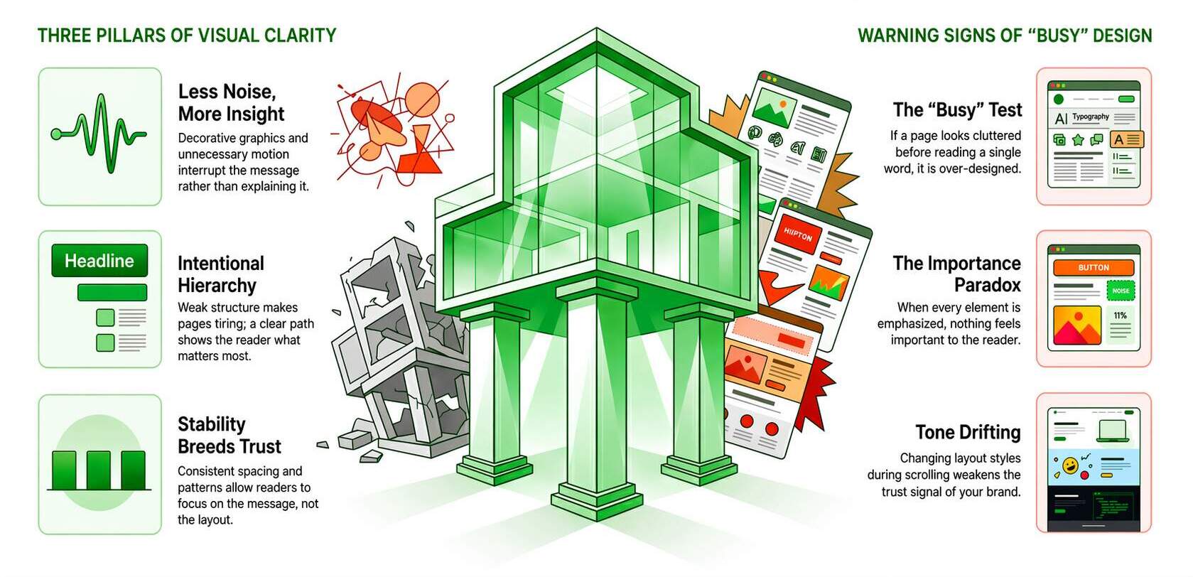
Common Design Mistakes That Reduce Clarity
The first major mistake is assuming that more design automatically creates more clarity. It usually does not. Decorative graphics, multiple emphasis styles, oversized screenshots, and unnecessary motion often make a useful page feel noisy instead of insightful. Nielsen Norman Group advises using images on mobile when they add informational value, not when they simply lengthen the page. That is a good rule everywhere, not just on smaller screens. When the visual does not explain, it is probably interrupting.
The second mistake is a weak structure. Without a clear path, readers cannot tell what matters most, what supports it, and what to do next. That is why design for marketing clarity matters at the page level, not just the brand level. Poor hierarchy does not always look dramatic. Sometimes it just makes a page feel strangely tiring. The reader keeps moving, but the message never settles properly because nothing is staged with enough intention.
The third mistake is inconsistency. When spacing patterns drift, buttons behave differently, or visual rules keep changing, readers stop trusting the system underneath the page. The result is subtle but costly: more effort, less confidence, weaker engagement. Strong design feels stable because the reader learns the pattern once and then moves through the message without reorienting at every turn. That is how clarity keeps its momentum.
Warning Sign
- If the page looks “busy” before anyone reads a sentence, it is already asking too much.
- If every element looks important, nothing actually feels important.
- If the layout changes tone with every scroll, the trust signal weakens.
Conclusion: Clarity Through Strategic Design
Design is not just the final layer that makes a page look polished. It is part of how the message gets understood in the first place. When information is structured well, people can scan it faster, trust it more easily, and use it without feeling lost. That is why design for complex ideas matters so much in modern content strategy. It does not water information down. It makes it easier for real people to step into it without feeling overwhelmed.
There is also a clear performance benefit. Orbit Media’s 2025 survey found that marketers publishing posts over 2,000 words were more likely to report strong results than the 21% benchmark, while Backlinko’s content study found that articles over 3,000 words earn 77.2% more referring-domain links than articles under 1,000 words. Depth works better when the structure supports it. That is exactly why visual communication in marketing, UX design for content, and visual storytelling marketing matter in practice.
If your content is useful but still feels harder to follow than it should, the problem may not be the idea. It may be the way the idea is being presented. Better structure, clearer visuals, and smarter user flow can make even complicated messages feel easier to understand and much easier to act on.
Turn Complexity Into Clearer Conversions
When people understand your message faster, they are more likely to trust it and move forward with confidence. That is where better UX, sharper design, and clearer content structure start making a real difference. eSign Web Services helps brands turn complex marketing ideas into clear, engaging, conversion-focused digital experiences. Request your UX and design audit today and start turning clarity into results.
Frequently Asked Questions (FAQS)
Question: Why is design important in digital marketing?
Answer: Design is important because it improves how users understand and interact with content. Visual structure, layout, and hierarchy make information easier to process. Good design enhances engagement and reduces confusion. It also influences perception, making content appear more credible and professional. In digital marketing, design supports communication by simplifying complex ideas and guiding users toward actions. Without effective design, even valuable content may fail to deliver results. Investing in design ensures better user experience, stronger engagement, and improved conversion outcomes.
Question: How does design improve user understanding of complex content?
Answer: Design improves understanding by organizing information into structured visual formats that are easier to process. Elements such as headings, spacing, icons, and visuals guide users through content logically. Instead of reading dense text, users can quickly grasp key ideas through visual cues. Design reduces cognitive load by breaking information into smaller, digestible sections. This approach improves comprehension and retention. When users understand content clearly, they are more likely to engage and take action. Effective design transforms complex concepts into simple, accessible experiences that support better communication and decision-making.
Question: What is visual hierarchy and why is it important?
Answer: Visual hierarchy refers to the arrangement of design elements in a way that guides users’ attention. It uses size, color, contrast, and spacing to highlight important information. A strong hierarchy ensures users focus on key messages first, improving comprehension. Without hierarchy, content appears cluttered and confusing. Proper visual structure helps users navigate content efficiently and understand relationships between elements. It also supports better user experience by reducing effort required to process information. In digital marketing, visual hierarchy improves engagement and increases the likelihood of conversion by directing attention effectively.
Question: Can design impact conversion rates directly?
Answer: Yes, design directly impacts conversion rates by influencing how users perceive and interact with content. Clear layouts, strong calls-to-action, and intuitive navigation make it easier for users to take desired actions. Poor design creates confusion, reduces trust, and increases abandonment. Elements such as button placement, color contrast, and readability affect decision-making. A well-designed interface reduces friction and guides users through the conversion process. By improving usability and clarity, design enhances user confidence and increases the likelihood of completing actions such as purchases or inquiries.
Question: What role do infographics play in marketing communication?
Answer: Infographics play a significant role by presenting complex information in a visually engaging and easy-to-understand format. They combine data, visuals, and text to simplify concepts. This makes it easier for users to interpret information quickly. Infographics improve retention and shareability, increasing content reach. They are particularly effective for explaining processes, comparisons, and statistics. In marketing, infographics enhance communication by making content more engaging and accessible. They also support brand authority by presenting information in a structured and professional manner.
Question: How does UX design support content clarity?
Answer: UX design supports clarity by focusing on usability, accessibility, and user behavior. It ensures that content is easy to navigate and understand. Elements such as layout, spacing, and responsive design improve readability across devices. UX design considers how users interact with content and optimizes the experience accordingly. Clear navigation and logical structure reduce confusion. By aligning design with user needs, UX improves engagement and satisfaction. This approach ensures that users can find information quickly and interact with content effectively, leading to better outcomes.
Question: Why is responsive design important for communication?
Answer: Responsive design ensures that content adapts to different screen sizes and devices. Users access content through mobile, tablet, and desktop platforms, each requiring optimized layouts. Without responsive design, content may appear distorted or difficult to read. This reduces engagement and trust. Responsive design maintains consistency and usability across devices. It improves accessibility and ensures users receive the same experience regardless of platform. In digital marketing, this is essential for maintaining effective communication and maximizing reach and performance.
Question: What are common design mistakes that reduce effectiveness?
Answer: Common mistakes include cluttered layouts, poor visual hierarchy, inconsistent branding, and excessive use of colors or fonts. These issues make content difficult to understand and reduce engagement. Lack of spacing and unclear navigation also create confusion. Ignoring mobile responsiveness limits accessibility. Overloading visuals without purpose can overwhelm users. Poorly designed calls-to-action reduce conversion potential. Avoiding these mistakes ensures content remains clear and effective. Strong design focuses on simplicity, consistency, and user experience, improving both communication and performance.
Question: How can businesses balance design and content effectively?
Answer: Balancing design and content requires aligning visual elements with messaging. Content should provide value, while design enhances clarity and presentation. Neither should dominate at the expense of the other. Collaboration between content creators and designers ensures consistency. Using structured layouts and visual hierarchy helps maintain balance. Testing different formats identifies what works best. The goal is to create a seamless experience where design supports understanding without distracting from the message. This approach improves engagement and effectiveness.
Question: How does design influence brand perception?
Answer: Design significantly influences how users perceive a brand. Professional, consistent design creates a positive impression and builds credibility. Poor design can make a brand appear unreliable or outdated. Visual elements such as color, typography, and layout communicate brand identity. Consistent design across platforms reinforces recognition and trust. Users often judge a brand within seconds based on visual presentation. Strong design enhances user experience and supports marketing goals. By investing in quality design, businesses can improve perception, engagement, and long-term customer relationships.
Author Details

Ashwani Kumar Sharma
Ashwani has been actively involved in SEO services since 2005. His expertise and distinctive work approaches have made him one of the most experienced and trusted SEO experts in the industry. He is a certified SEO and Google Ads professional. He also has strong business development skills in advanced SEO, PPC, and digital marketing strategies.